25 cardinal interior changes from the cult BBC show "Changing Rooms"
Categories: Design and Architecture | Europe | World
By Pictolic https://pictolic.com/article/25-cardinal-interior-changes-from-the-cult-bbc-show-changing-rooms.htmlThere are many ways to update the interior. You can go to Ikea, you can call your mom, you can hire a designer. But never, never entrust the repair of your apartment to a neighbor! The results of such cooperation regularly brought to hysteria everyone who watched the popular BBC show "Changing Rooms" ("Change Rooms"), which was released in the UK from 1996 to 2004.
Yes, the audience had a lot of fun, but the owners of the rooms who got involved in this venture — not always.
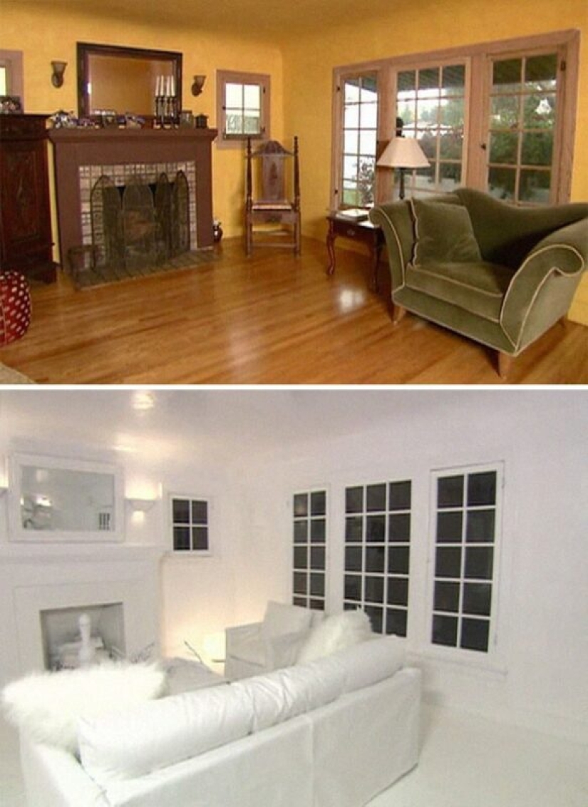
The room that was made completely white
The designer's explanation: "We thought it would be interesting to see what an all-white room would look like."
The owner's reaction: "This is a nightmare. Take the microphone off me."
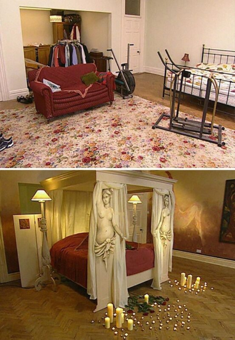
Bedroom "Touch of Art"
The designer's explanation: "This is a bold statement."
The owner's reaction: "Oh my God..."
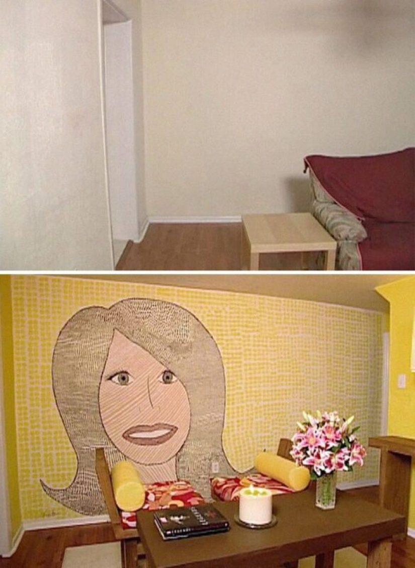
A room with a designer's self-portrait on the wall
The designer's explanation: "I wanted to add some fun."
The owner's reaction: "What a... strange choice."
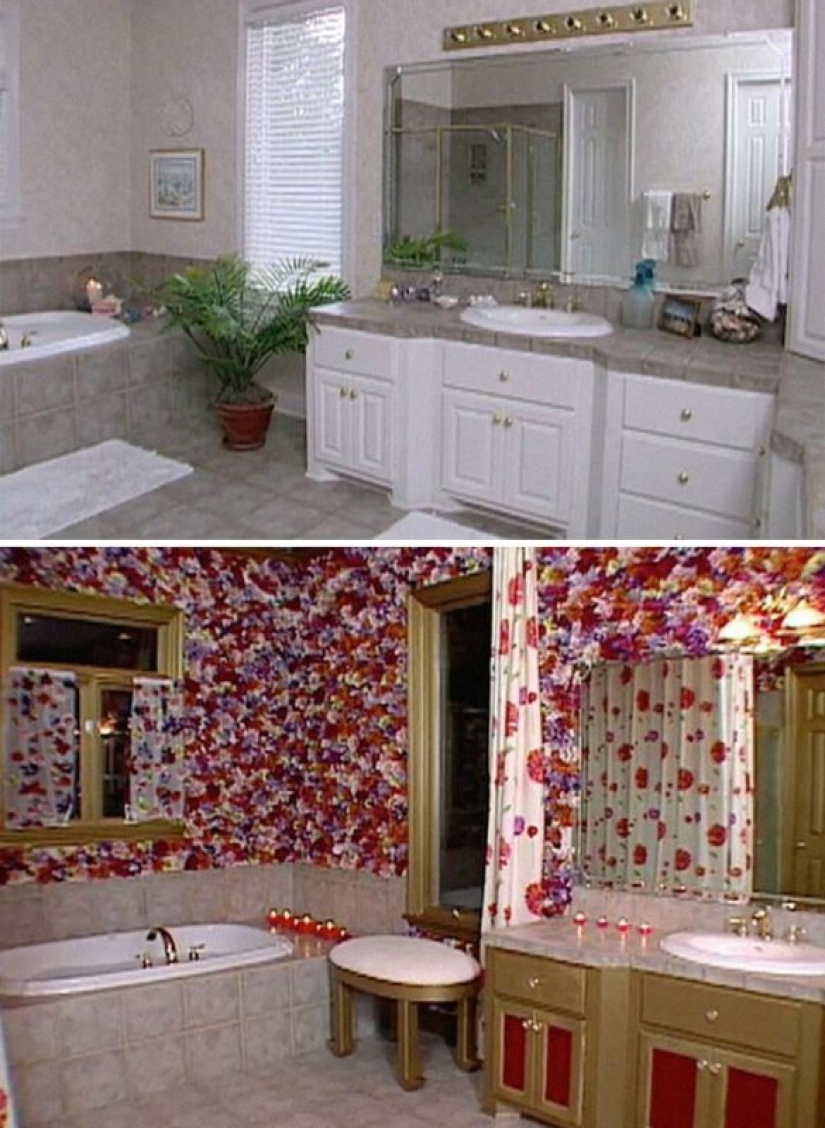
A bathroom decorated with 6,000 flowers
The designer's explanation: "Any room looks better with flowers."
The reaction of the owner: "How many of them there are ..."
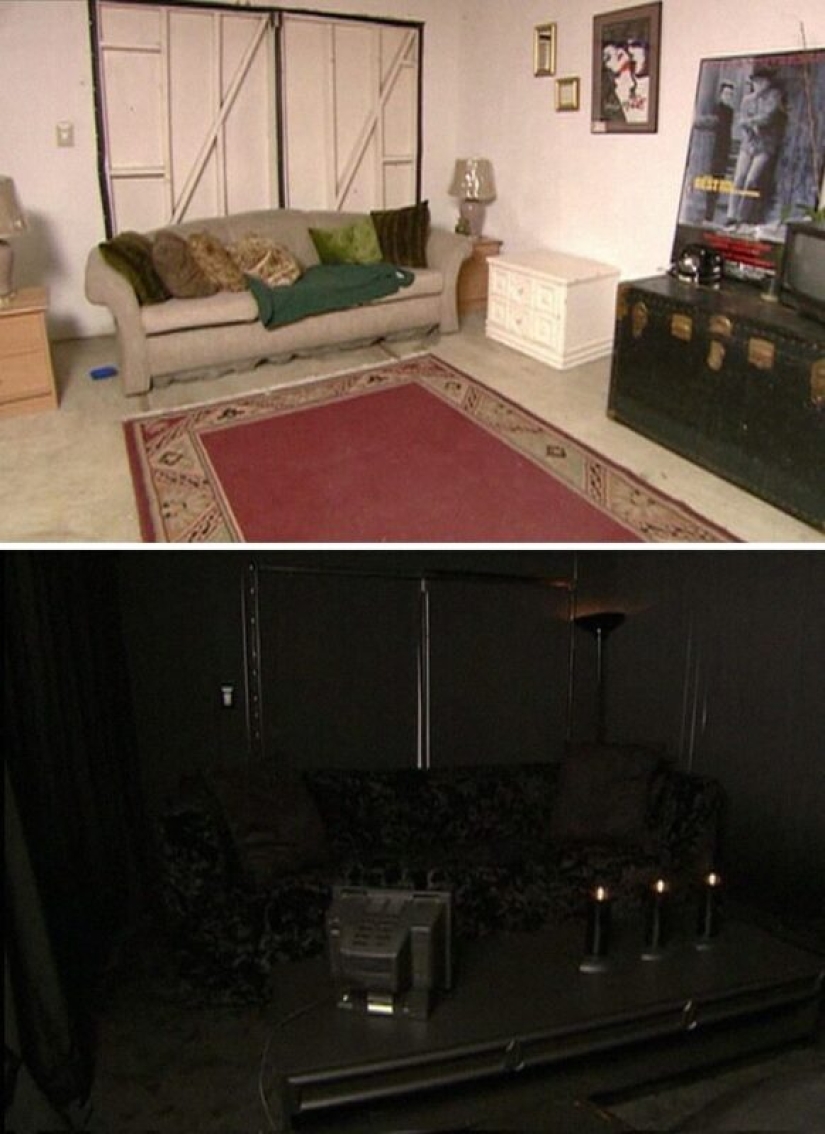
A completely black room in the house of one couple
The designer's explanation: "I knew they were waiting for drastic changes. I'm very, very proud of this room."
The reaction of the owner: "It goes all the way to goosebumps."
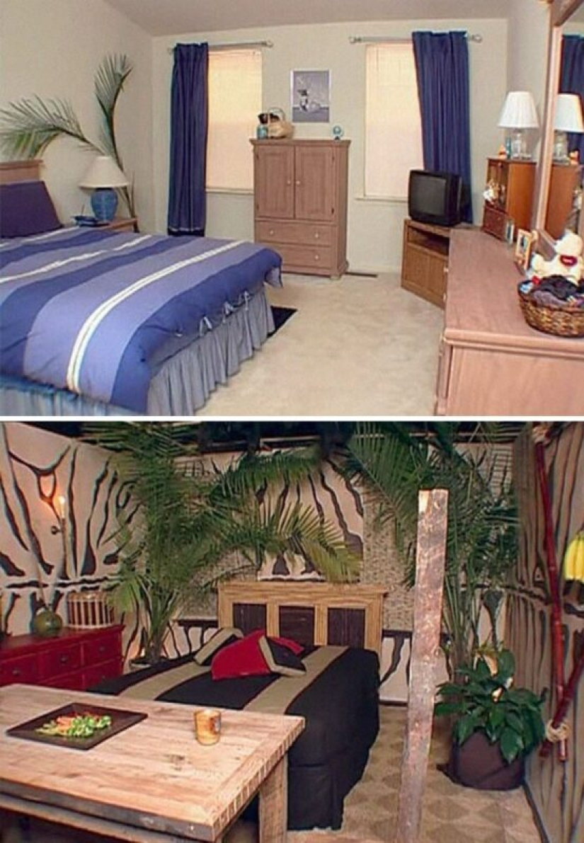
The designer, apparently, was inspired by the safari theme
The designer's explanation: "Everything just fits very well here."
Owner's reaction: [screaming] (clarification: from excitement)
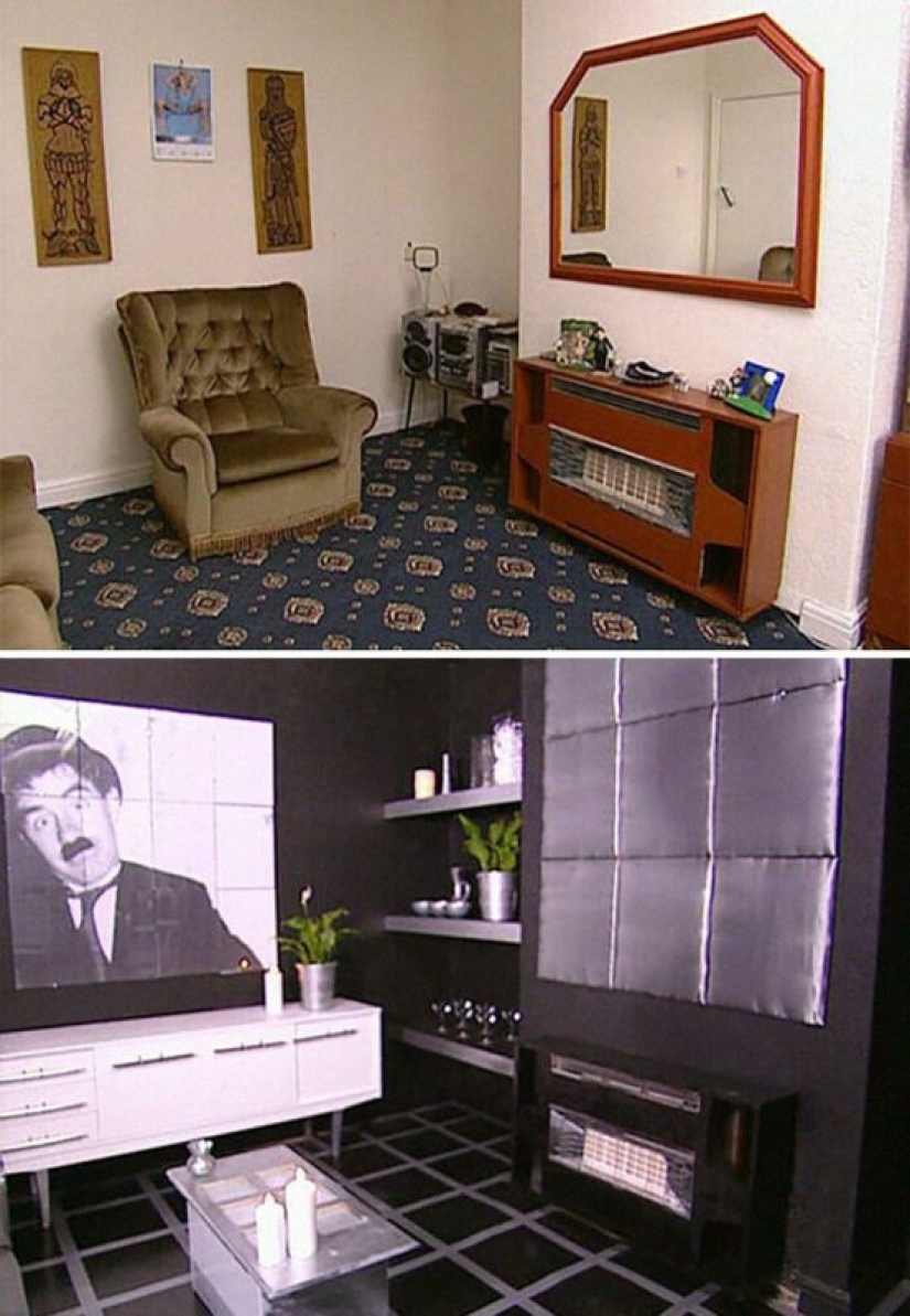
Black and white theme
The designer's explanation: "I think it turned out great."
The owner's reaction: "What the hell is this?"
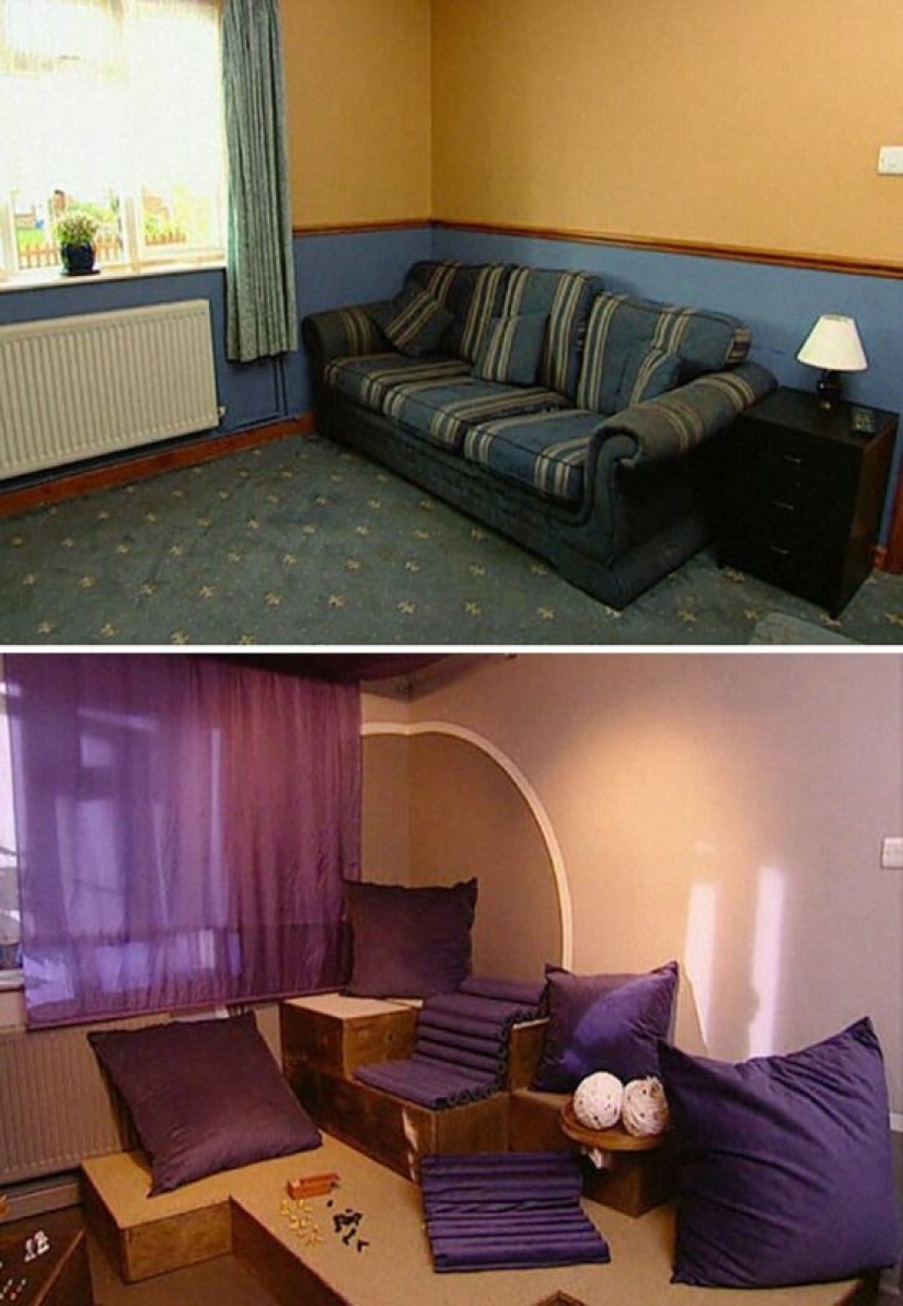
"Fashionable" living room
The designer's explanation: "We need to see how it will look in the end."
The owner's reaction: "Oh no, it's terrible."
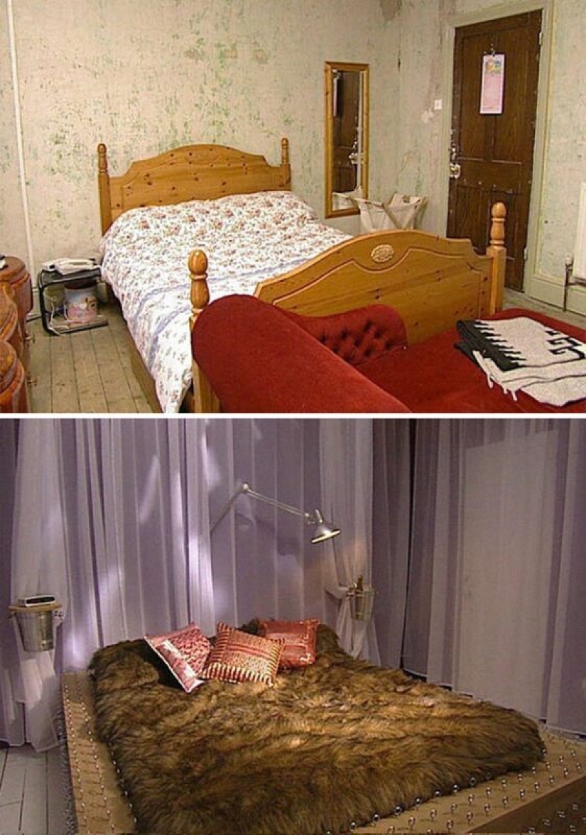
A "magnificent" bedroom for lovers
The designer's explanation: "A sensual, sexy room."
The owner's reaction: "I don't like the bed. The color is terrible."
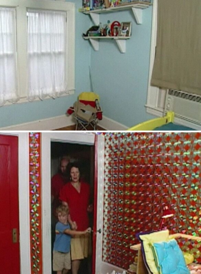
A room decorated with CDs. There are 1800 of them and they take up all the free space on the walls
The reaction of the owners: "Cool" [child]. "Oh my God!" [Mom].
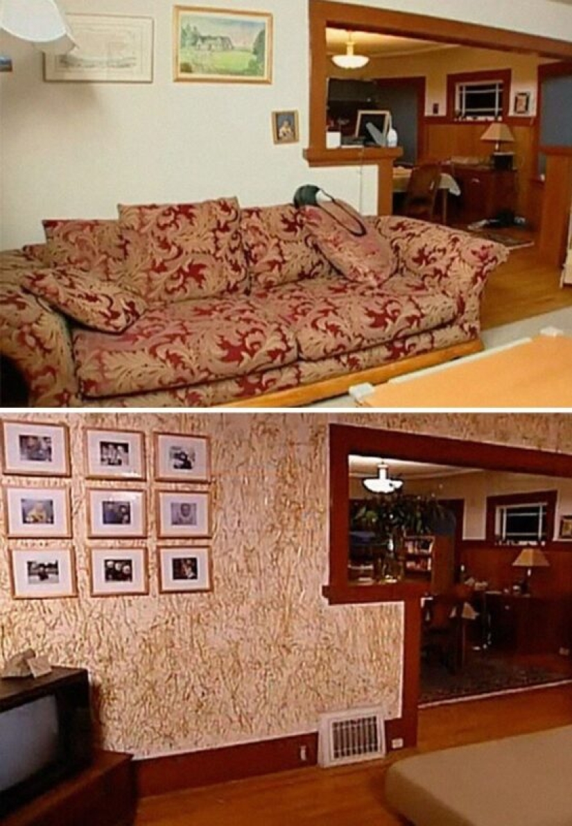
Children's room decorated with hay
The designer's explanation: "I really wanted to emphasize the straw color of the sofa, since the whole room is designed around the sofa."
The owner's reaction: "It smells wonderful here." [opens his eyes] "Oh shit."
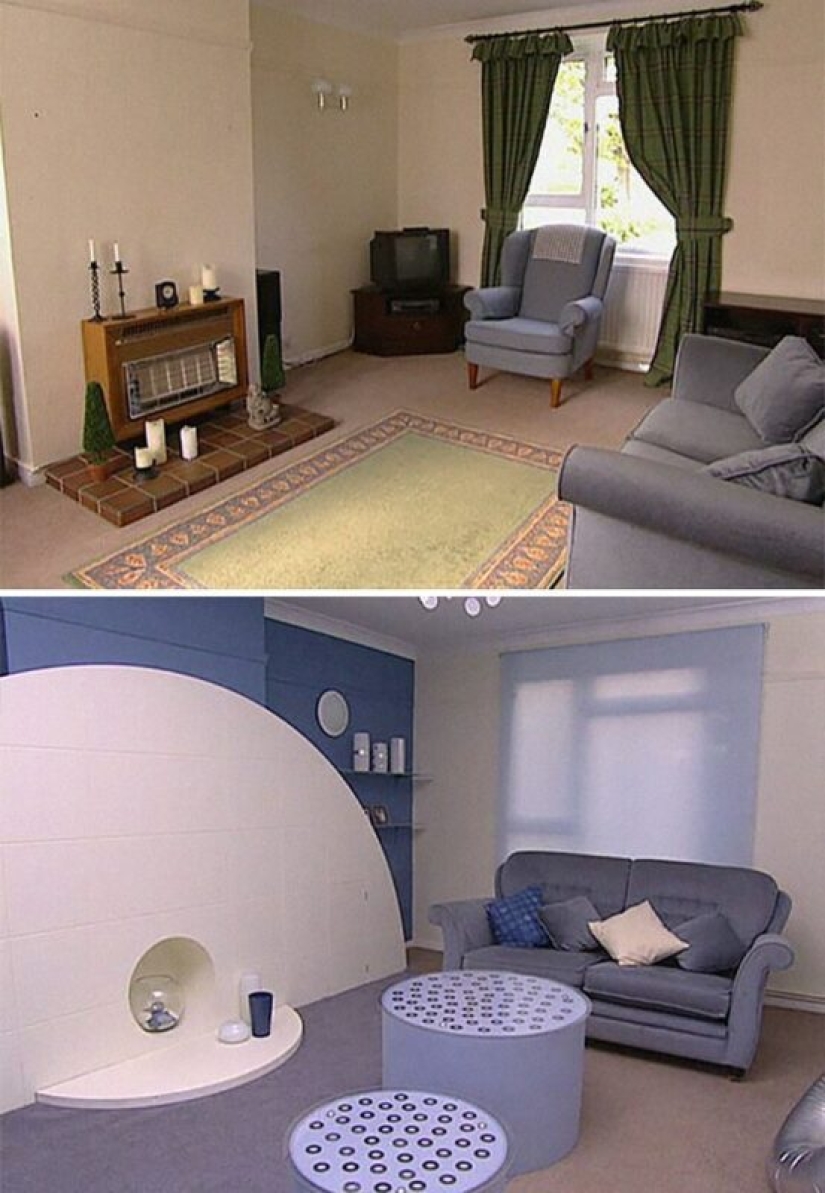
"Tribute to round shapes"
The designer's explanation: "I like circles."
The owner's reaction: "Is this the same room? Amazing..."
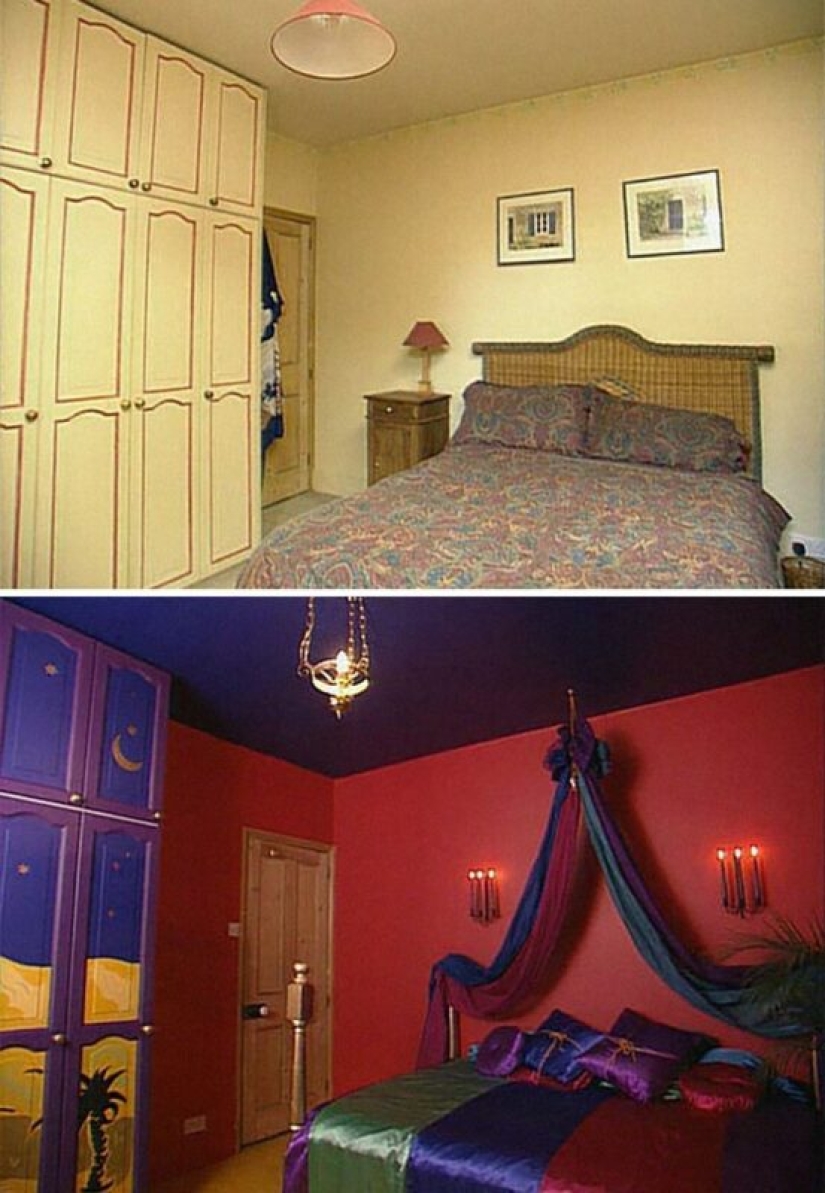
"Hot purple passion"
The designer's explanation: "It's an atmosphere of passion."
The owner's reaction: "Just great."
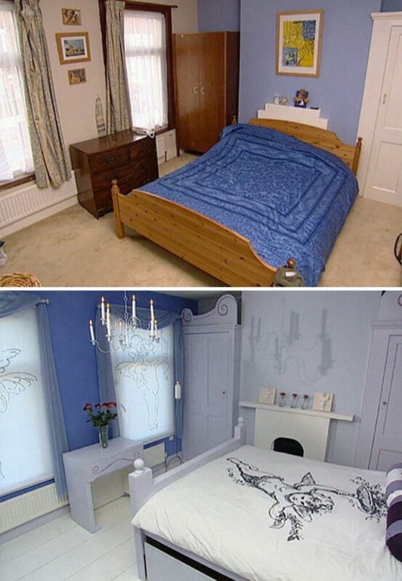
Bedroom in a romantic style
The designer's explanation: "They need somewhere to escape from three children."
The owner's reaction: "What a change. My God!"
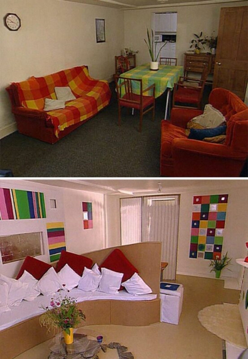
Living room in the style of a New York art gallery
The designer's explanation: "It sets you up for a contemplative mood, right?"
The owner's reaction: "I wouldn't change anything. It's amazing."
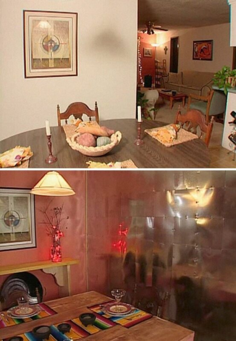
Unexpected redevelopment
Owner's reaction: "..."
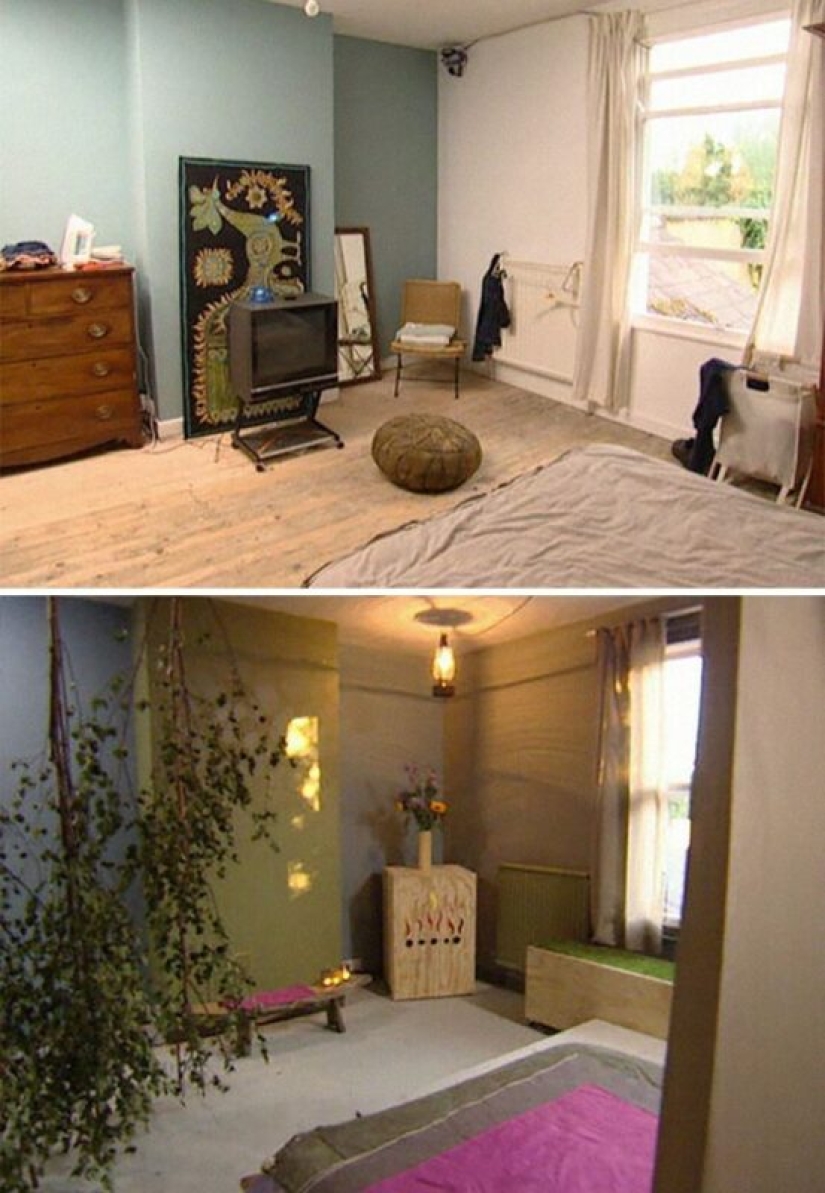
Penthouse "Camping in nature"
The designer's explanation: "They like to relax in nature..."
The owner's reaction: "This is not what I expected."
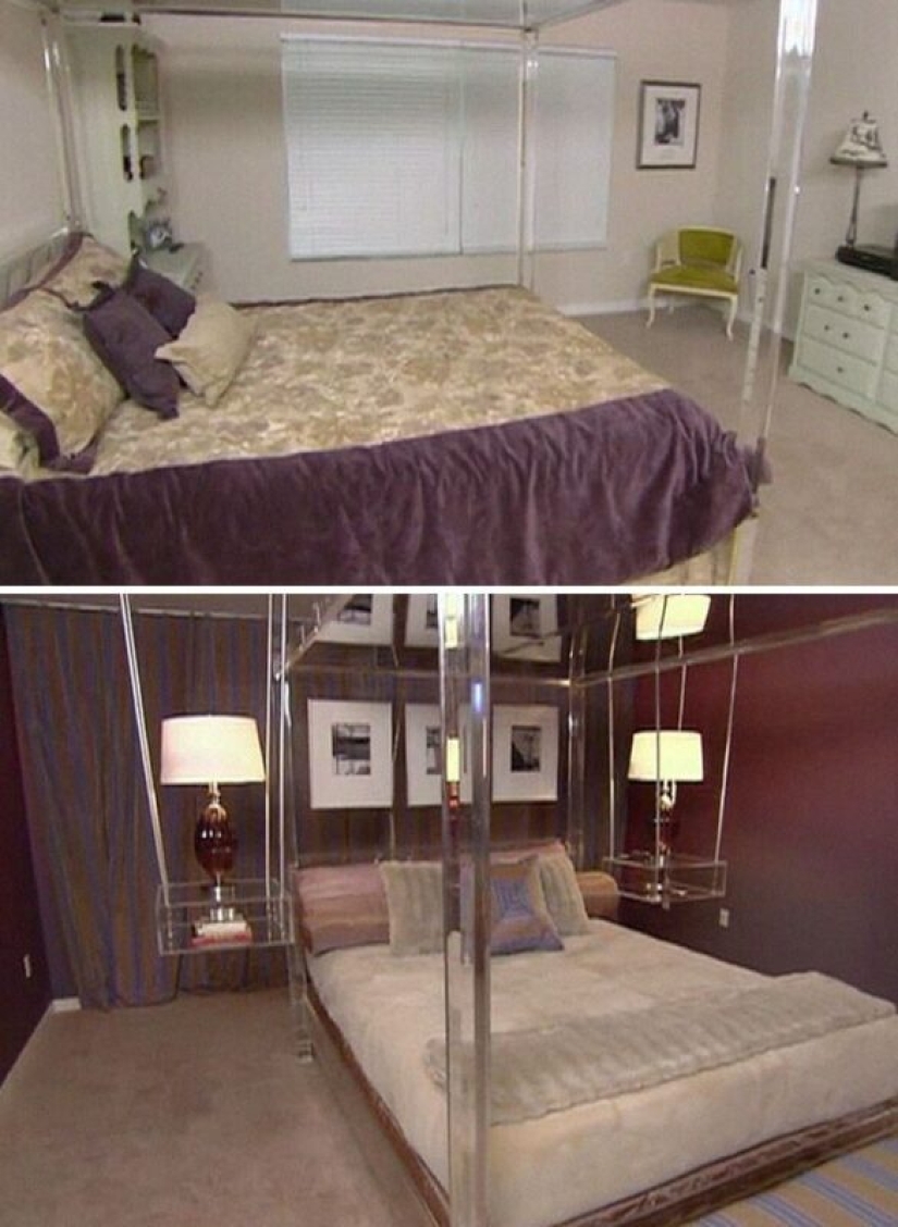
A room decorated with hanging lamps
The designer's explanation: "I like the way they are suspended, because it "equalizes" the ceiling with the bed and the floor."
The owner's reaction: "Look at this. It's hanging."
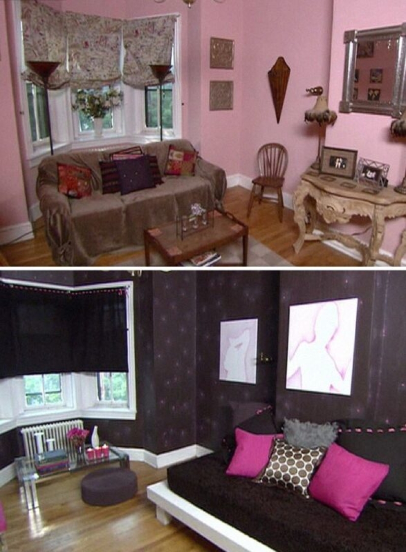
The room that was painted with a paintball gun
The designer's explanation: "I would like the balls to stay, but it didn't work out."
The owner's reaction: "Awesome! I'm thrilled!"
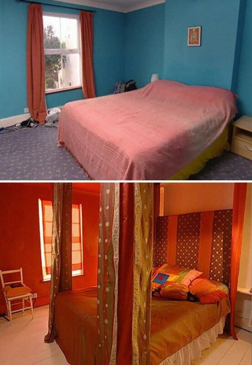
Bedroom "Love nest"
The designer's explanation: "They like to spend a lot of time in the bedroom."
Owner's reaction: "It's red, right?"
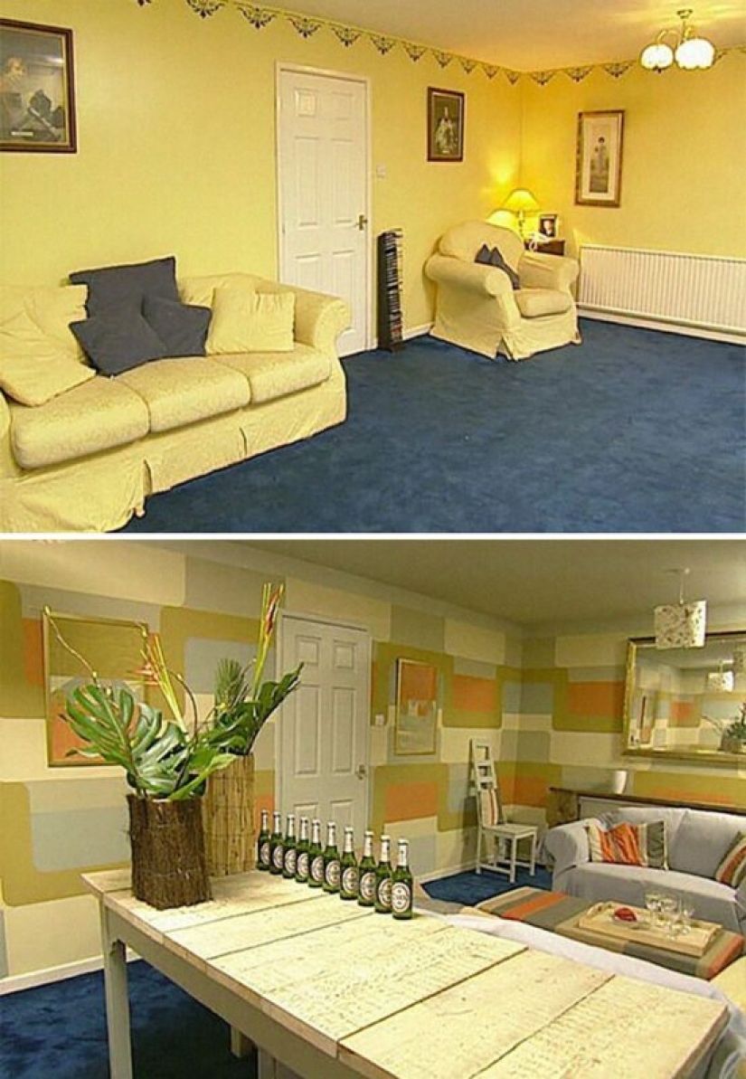
Living room in the style of an art gallery
The designer's explanation: "This is the Tate Modern gallery plus the chic of the 70s."
The owner's reaction: "Barbara, this is gorgeous. Look at the wall."
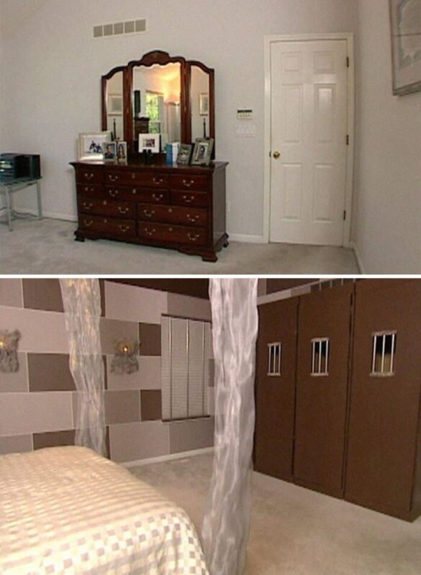
Prisoners of Love - solitary confinement bedroom
The designer's explanation: "I wanted to do something really interesting."
Owner's reaction: "Ha-ha-ha-ha-ha-ha… It's wild."
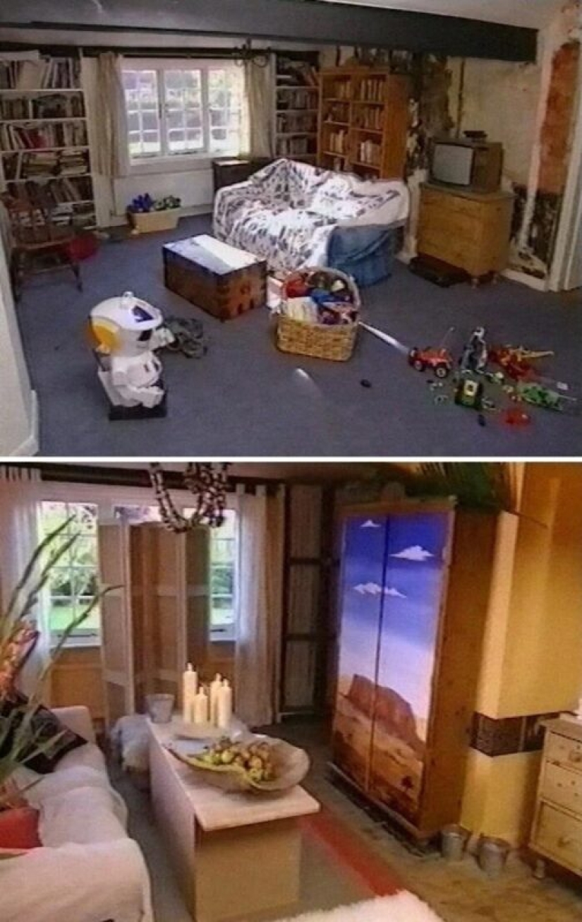
"Tumbleweed"
The room was redone in the style of "westerns" and it seems to have become much smaller. Not the best option.
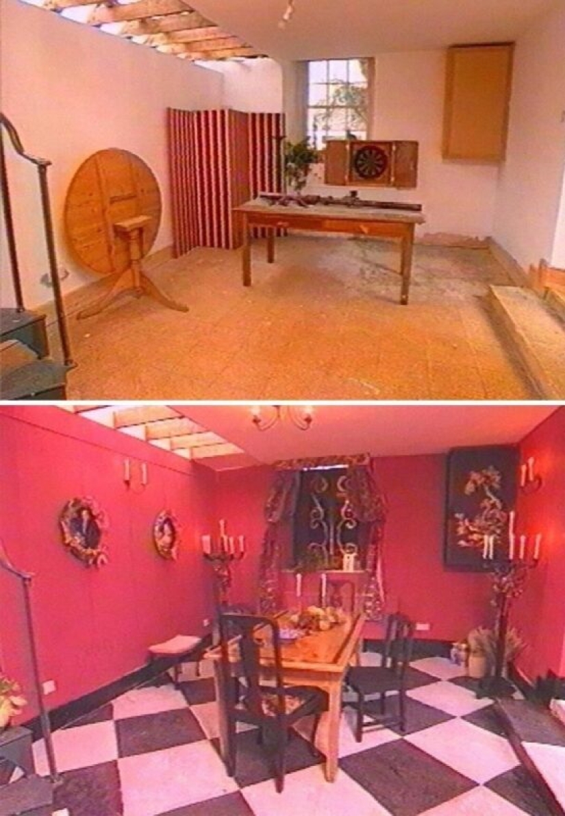
The Red Room
Well, at least the floor can be used as a chessboard. There must be some advantages.
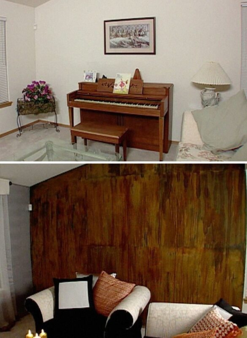
Kimono-style room decorated with real rust
The designer's explanation: "These people needed a change."
Host's reaction: "Look at the wall! Look at the wall!"
Recent articles

It's high time to admit that this whole hipster idea has gone too far. The concept has become so popular that even restaurants have ...

There is a perception that people only use 10% of their brain potential. But the heroes of our review, apparently, found a way to ...

New Year's is a time to surprise and delight loved ones not only with gifts but also with a unique presentation of the holiday ...