10 famous logos, which contain hidden meaning
Categories: World
By Pictolic https://pictolic.com/article/10-famous-logos-which-contain-hidden-meaning.htmlLogo is the face of the company. It's more than just a symbol. Because a good logo associated with the brand, its products and services. In addition, often in the symbolism of the company based on its history, and often a hidden meaning. It is about these logos will be discussed in our review.

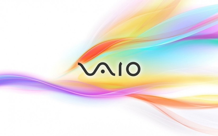
1. Vaio
The company Vaio was originally a subsidiary of Sony, but in 2014 it became the property of the company JIP. Engaged in the production of Vaio computers. The wave in the logo symbolizes the analog signal, and the unit and zero digital signal.
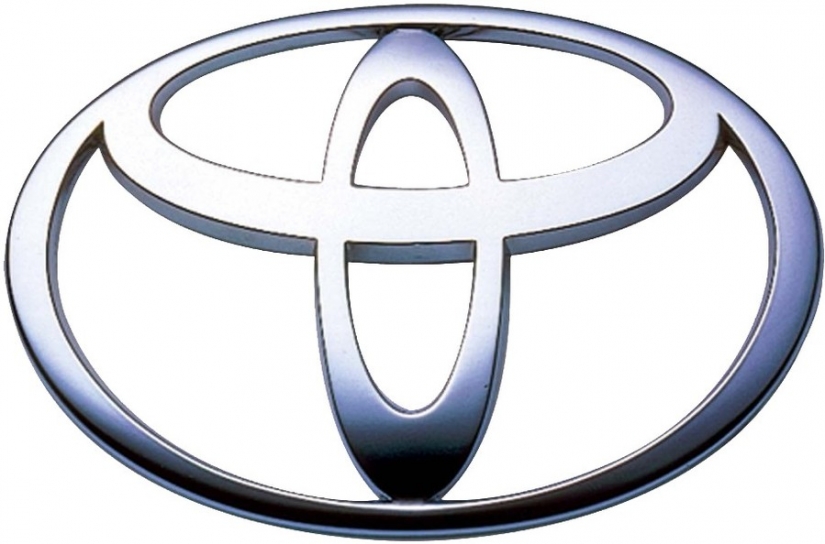
2. Toyota
The logo of Japanese carmaker Toyota is nothing like the eye of a needle threaded it with a thread. The unusual logo is a reference to the past of the company when she engaged in the manufacture of sewing machines. While the individual elements of Toyota's symbol consists of the letters of the word — the name of the company.
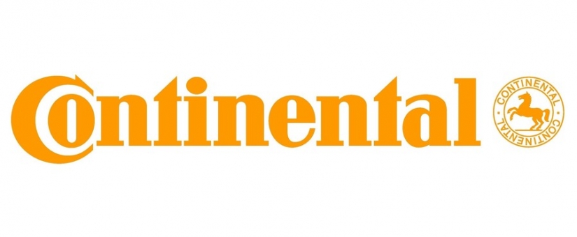
3. Continental
The logo of the company Continental is a trick with the letters "s" and "O" are in the title in the future, form the image of an automobile tire. Recall that it was their production company does.
4. Pinterest
The logo of the popular Internet service Pinterest, the key feature of which was the opportunity to collect "pin" any image, is distinguished by its capital letters. If you look closely, the "R" here is stylized under the hot button.
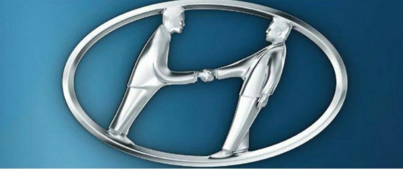
5. Hyundai
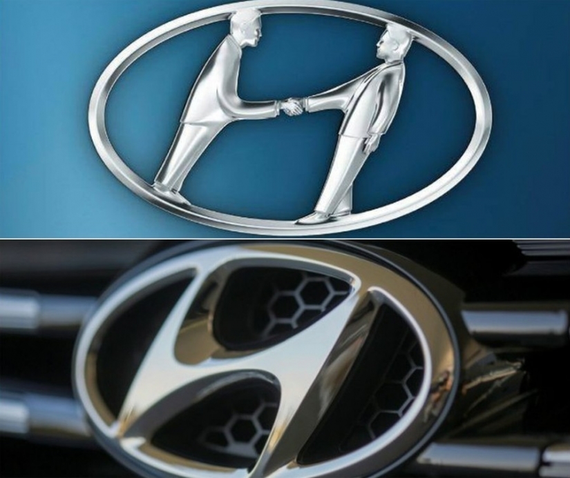
Many people mistakenly believe that Hyundai logo simply means the initial letter of the company name. This is not so. In fact the improvised "N" is the client and the seller, shake hands.
6. Amazon
The secret of the logo of Amazon is quite simple, though not obvious. Mysterious arrow connecting the letter "A" and "z" is not that other, as a symbol of a smile. It indicates friendliness and the friendliness of the employees.

7. LG
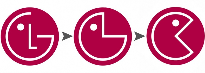
The LG logo is the most obvious — it symbolizes a person's face. The company said that their side is the desire to maintain the human relation to the client. The network was also the symbol of LG is often compared to Pac-Man.
8. Coca-Cola
At first glance the symbol of Coca-Cola there is nothing remarkable. In fact, in the second part of the word between the letters "s" and "l" the hidden flag of Denmark. It is also worth noting that this company is one of the few in the world that in the entire history of its existence has never changed its logo.
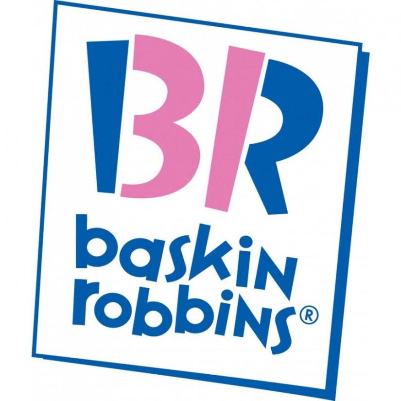
9. Baskin Robbins
Earlier, the slogan of the popular youth café Baskin Robbins (and now cafe) sounded like "31 flavors — each day of the new month". Subsequently, the designers of "built" number 31 in the title, in capital letters "B" and "R".
10. Formula 1
If you look closely, the signature brand logo Formula 1 between the letter F and the image of the flag hiding the white one. Here, however, and the secret of the company.
Keywords: Brand | Company | Logo | Symbol | Meaning
Post News ArticleRecent articles

It's high time to admit that this whole hipster idea has gone too far. The concept has become so popular that even restaurants have ...

There is a perception that people only use 10% of their brain potential. But the heroes of our review, apparently, found a way to ...
Related articles

Our beautiful and diverse world will surprise even the most inveterate skeptic! We publish a selection of irrefutable photoproofs ...

Bottled water is in great demand all over the world. Its sales are growing by an average of 10% per year and by the next 2020, the ...

Time not only changes the appearance and habits of the people, but also force us to drastically change some things. To them ...

New Year's is a time to surprise and delight loved ones not only with gifts but also with a unique presentation of the holiday ...