What should Lolita look like? The 15 best covers of Roman Nabokov
On August 18, 1958, Vladimir Nabokov's novel Lolita was published in the United States, which brought the writer great fame.
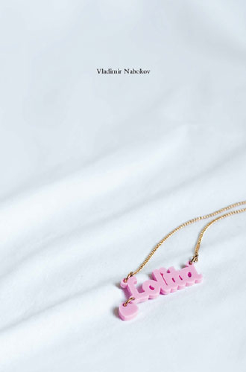
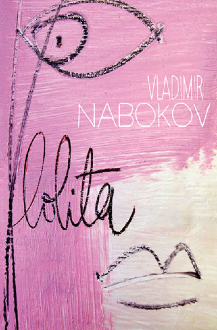
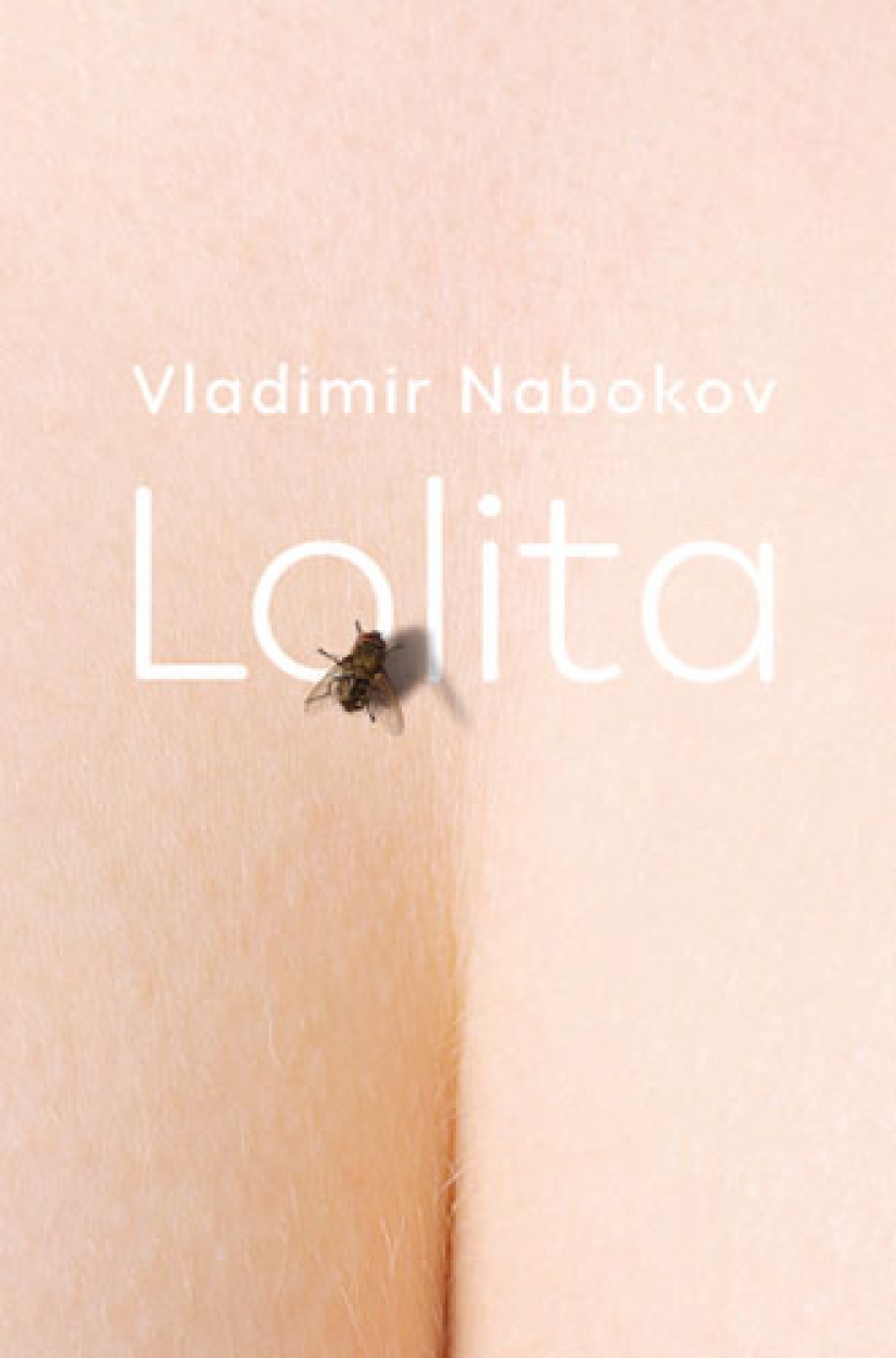
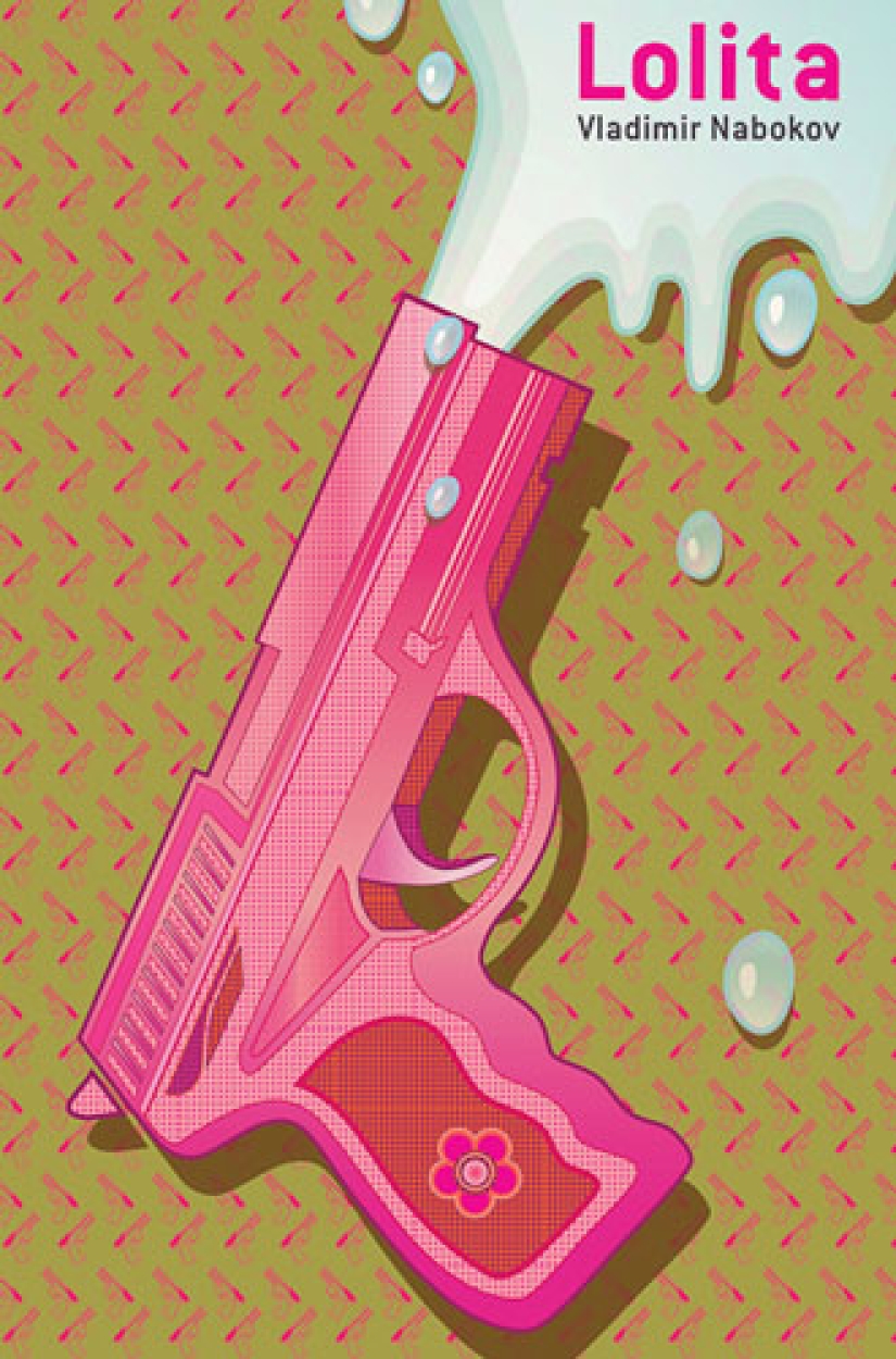
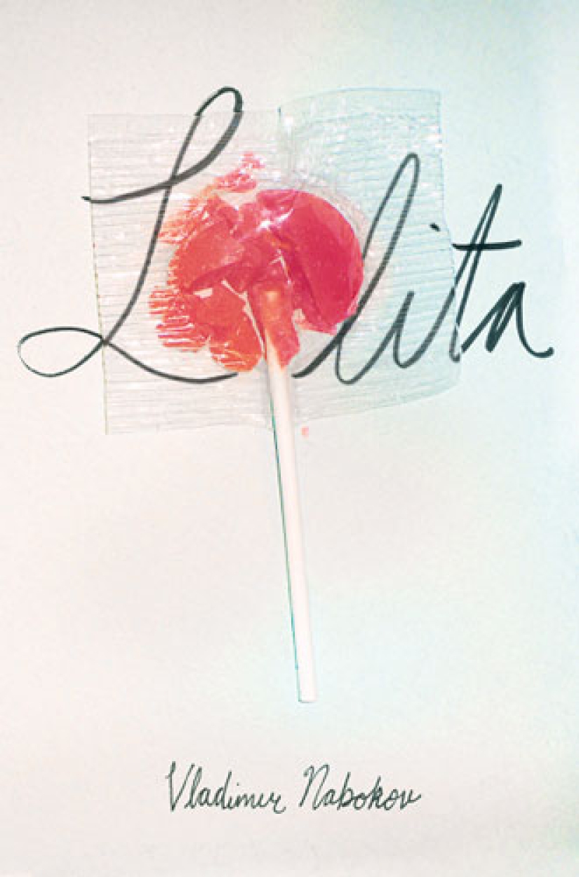
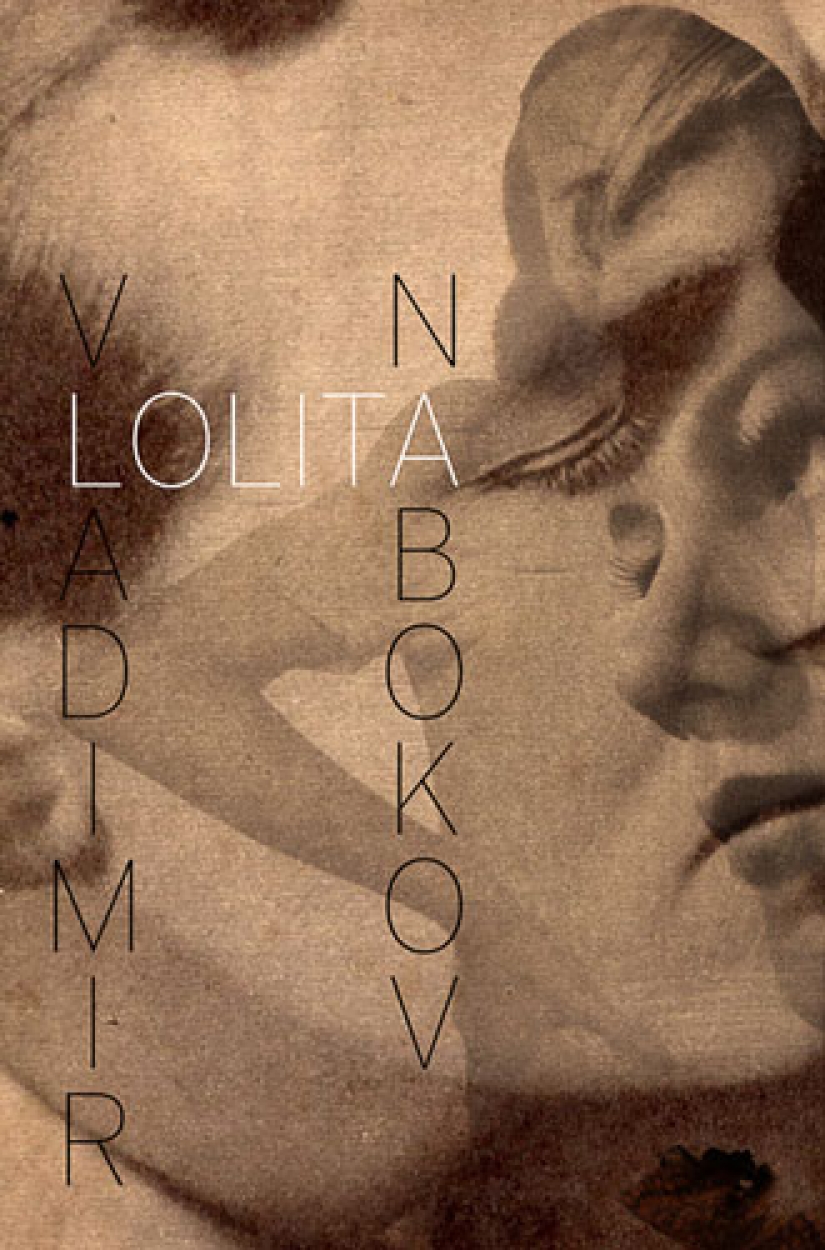
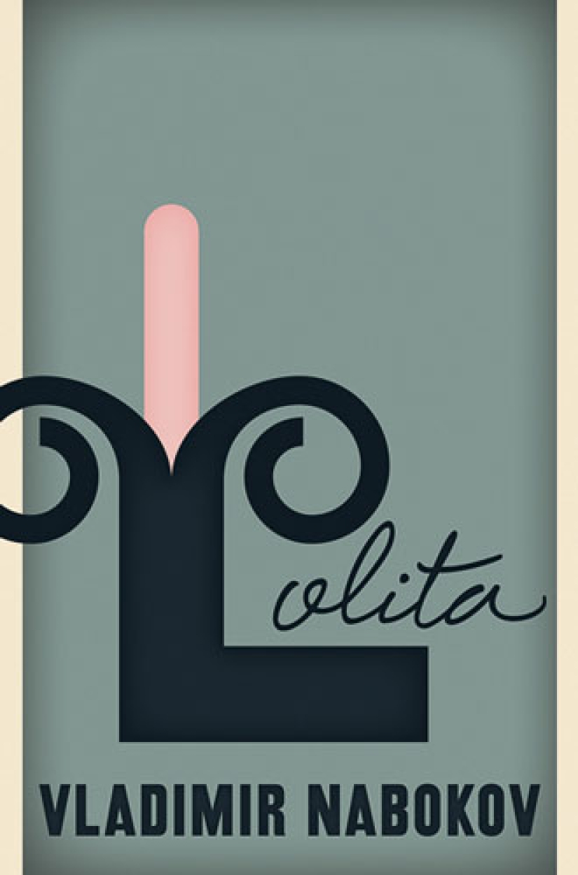
What should Lolita look like? This question has been bothering book cover designers since 1955, when Lolita was first published in a simple green cover. The heroine of Vladimir Nabokov's classic novel was often portrayed as a young seductress in heart-shaped glasses — a false image that misinterprets the book, but is deeply rooted in all spheres of cultural life, from fashion to the film industry.
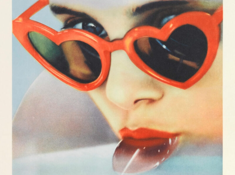
Back in the 1990s, the Nabokovist researcher Yuri Leving began buying up Russian editions of Lolita because of their covers.
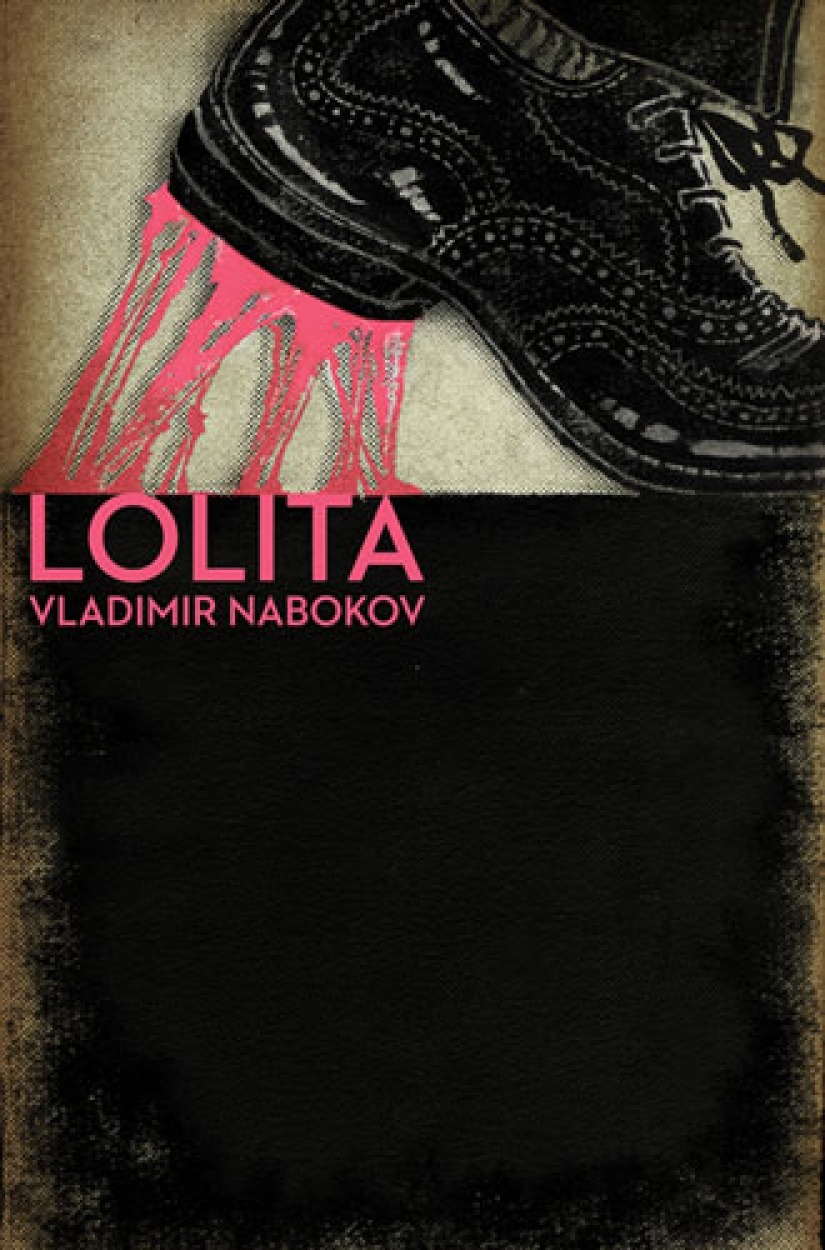
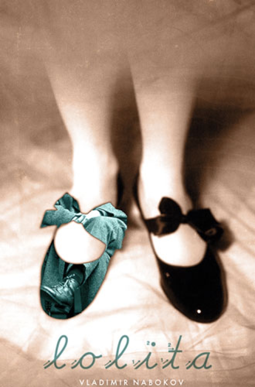
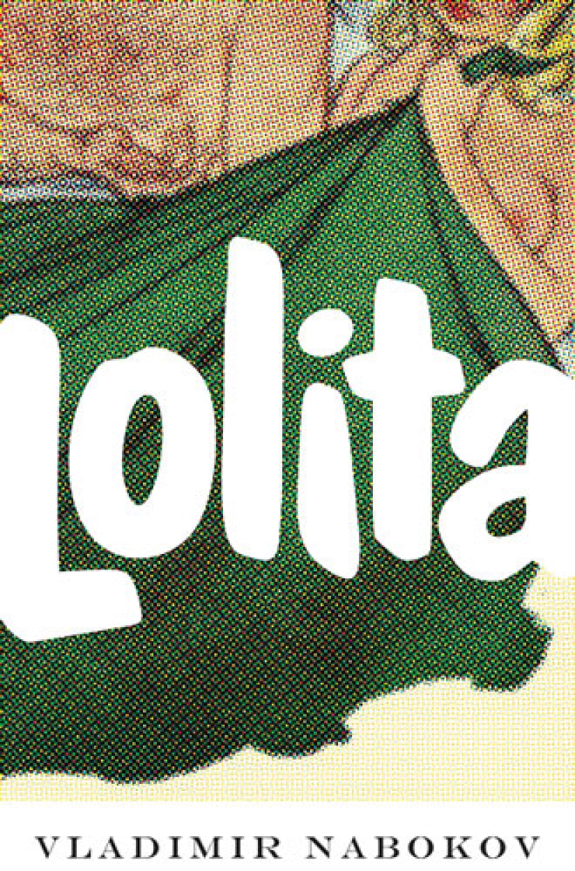
Later, Yuri Leving met the Californian architect John Bertram, who became the co—editor of the album "Lolita - the story of the cover girl". It was he who came up with the idea to invite illustrators and artists to create their drawings for the cult book. As a result, only a third of the 200 sketches were selected.
So "Lolita — The Story of the cover Girl" became not only an art album, but also something like a scientific work that clearly showed the evolution of the graphic design of the book and its history. According to Yuri Leving, the illustrations also reflect the dynamics of public attitudes towards the novel. The researcher notes that Nabokov was categorically against the image of "nymphets" on the covers of the book. Nevertheless, most often it was languid teenage girls who became their heroines.






Recent articles

It's high time to admit that this whole hipster idea has gone too far. The concept has become so popular that even restaurants have ...

There is a perception that people only use 10% of their brain potential. But the heroes of our review, apparently, found a way to ...

New Year's is a time to surprise and delight loved ones not only with gifts but also with a unique presentation of the holiday ...