Stupid design decisions in public places
Categories: Art | Design and Architecture | People | Photo project | Positive | Society | World
By Vika https://pictolic.com/article/stupid-design-decisions-in-public-places.htmlWe often form our opinion of a city by evaluating the quality of its public spaces. If they give us a hard life, chances are we won't be too excited. That is why stupid design decisions in public places are so visible.
And, unfortunately, there are many ways in which urban planners and interior designers mess up our daily lives and force us into horrific, anxiety-provoking situations.
They make us sit on uncomfortable benches, walk-on dirty floors.
To show how ridiculous this can be, we've rounded up some of the worst public space "solutions" ever made - we deserve better.
10 PHOTOS
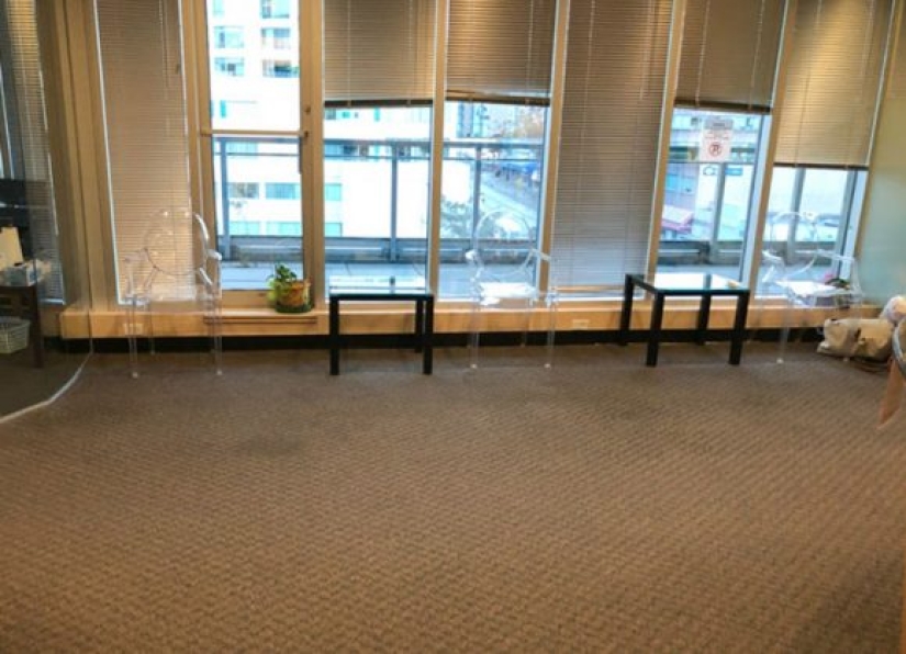
1. Armchairs are waiting for you at the receptions of laser vision correction clinics.
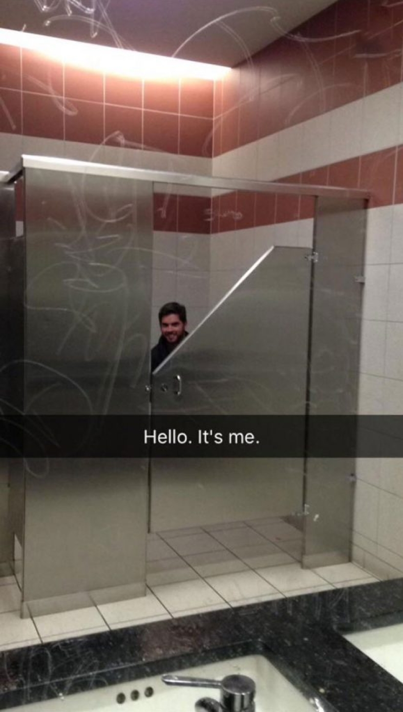
2. No words are needed here.
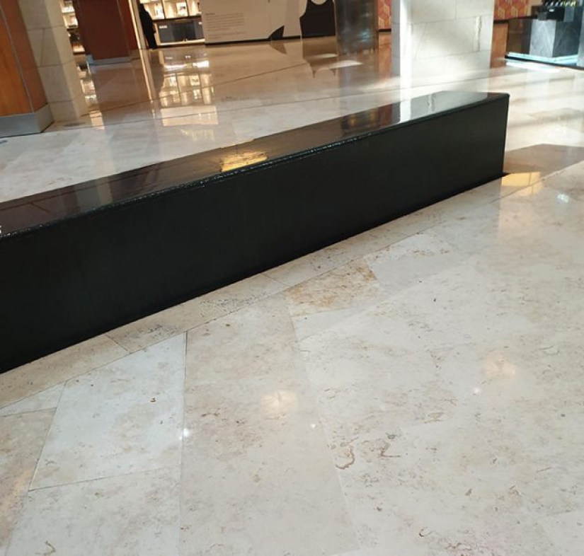
3. This fountain looks like the perfect place to relax.
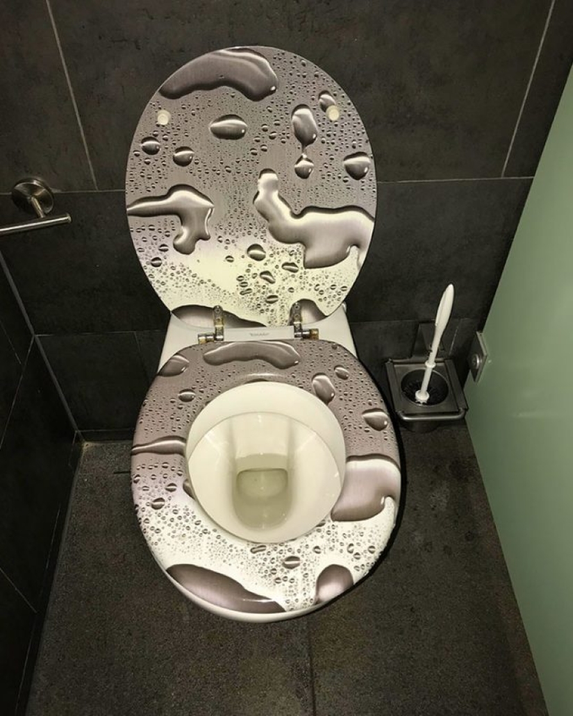
4. As if public toilets weren't bothersome enough.
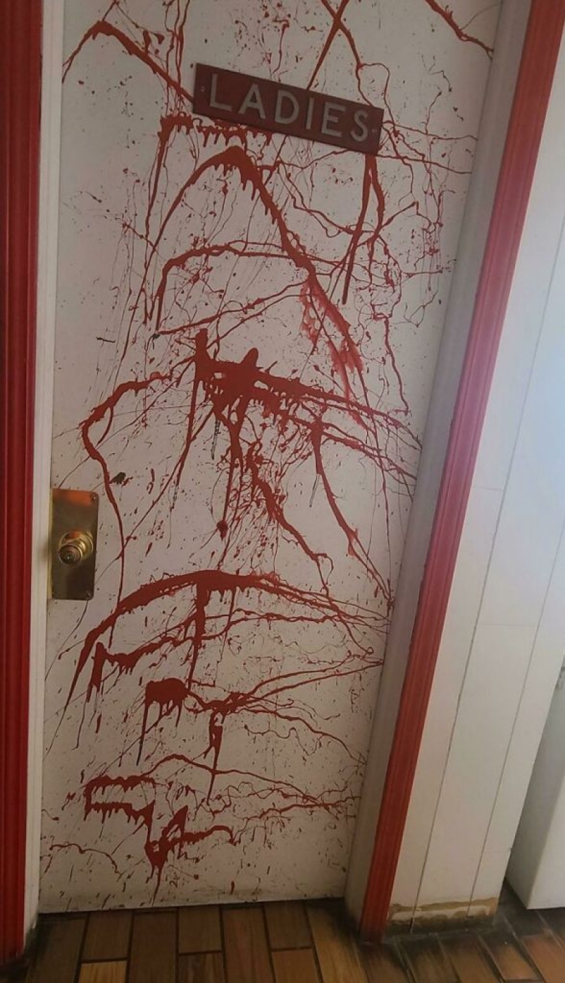
5. Gas station in Nebraska. The station's color scheme was red.

6. The design of the school is the place where all the corridors intersect.
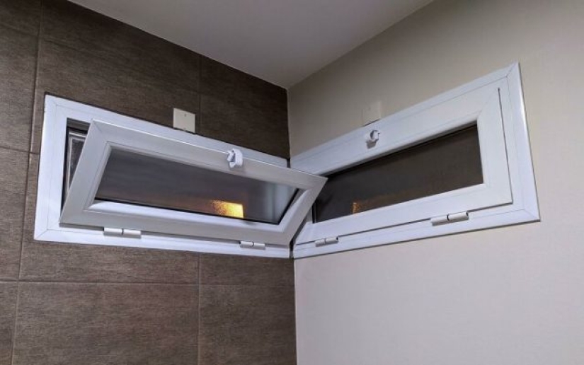
7. Two windows are constantly fighting for the honor of being the one they are about to open.
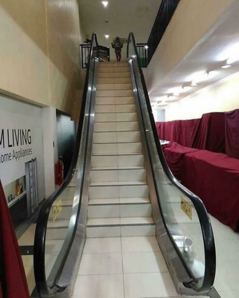
8. Fake escalator.
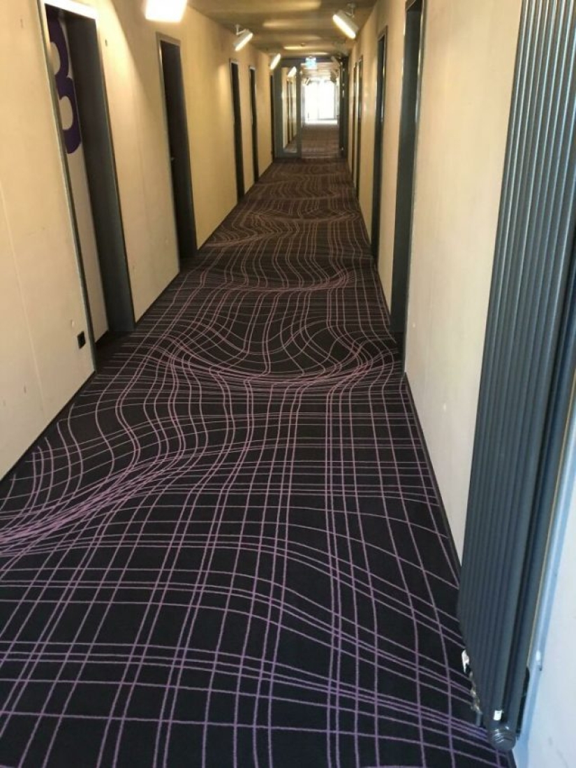
9. Flat carpet in a hotel in Cologne, Germany, imitating a curved surface.
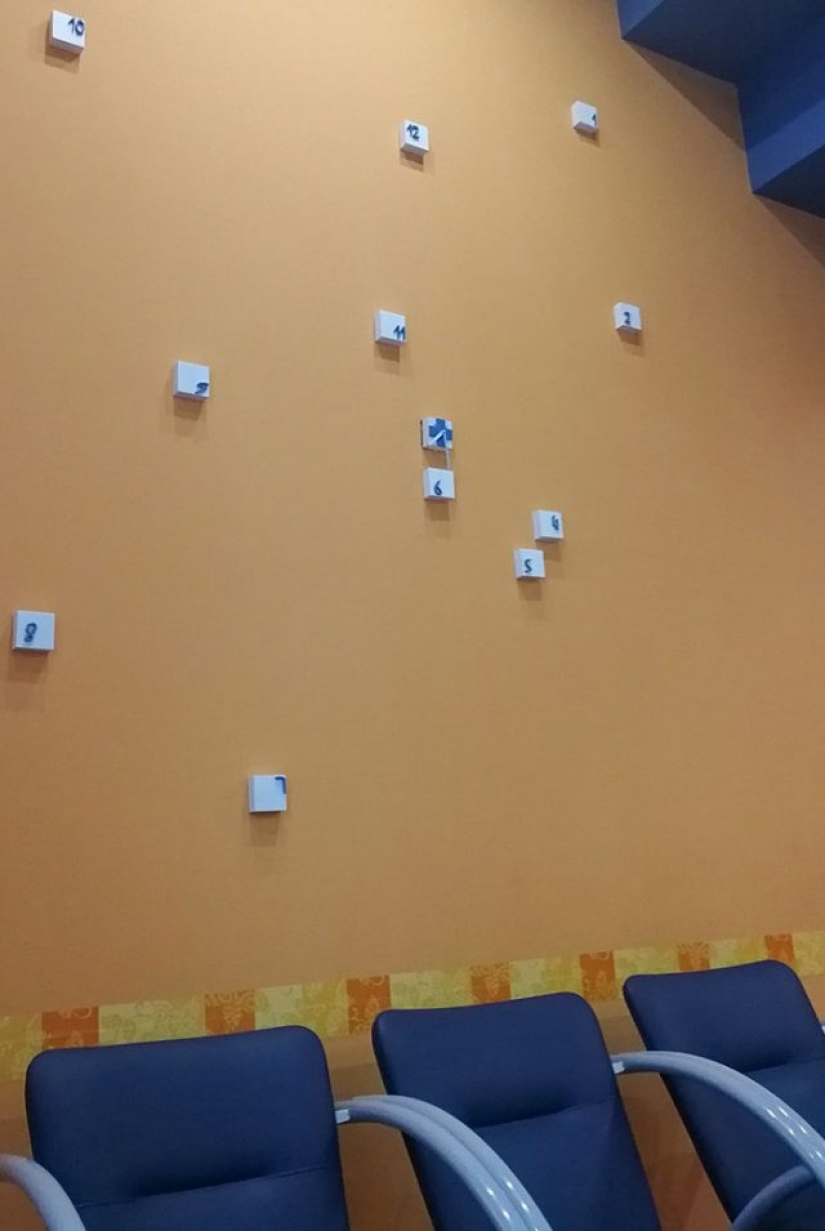
10. Worst watch.
Keywords: Design decisions | Designer | Art | Artists | Positive | Design mistakes | Photo projects | Creativiy
Post News ArticleRecent articles

It's high time to admit that this whole hipster idea has gone too far. The concept has become so popular that even restaurants have ...

There is a perception that people only use 10% of their brain potential. But the heroes of our review, apparently, found a way to ...
Related articles

These artists love cats, but also masterfully draw them, often complementing funny and life signatures. Meet! --> Russian ...

Photography has the magical ability to catch the moment before it disappears. American a self-taught photographer Lauren Shipman ...

Is it possible to laying wood to name a form of art? Turns out you can. Because in the world there are such people, which gently ...

New Year's is a time to surprise and delight loved ones not only with gifts but also with a unique presentation of the holiday ...