22 funny signs whose authors went too far with creativity
Categories: Culture | Design and Architecture
By Pictolic https://pictolic.com/article/22-funny-signs-whose-authors-went-too-far-with-creativity.htmlA good sign is an important factor in a successful business. Therefore, entrepreneurs make a lot of efforts to make the “face” of the institution different from others and at the same time echo the goods or services. But in this case, there is always a risk of overdoing it and creating a local landmark that passers-by will admire and photograph with delight.


Alternatively: "Get out of here."

This amazing "curia" world.

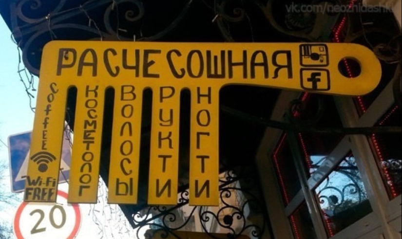
And you can also "Epilyashka" and "Barbershop".

It is important that the fish also eat at the same time.

Ah, the smell of amazing adventures!

If you wrap flowers in a shawarma, you get a good gift.

Our answer to "cheap and cheerful".

Latin letters would be more intriguing.

Wonders of compactness from a provincial designer.

Is this place really good?

Sounds promising and even a little creepy.

Nothing strange, because hogs sleep with beavers.

The perfect place for a first date.

The second part of the title is disturbing. It is better not to take desserts here.

National cuisine?

Nails are on the hands, so everything is in order.

It doesn't seem like a very encouraging sign.

Yeah, and then put some cider in your nose.

Fascinating excursions in thongs and boxers.

Thank you for being knee-deep.

Are you sure about design?

Establishment for an amateur.
But no matter how hard we try, we can't get around the Chinese creatives with their signs.
Recent articles

It's high time to admit that this whole hipster idea has gone too far. The concept has become so popular that even restaurants have ...

There is a perception that people only use 10% of their brain potential. But the heroes of our review, apparently, found a way to ...

New Year's is a time to surprise and delight loved ones not only with gifts but also with a unique presentation of the holiday ...