15 Times People Spotted Stupid Design Decisions In Public Places And Just Had To Share
Categories: Design and Architecture | People | Photo project | Positive | Society | World
By Vika https://pictolic.com/article/15-times-people-spotted-stupid-design-decisions-in-public-places-and-just-had-to-share.htmlGood design is aesthetic and pleasing. But truly great design is deeply empathetic—it always puts the user first. And nothing could be more important than empathetic designs when it comes to public places. They’re meant to be for the public’s benefit after all!
However, the world is full to the brim with examples of poor design. From truly awful restrooms that anyone would think twice about using to unfriendly restaurant seating, disruptive decor, and stairwells that go nowhere. Our team here at Bored Panda has collected some of the worst public place design decisions to prove to you that everyone deserves better. Scroll down for the crème de la crème of bad interiors and upvote the pics you loved to hate.
15 PHOTOS
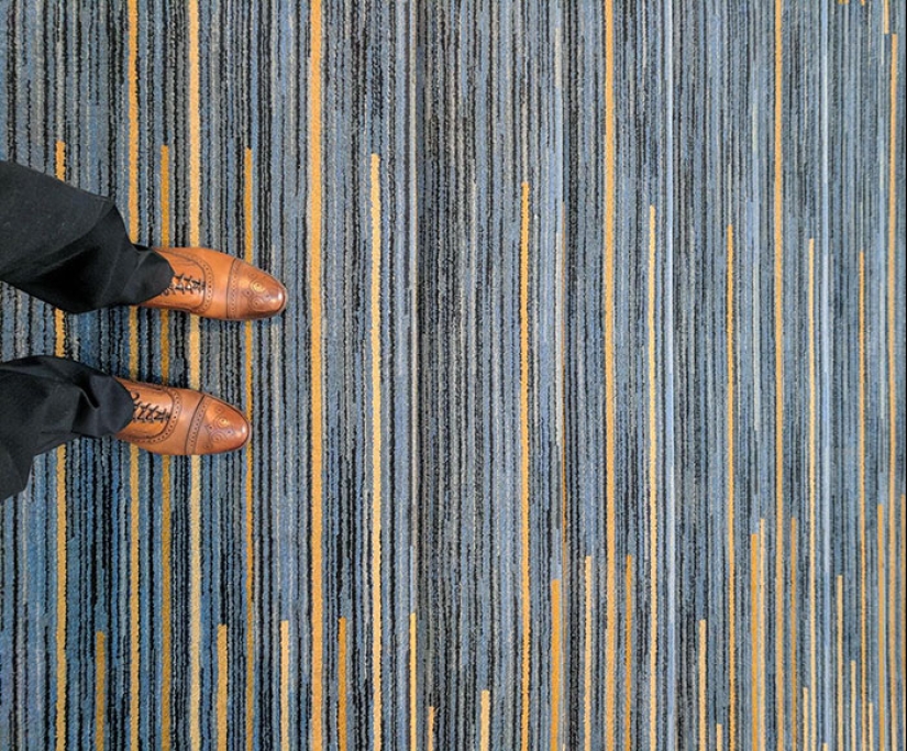
#1 Not A Good Carpet Choice For Stairs If You Ask Me
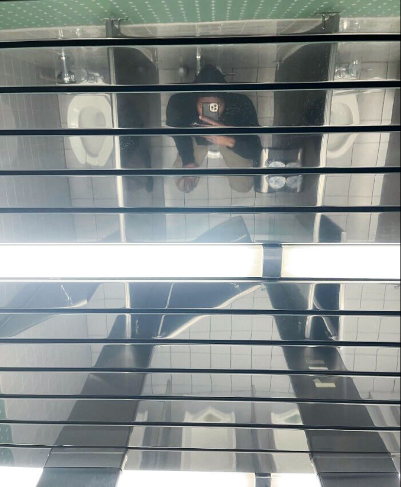
#2 This Mirrored Ceiling In Our Bathroom At Work
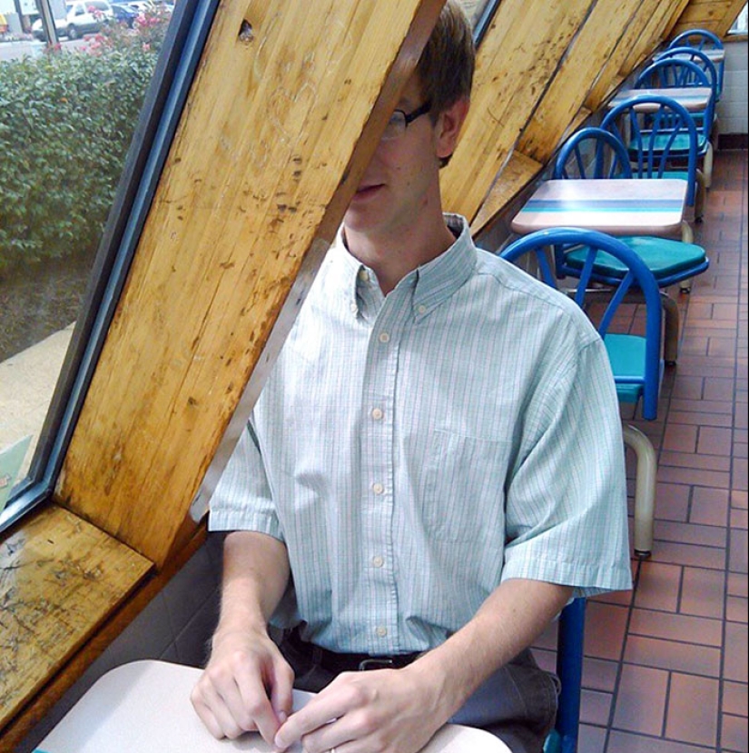
#3 Waiting To Engage In A Dining Experience At My Favorite Taco Establishment
Dr. Steve Soifer, program manager for the American Restroom Association, was kind enough to share his thoughts on public bathroom design with us.
According to Soifer, privacy is the key factor when it comes to restroom use. "People want privacy, in general, for their business," he stressed the fact. And so, this is the factor to keep front-of-mind in terms of design.
Unfortunately, privacy is often a forgotten concern. "In the U.S., so many public bathrooms aren't designed for that—if you can find one!" the ARA program manager noted that there's a noticeable lack of public restrooms. Especially quality ones.
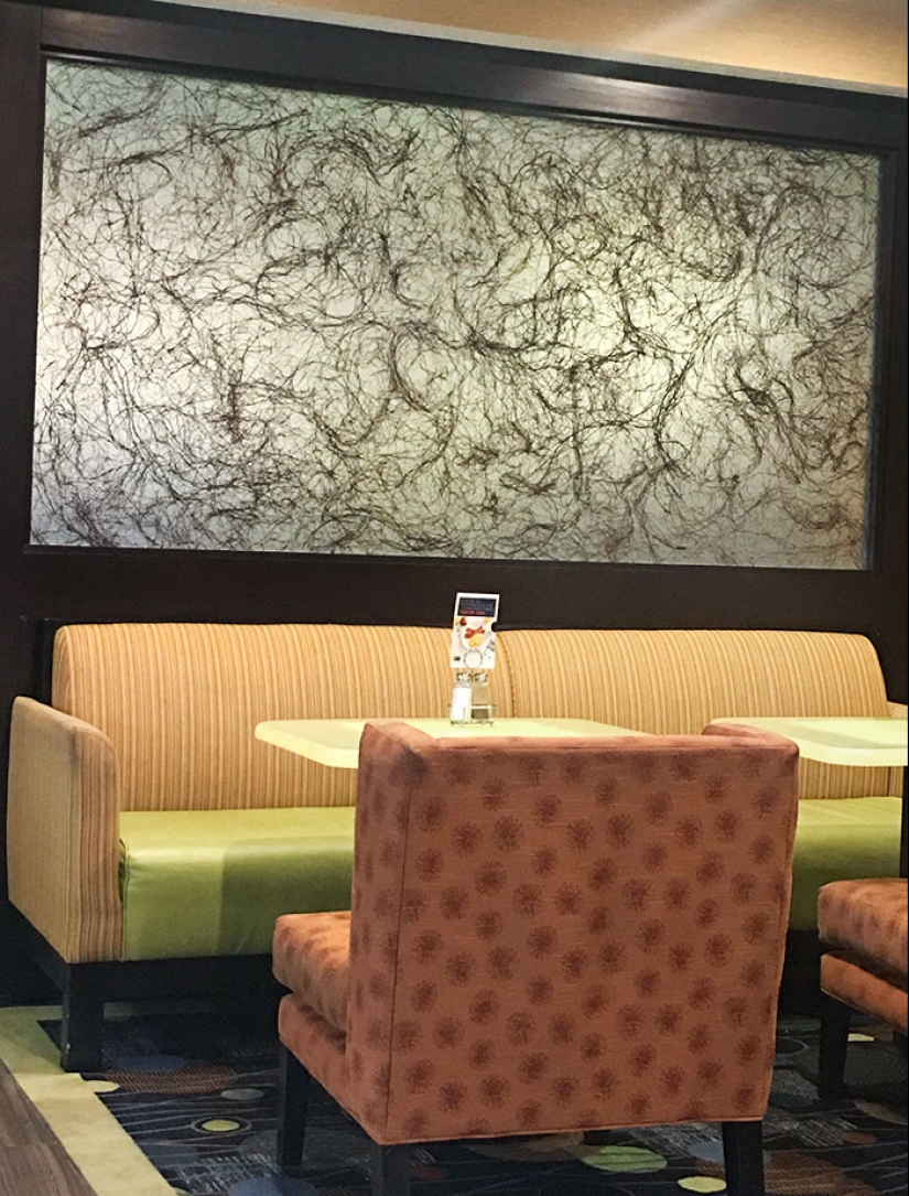
#4 This Picture In The Hotel Lobby Looks Like Pubes
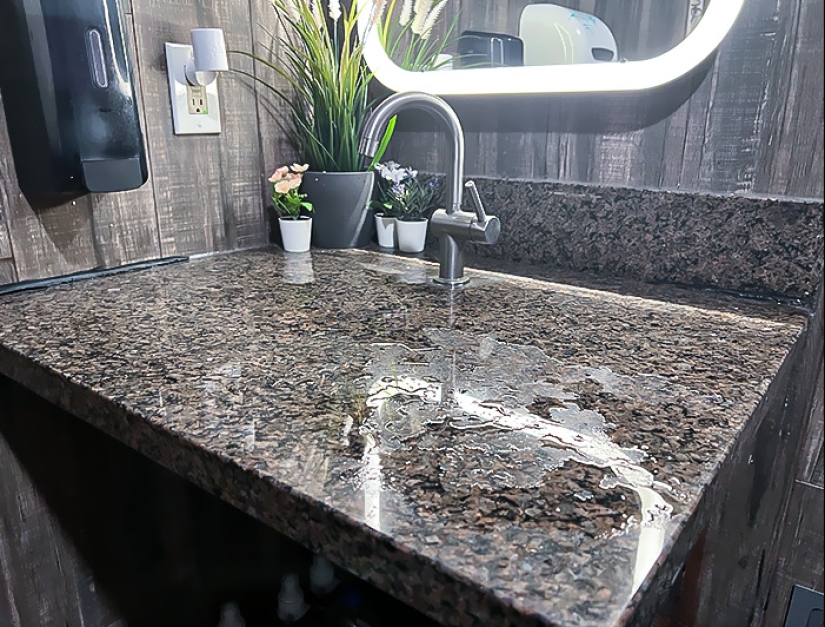
#5 It's Not Even Angled Or Anything To Guide The Drainage. It Just Dribbles Onto The Floor
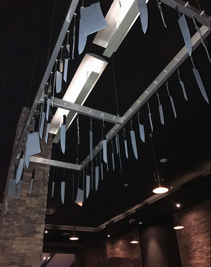
#6 Best Item To Hang Above Your Head At Dinner? Ah Yes, A Chandelier Of Knives
We were interested to learn about the main factors that would drive someone away from using a public restroom. "Well, of course, a shy bladder, or medical concerns like emptying a colonoscopy bag," Dr. Soifer told Bored Panda.
It's situations like these that make privacy so paramount in the first place. A poorly-designed bathroom that makes someone feel like they're being watched by others won't instill much confidence.
According to Dr. Soifer, the main issue for the American Restroom Association is SOAG—single occupancy, all-gender toilets. These offer more privacy, and people tend to prefer them, especially if they have thicker doors and partitions that extend further down to the floor.
Meanwhile, larger SOAGs can help accommodate individuals with disabilities. And, of course, if these facilities are cleaned well and regularly, they'll only be more appealing to the public.
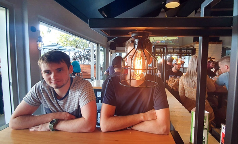
#7 The Lighting At This Bar
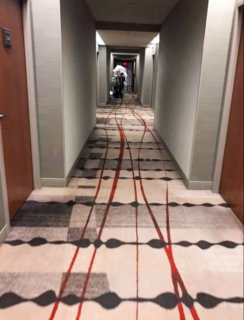
#8 It Looks Like The Hotel Cart Ran Someone Over And Is Dragging Their Blood Through The Halls
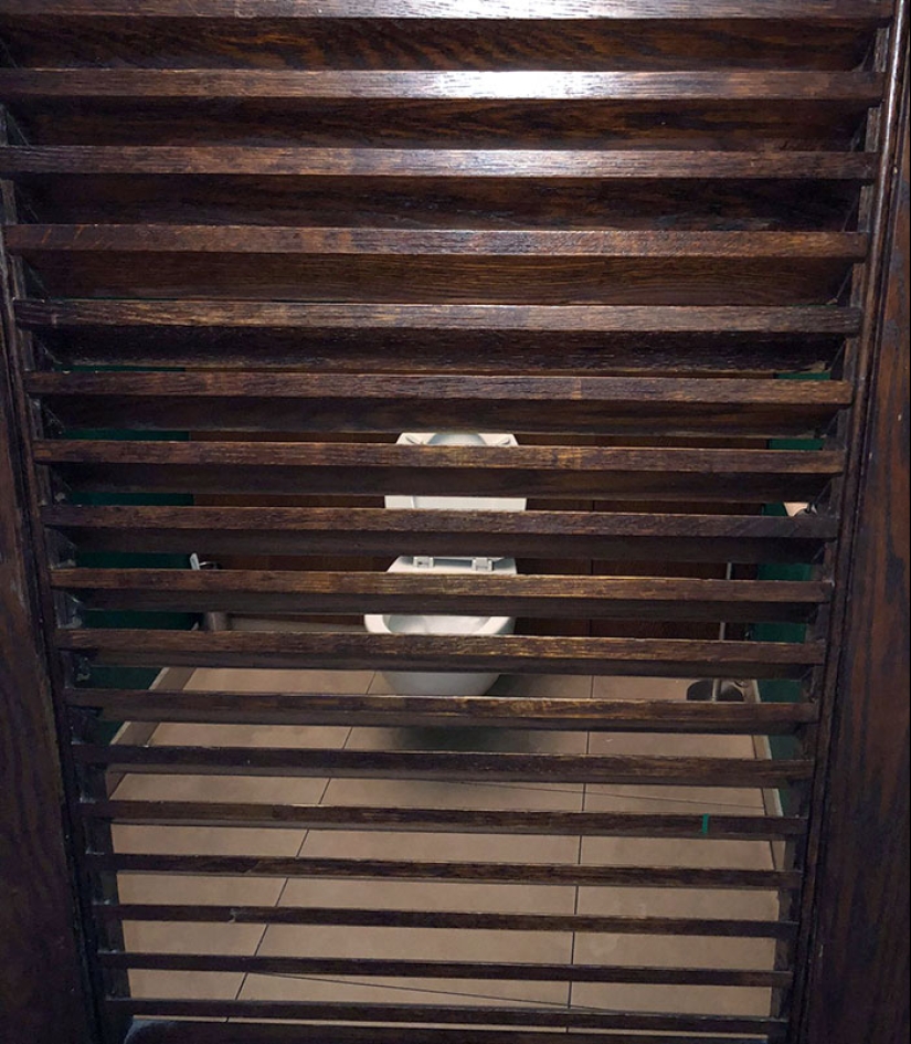
#9 Toilet Door In A Pub, London
Arch Daily notes that the best public places will be easily accessible, create a good first impression, and will make people feel comfortable.
It’s one thing to have a poorly designed interior at home—if you love it, you love it, no matter what your guests might think. It’s another thing entirely when those same bad design decisions make their way out into the public sphere.
In public, you have to be far more acutely aware of common denominators and what most people would agree that comfortable design looks like. You can’t go about designing everything based on deeply subjective factors: you have the so-called common good to look out for.
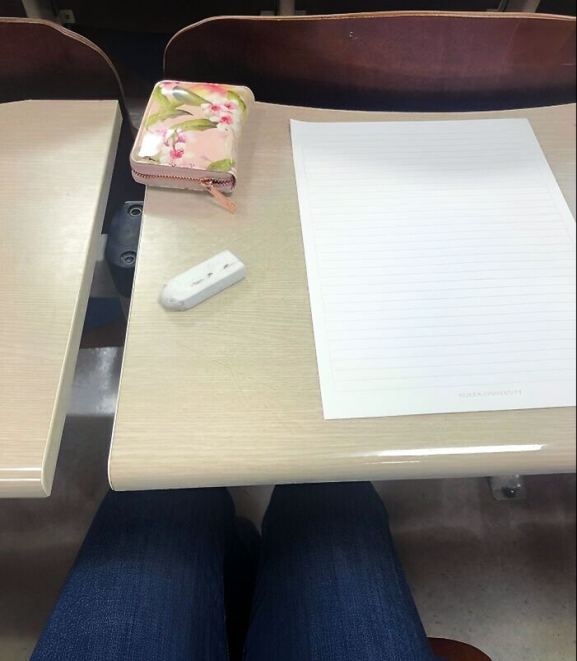
#10 The Seats Don't Match With The Desks In The Lecture Hall I Take My Exams In. This Is The One Of The Engineering Buildings
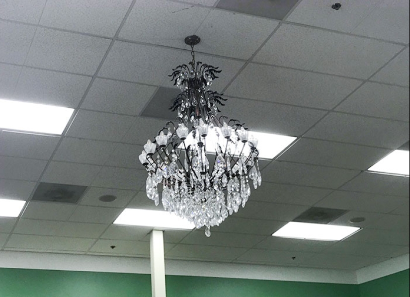
#11 A Chandelier Would Really Tie All This Florescent Lighting And Ceiling Tiles Together
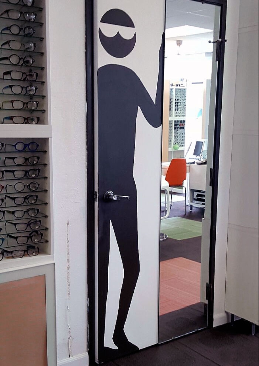
#12 This Door Handle
You can’t, for instance, design public places as though you yourself were the only person using them. You have to keep in mind that people come in all shapes and sizes. So you have to be equally aware of how certain decisions, decorations, and interior quirks will affect someone who’s taller or shorter, bigger or smaller than you.
Not only that, you have to ensure that these spaces are accessible to everyone. If everything’s extremely cramped, someone who’s using a wheelchair may have difficulty navigating the area. The more accessible these spaces are to people regardless of their physical abilities, the more universal they truly are.
Moreover, public places should also be designed with comfort and safety in mind. You want people to be able to relax, instead of constantly being on edge. That might mean investing in good lighting and security, as well as ergonomic furniture design. Not only that, you could also focus on environment-friendly, sustainable materials that are both pleasant to look at and touch.
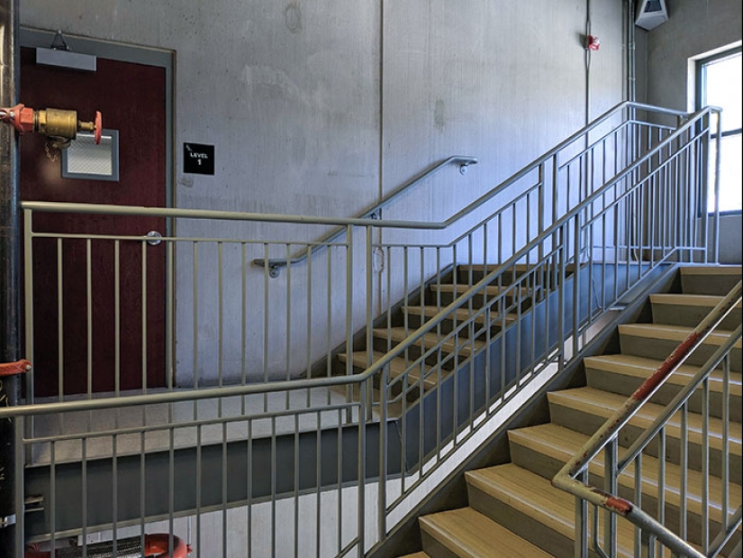
#13 You Have To Go Up The Stairs, And Then Down The Stairs To Get To The Door
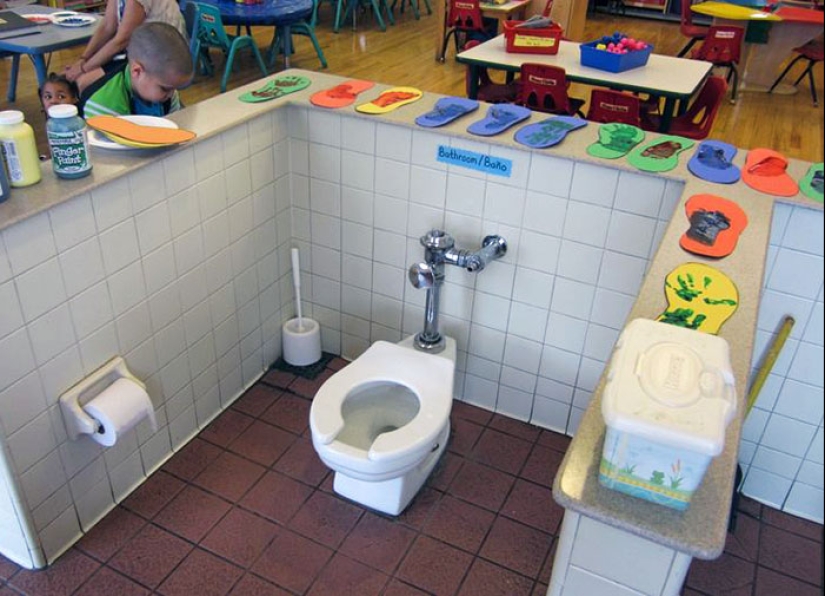
#14 All Toilets Must Be Centered In The Middle Of The Classroom So Kids Eating Their Snacks Three Feet Away Can Bare Witness To Their Classmates Defecating
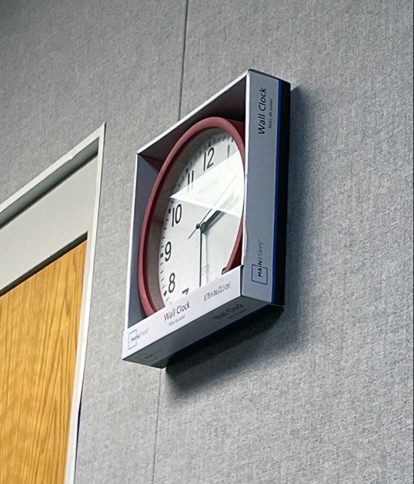
#15 The Clock In My School's Band Practice Room
Keywords: Good design | Stupid designs | Public places | Aesthetic design | Design fails | People
Post News ArticleRecent articles

It's high time to admit that this whole hipster idea has gone too far. The concept has become so popular that even restaurants have ...

There is a perception that people only use 10% of their brain potential. But the heroes of our review, apparently, found a way to ...
Related articles

The secret of a great public space lies in its design. For people to visit and make use of these places many times over, they have ...

Let’s face it – everybody desires a stylish profile picture for their social media accounts. However, achieving picture ...

Good design is aesthetic and pleasing. But truly great design is deeply empathetic—it always puts the user first. And nothing ...

New Year's is a time to surprise and delight loved ones not only with gifts but also with a unique presentation of the holiday ...