12 Times People Spotted Stupid Design Decisions In Public Places And Just Had To Share (Part2)
Categories: Art | Design and Architecture | Entertainment | People | Photo project
By Vika https://pictolic.com/article/12-times-people-spotted-stupid-design-decisions-in-public-places-and-just-had-to-share-part2.htmlGood design is aesthetic and pleasing. But truly great design is deeply empathetic—it always puts the user first. And nothing could be more important than empathetic designs when it comes to public places. They’re meant to be for the public’s benefit after all!
However, the world is full to the brim with examples of poor design. From truly awful restrooms that anyone would think twice about using to unfriendly restaurant seating, disruptive decor, and stairwells that go nowhere. Our team here at Bored Panda has collected some of the worst public place design decisions to prove to you that everyone deserves better. Scroll down for the crème de la crème of bad interiors and upvote the pics you loved to hate.
12 PHOTOS
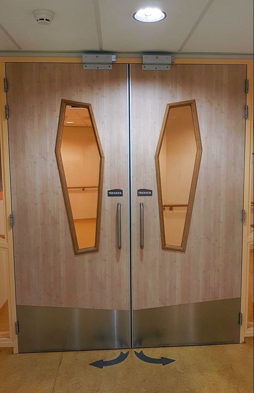
#1 These Coffin-Shaped Door Windows In This Hospital
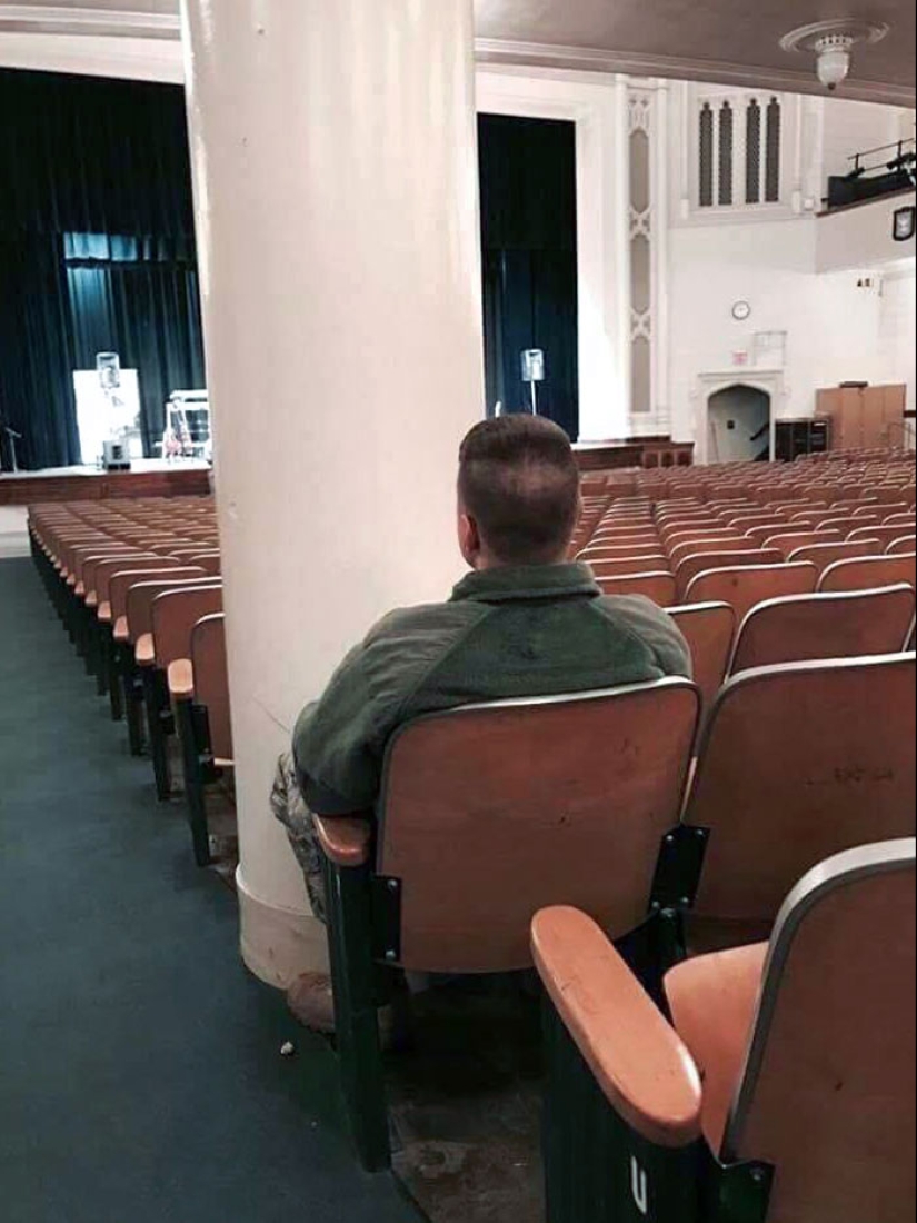
#2 This Pillar
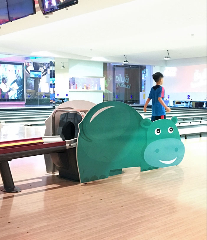
#3 Bowling Alley Located In Bangkok. Cracks Me Up When The Ball Rolls Out From That
Well-designed interiors aren’t just about aesthetics, after all, even though creating a pleasant first impression is important. There has to be a balance between beauty and functionality. If your public library looks Instagram-worthy, for instance, then congratulations. However, if there isn’t enough space for folks to actually sit down and read, the library fails in its duty to the public.
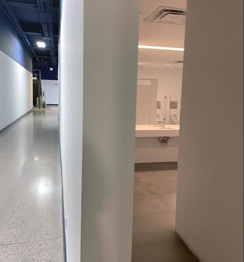
#4 The Positioning Of The Mirror And Urinals In Our Office Building. This Is The Main Hallway
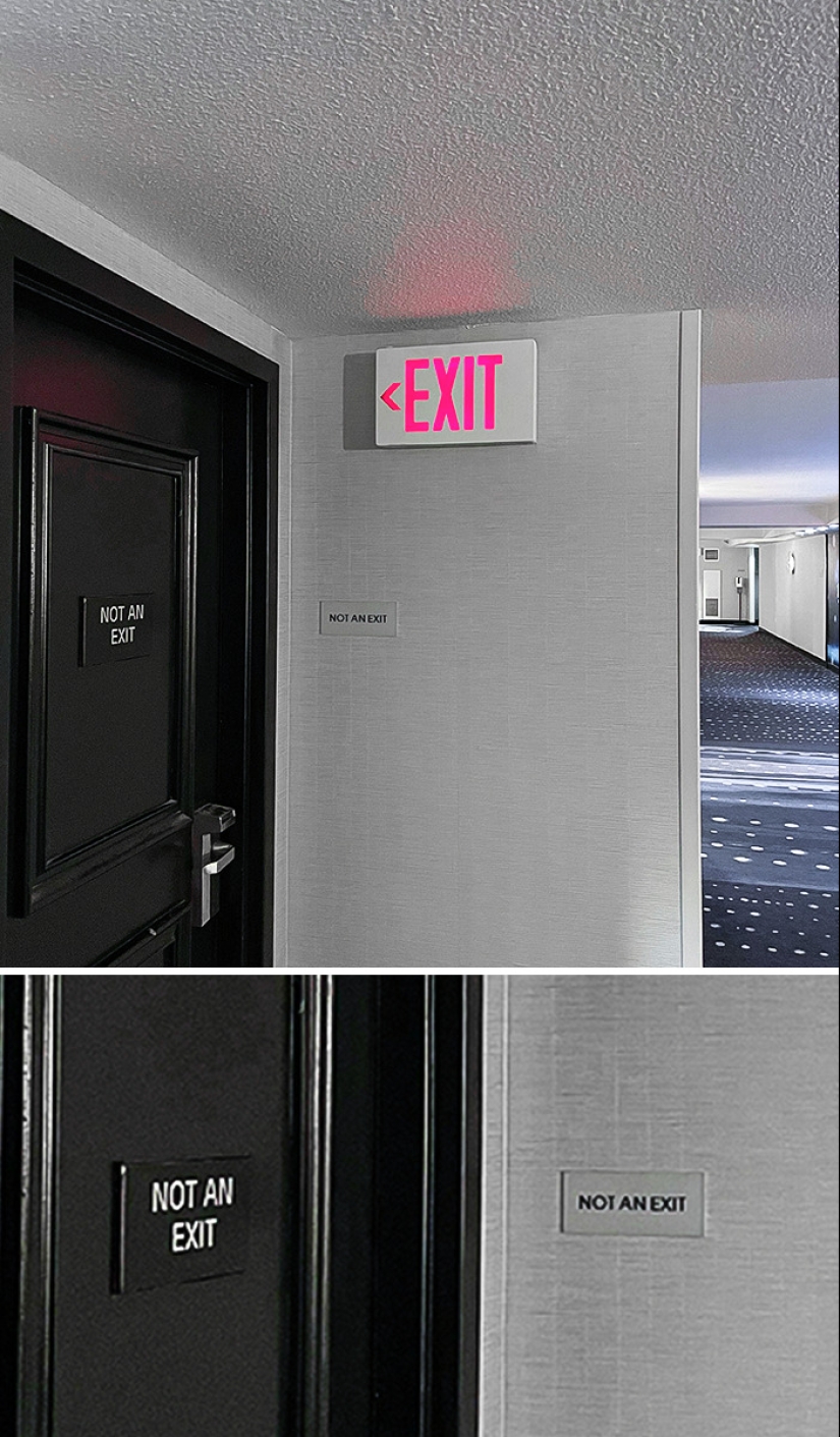
#5 When Life Tries To Give Me A Sign
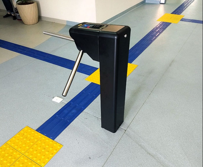
#6 This Ticket Gate At My School
Previously, Bored Panda spoke about good design with an urban planning expert from Sweden. “Most of the time, the elements of the built environment should be in harmony amidst each other and with the surroundings. However, sometimes, something bolder and out-of-the-box might form an engaging contrast,” she shared that built environments have to engage the public and stimulate people’s minds and senses.
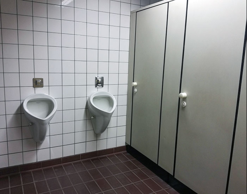
#7 Imagine Walking Out Of That Cabin, And There's A Guy Doing His Business Right In Front Of You, Blocking Your Way. So You Have To Wait There Until He Is Done, And You Can Pass
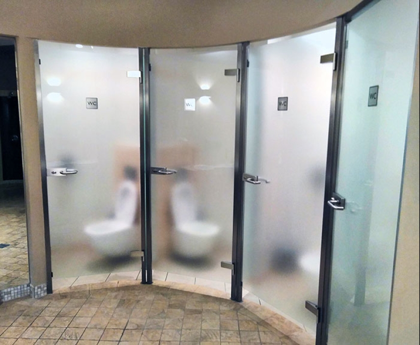
#8 Semi-Transparent Bathroom Stall Doors
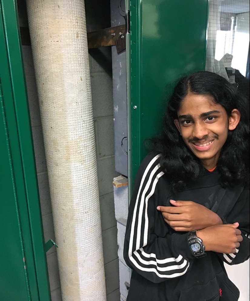
#9 My Friend's New Locker Has A Huge Pipe Running Through It
“There are circumstances where the architecture should create a sense of calmness and safety, yet there are instances in which it is not bad if the architecture provokes us and makes us think, ‘Why don't I like the look of this building?’” the urban planning expert noted that when it comes to private property, there’s far more flexibility for creativity.
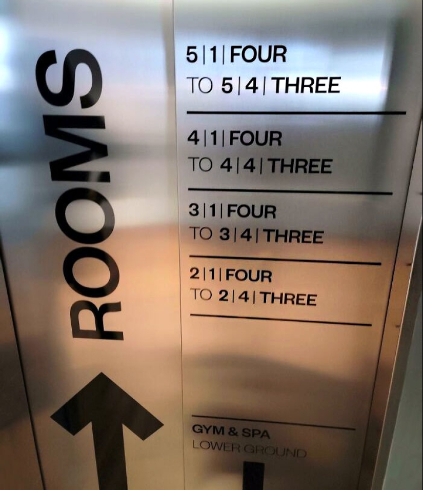
#10 Hotel In Iceland. It's Supposed To Tell You Which Rooms Are On Which Floor
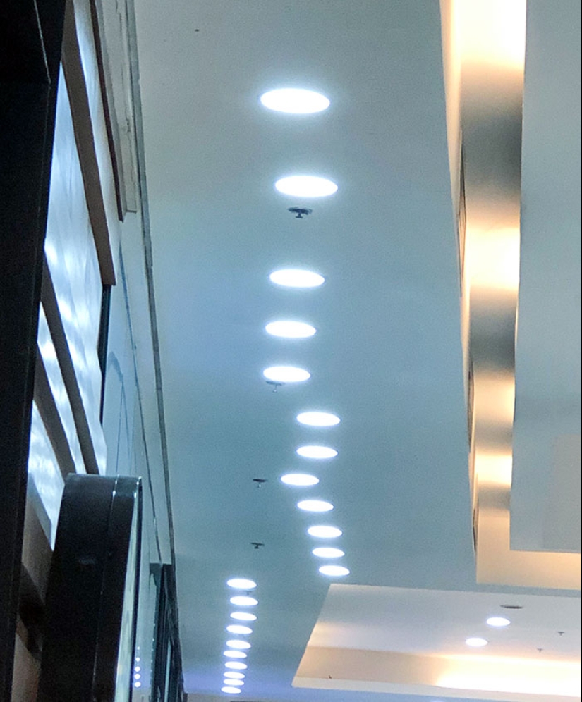
#11 These Lights At The Mall
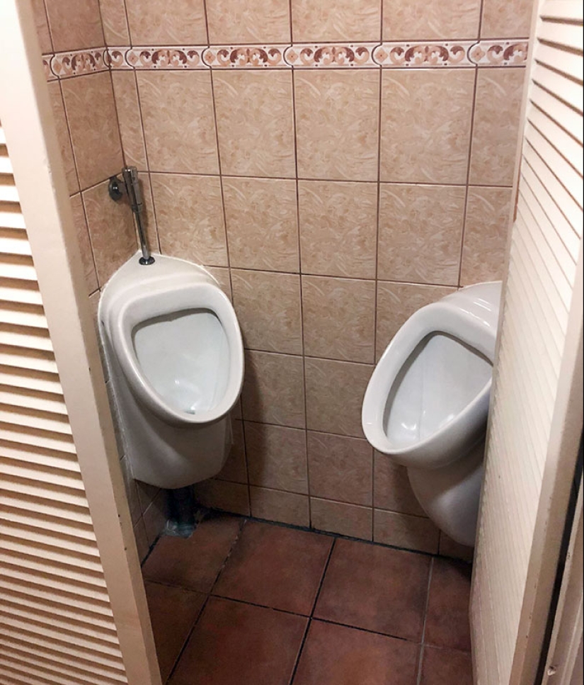
#12 This Disastrous Thing In A German Restaurant
“Quirky architecture comes from our innate desire to demonstrate our uniqueness. However, not everyone who has the means has an average taste for aesthetics. Yet, as long as it is for the people who inhabit or use their private space, I mean why not?”
Keywords: Good design | Stupid designs | Public places | Aesthetic design | Design fails | People
Post News ArticleRecent articles

It's high time to admit that this whole hipster idea has gone too far. The concept has become so popular that even restaurants have ...

There is a perception that people only use 10% of their brain potential. But the heroes of our review, apparently, found a way to ...
Related articles

The secret of a great public space lies in its design. For people to visit and make use of these places many times over, they have ...

Let’s face it – everybody desires a stylish profile picture for their social media accounts. However, achieving picture ...

Good design is aesthetic and pleasing. But truly great design is deeply empathetic—it always puts the user first. And nothing ...

New Year's is a time to surprise and delight loved ones not only with gifts but also with a unique presentation of the holiday ...