12 unsuccessful examples of using Photoshop in the world of fashion and film
Categories: Art | Beauty | Design and Architecture | Entertainment | Fashion | People | Society | Technology | World
By Vika https://pictolic.com/article/12-unsuccessful-examples-of-using-photoshop-in-the-world-of-fashion-and-film.htmlWe live in the age of computers and high technologies. And of course, any person today can master the basic skills of using Photoshop and edit their photos, making themselves more slim, graceful, without wrinkles and acne.
Stars in glossy magazines in real life are also not perfect and resort to the services of retouchers. But the retouchers themselves sometimes are not familiar with elementary anatomy, as a result of which these photoshop-fails are obtained.
12 PHOTOS
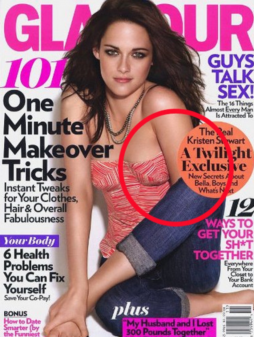
1. At first glance, there is nothing unusual about this photo. But if you look closely, the viewer realizes that Kirsten Stewart's left hand has magically evaporated.

2. The cover of the American comedy series Don't Trust With - from Apartment 23. Actress Kristen Ritter's arm is twisted unnaturally.
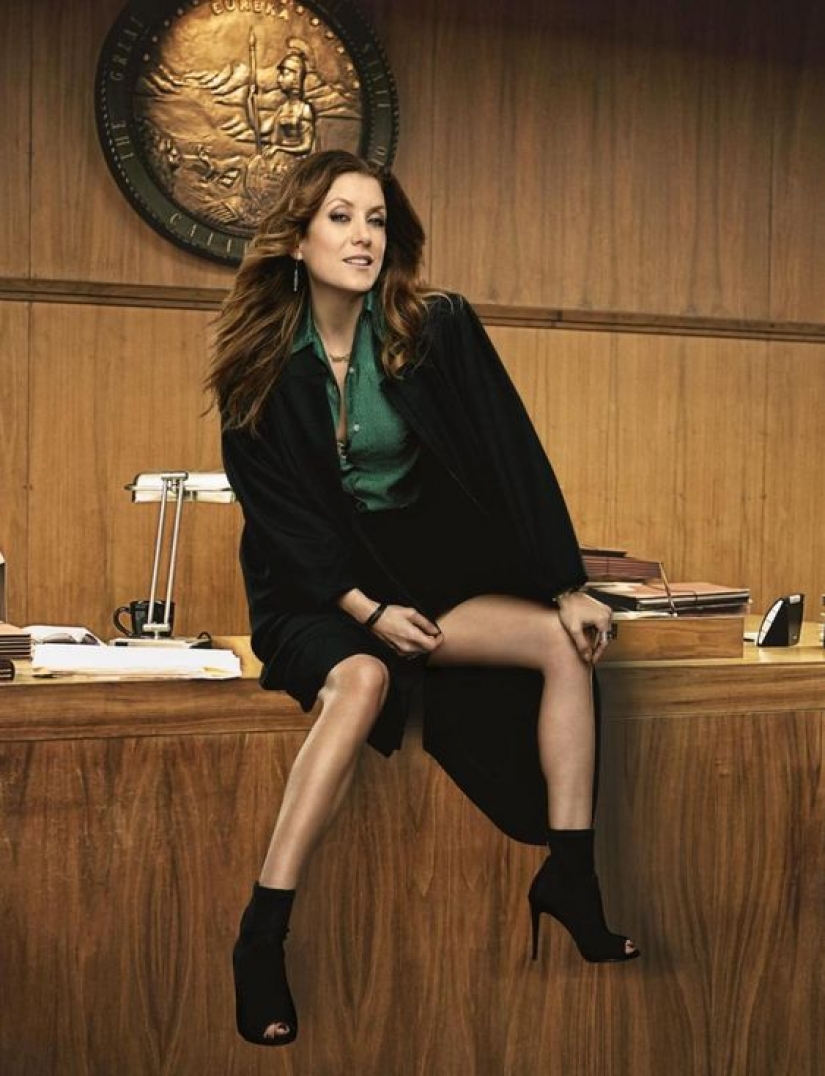
3. One of the posters of the TV series Bad Judge. You do not need to carry out a photographic examination (http://sudexpa.ru/expertises/fototekhnicheskaia-ekspertiza/) to see a photomontage. Actress Kate Walsh's legs don't match her body. They are too skinny and heavily toned.
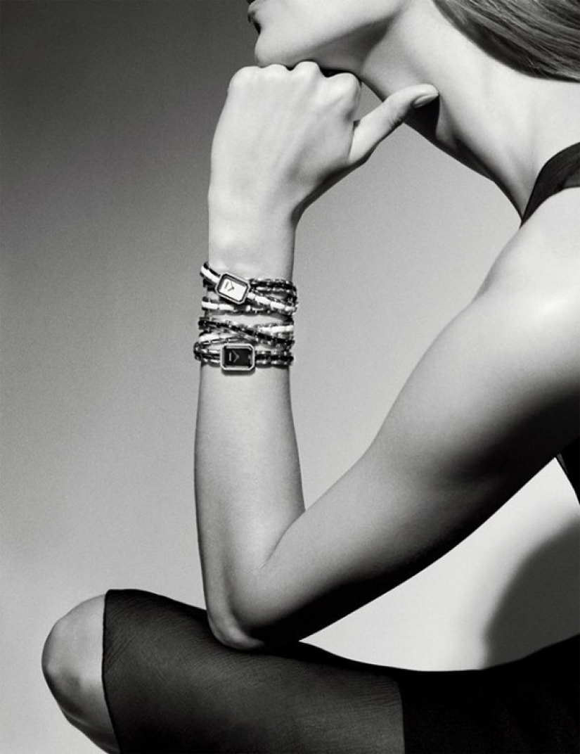
4. If there was a giraffe or an emu in the photo, then such a long neck would be justified.

5. Another long neck and fail from the Chanel advertising department.

6. There are no questions about the mouth-watering forms of Chrissy Teigen's model. But there is one but. According to all the rules of anatomy, the nipple should be visible on the left breast. Of course, the censorship of the GQ magazine is understandable, but this is an obvious mistake by the photographer.

7. Sarah Jessica Parker starred in the Chinese number BAZAAR. The actress was never considered a beauty, but on the cover, the designer clearly highlighted all her flaws, instead of hiding them.

8. It looks like the ad agency just ran out of money to pay the designer for the job. The work was abandoned halfway.

9. Britney Spears' face and neck clearly do not match what is below.

10. What happened to the model's hips, which the retoucher clearly wanted to reduce by making the legs slimmer.
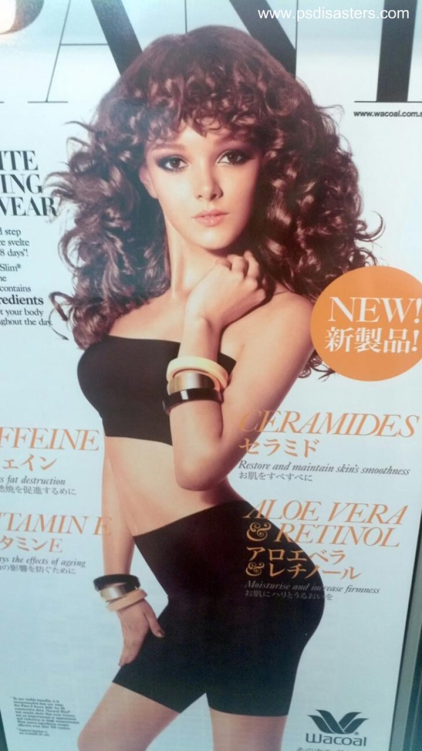
11. It looks like here they just cut out different parts of the body from different magazines and then combined them, even without observing the proportions

12. Nothing out of the ordinary, except for the unrealistically long index finger.
Keywords: Fashion | World | People | Technology | Photoshop | Retouching | Photographs | Skills | Design | Designer | Celebrities | Famous | Age | Computer | Fil | Cinema | Manipulation
Post News ArticleRecent articles

It's high time to admit that this whole hipster idea has gone too far. The concept has become so popular that even restaurants have ...

There is a perception that people only use 10% of their brain potential. But the heroes of our review, apparently, found a way to ...
Related articles

This is an amazing photo project of Mike Harvey: it takes people in his car, and photographs them at the same time, we are about to ...

Have you heard of such a phenomenon as the doorway effect? Let's put it simply: have you ever walked into a room and immediately ...

Surely, many of you had classmates who, to put it mildly, were not distinguished by outstanding external data. Braces, strange ...

New Year's is a time to surprise and delight loved ones not only with gifts but also with a unique presentation of the holiday ...