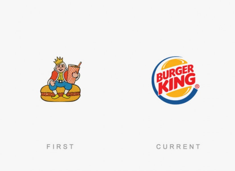
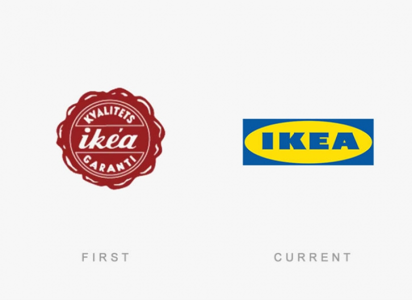
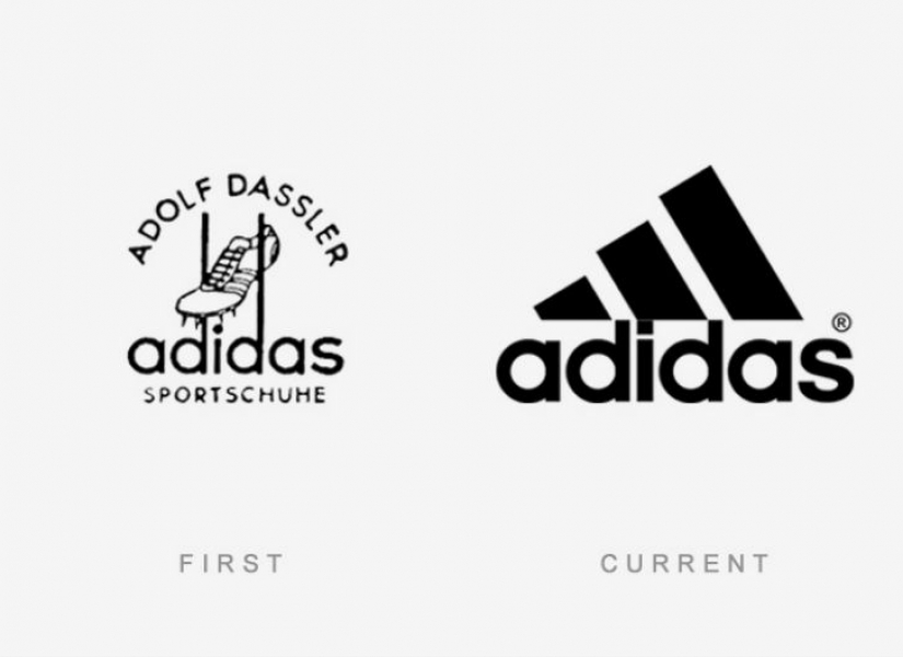
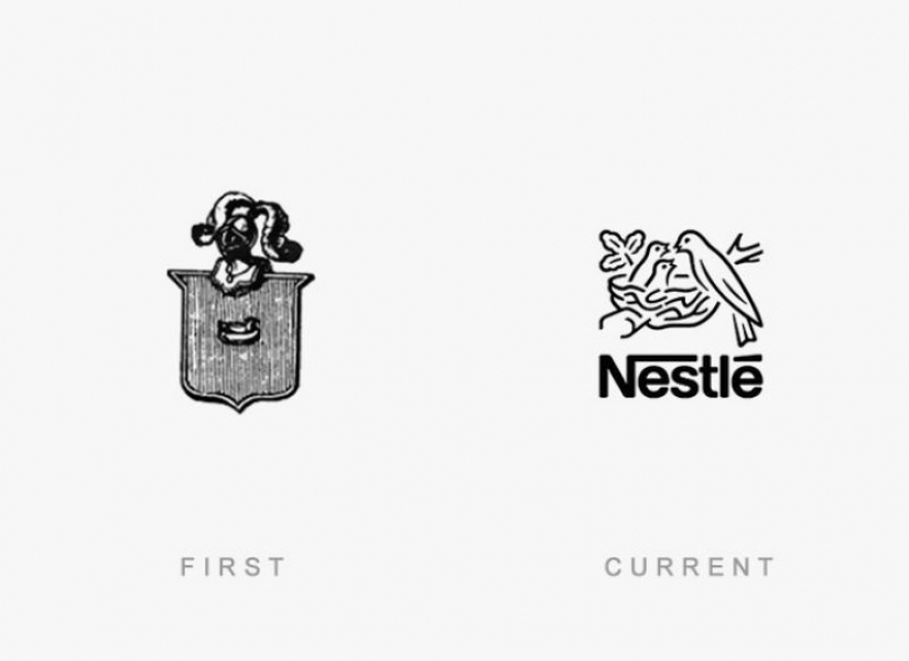
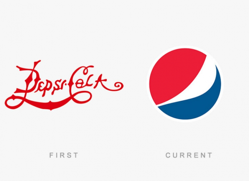
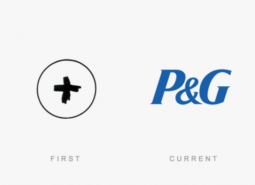
Looked like the first logos of world famous brands
Categories: Design and Architecture | World
By Pictolic https://pictolic.com/article/looked-like-the-first-logos-of-world-famous-brands.htmlWorld famous companies spend millions of dollars on developing and maintaining its brand image. Because one single image, their logo must reflect the values and goals of the company, and it is not an easy task. It is therefore interesting to see what looked like many years ago the first versions of the logos familiar to all of us brands. Some have changed beyond recognition, while others have changed only the color.
And what do you like best — the original version or modern?
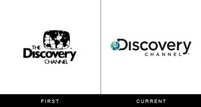
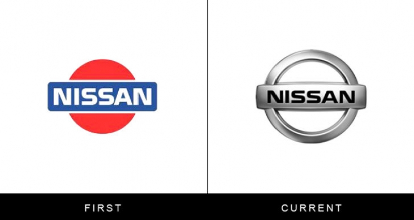
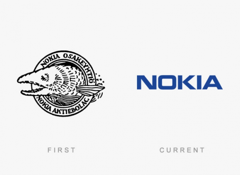
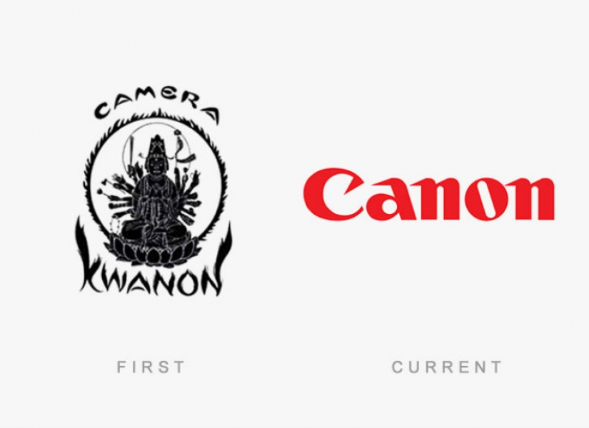
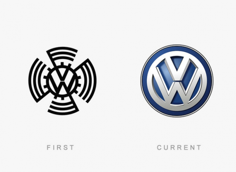
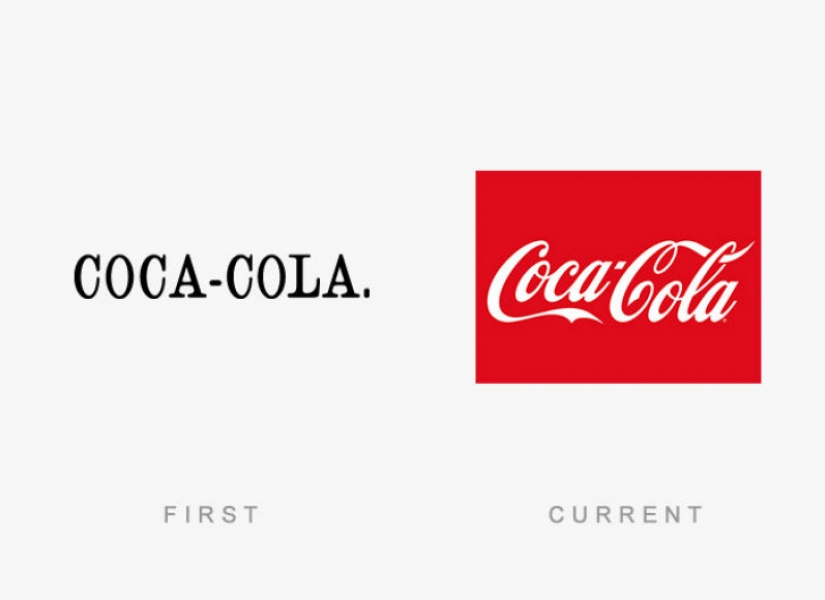
Keywords: Brand | From the past image | The logos | The First advertising campaign
Post News ArticleRecent articles

It's high time to admit that this whole hipster idea has gone too far. The concept has become so popular that even restaurants have ...

There is a perception that people only use 10% of their brain potential. But the heroes of our review, apparently, found a way to ...
Related articles

Bottled water is in great demand all over the world. Its sales are growing by an average of 10% per year and by the next 2020, the ...

Time not only changes the appearance and habits of the people, but also force us to drastically change some things. To them ...

The Barbie doll has been a favorite toy of girls for many generations. She has always been considered the ideal of beauty and ...

New Year's is a time to surprise and delight loved ones not only with gifts but also with a unique presentation of the holiday ...