13 famous brand logos that have changed over the past 50 years
Categories: Design and Architecture | Microworld | People | Society | World
By Vika https://pictolic.com/article/13-famous-brand-logos-that-have-changed-over-the-past-50-years.htmlThe BBC logo is worth $ 1.8 billion. Therefore, it should come as no surprise that the stakes are high when a company decides to change its logo. And this is not only a financial risk, as a brand can lose its identity if the logo is not executed properly. Fortunately, some companies we know have taken the risk and over time have given their logos a more modern look.
Pictolic shows what brand logos looked like before you knew them.
13 PHOTOS
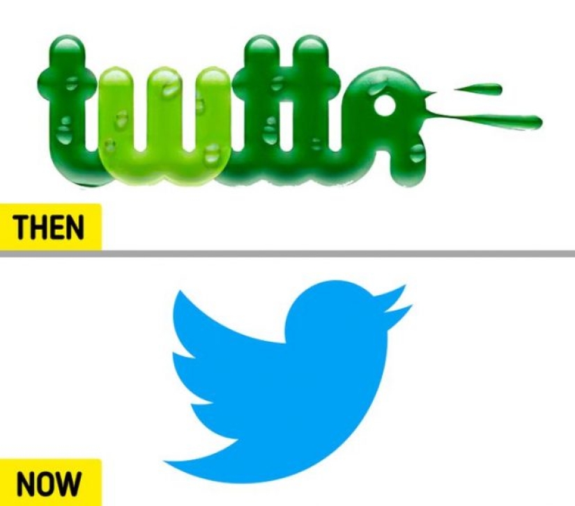
1. Twitter.
The famous Twitter bird logo, as you know, debuted in 2012 after a number of redesigns. “Larry's Bird,” as it is affectionately called, originally goes back to a picture created by British graphic designer Simon Oxley.
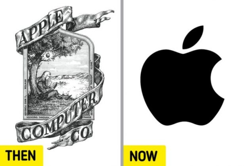
2. Apple.
Apple's first Sir Isaac Newton logo didn't last long. Ron Wayne's design was replaced by the "apple" we recognize today, just a year after its first appearance. The Apple changed color several times before settling on black.

3. Canon.
Canon's original 1934 logo depicts the Bodhisattva Kwanon and other spellings of the brand name. "Kwanon" was the name of the prototype of Japan's first 35mm focal-plane shutter camera. In 1956, the company settled on its current red logo.
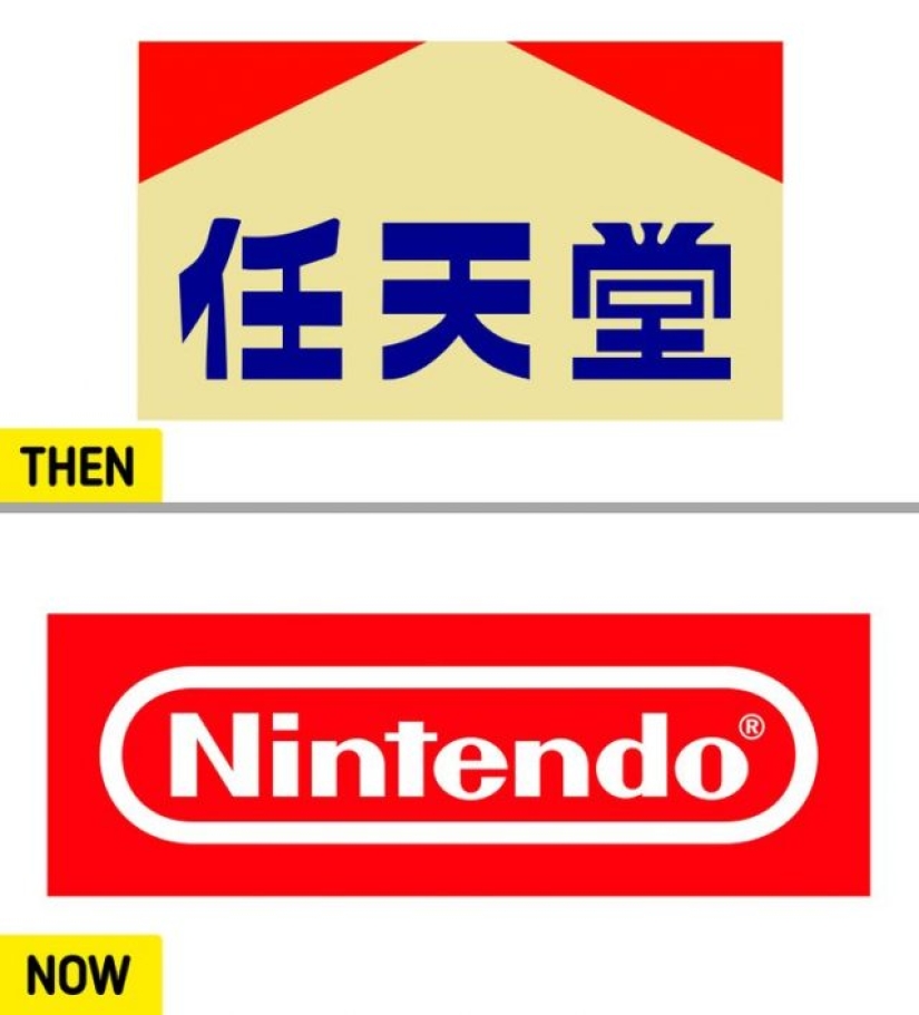
4. Nintendo.
From 1889 to 1950, the Nintendo logo was written in the language of the company's birthplace, Japan. The following logos used the Western spelling of the company name until 2016 when the current version was introduced to the public.
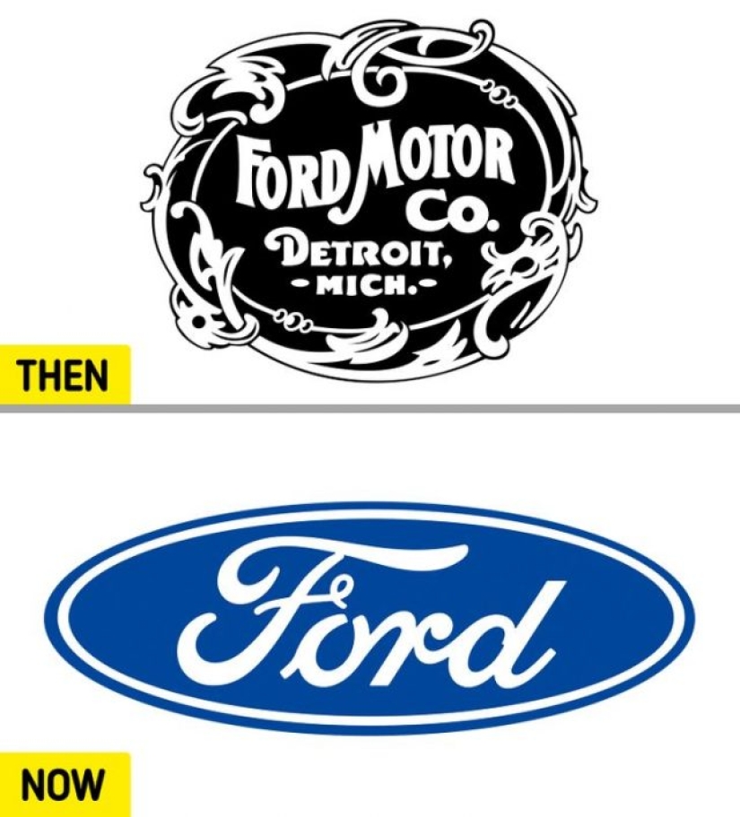
5. Ford.
Since its first logo, which debuted in 1903, the automobile manufacturer Ford has gone through 10 other logos before arriving at the modern blue Ford nameplate design.
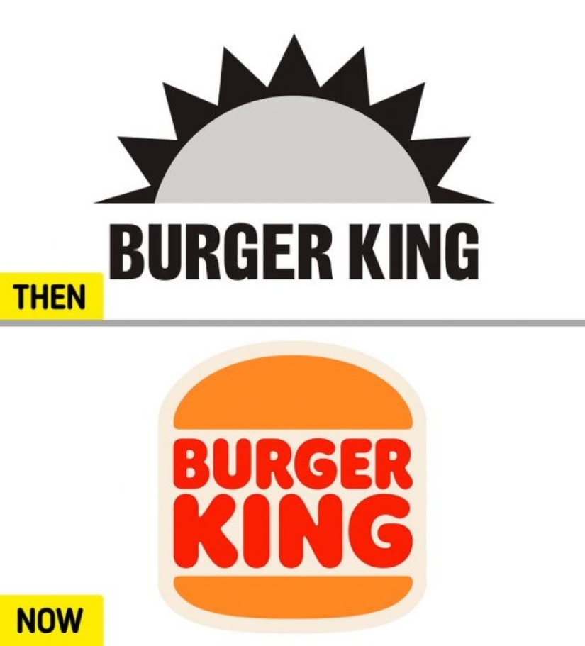
6. Burger King.
The American multinational fast-food chain began in 1953 as the "Insta-Burger King" with a colorless rising sun logo. After the company was bought and renamed Burger King, the company opted for more colorful designs. The current version of the brand logo has been in use since December 21, 2020.
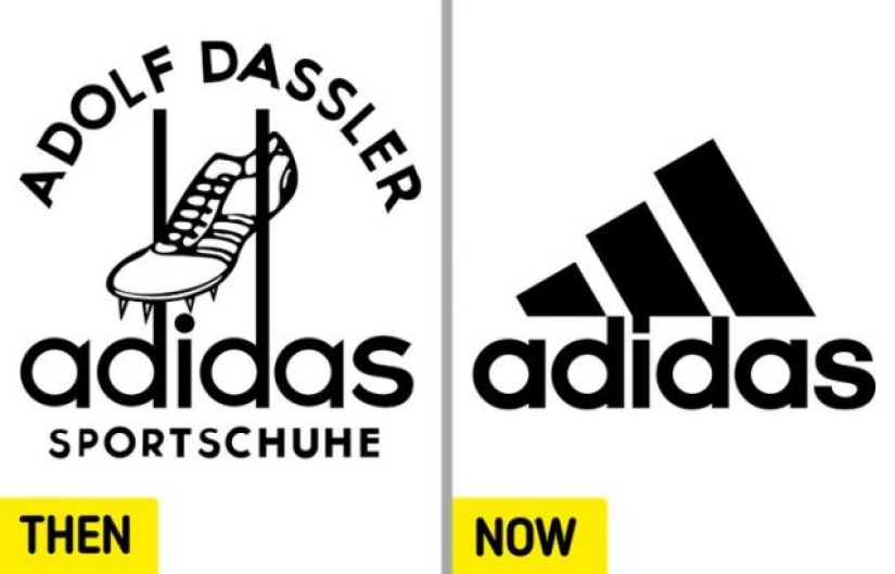
7. Adidas.
Adidas' signature three-stripe design comes after the company acquired it from Finnish athletic shoe brand Karhu Sports, which used it in its products during the 1952 Summer Olympics. Years later, in 1990, the company founded by Adolph Dassler introduced a three-stripe logo designed by creative director Peter Moore.
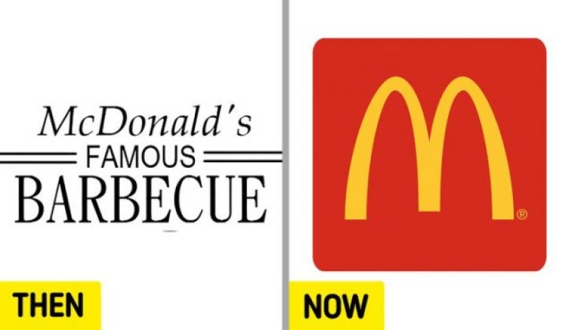
8. McDonald's.
One of the most recognizable logos in the world, McDonald's Golden Arches were added to the chain's logo in 1962. They are in stark contrast to the company's textual black and white logo that debuted in 1940.
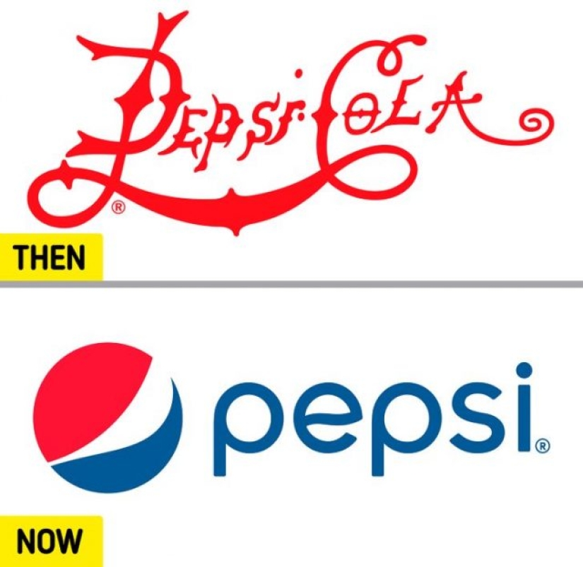
9. Pepsi.
The drink we now know as Pepsi was first called "Brad's Drink" and was later renamed "Pepsi-Cola" in 1898. In the same year, the premiere of the stylized red word logo took place, which lasted until 1905. The name changed again in 1961. It has been shortened to "Pepsi" as seen in the current logo.
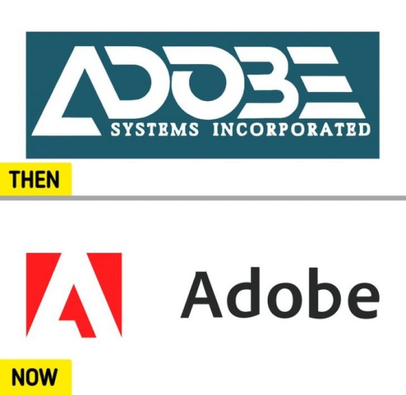
10. Adobe Inc.
The current logo of Adobe Inc. has existed since May 2020. The stylized A was designed by Marva Warnock, a graphic designer who was married to co-founder John Warnock.
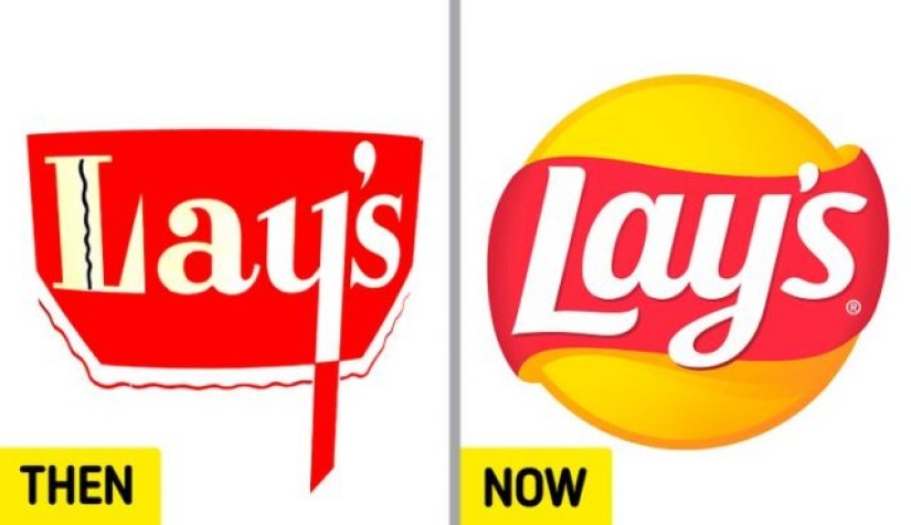
11. Lay's.
Introduced to the world in 1940, Lay's logo changed from a red cauldron to a modern red ribbon around a yellow sun.
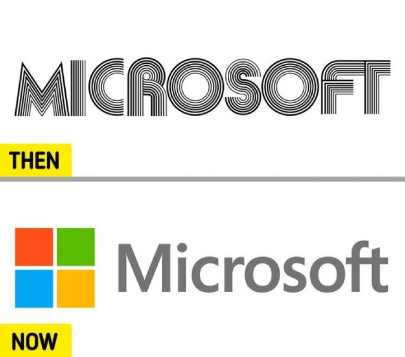
12. Microsoft.
The first Microsoft logo lasted 5 years, from 1975 to 1980. Its fifth and current version, which appeared in 2012, introduced 4 colors that represent the company's 4 main products: Windows (blue), Office (red), Excel (green), and Bing (yellow).
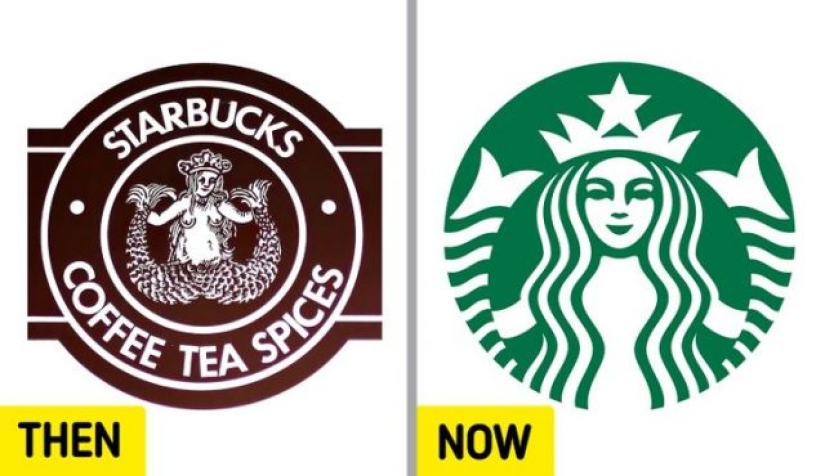
13. Starbucks.
Valerie O'Neill, a Starbucks spokeswoman, explained in 2006 that the image on the logo is "a two-tailed mermaid or siren, as it is called in Greek mythology." Since its original version in 1971, the logo image has been edited 3 times. The latter removed the inscription and drew attention to the siren.
Recent articles

Treasures are all associated with pirates, robbers and the affairs of bygone days. You will be surprised, but countless treasures ...

It seems that Russia has always been the leader in diamond mining, because there are very few countries in the world that could ...

If you have not yet decided what kind of tattoo you want to do, pay attention to these options with the works of the Austrian ...