I will come here on Saturday
Categories: Design and Architecture
By Pictolic https://pictolic.com/article/i-will-come-here-on-saturday.htmlThe office is the place where many of us spend more time than at home, especially if you subtract from the "home" hours that are spent sleeping. It is not surprising that our well-being, mood and view of the world as a whole largely depend on how everything is arranged in the office. What is an office - a place of self-realization or a corporate hell, everyone decides for himself. Well, we have picked up a rather specific "tuning fork": several bright projects nominated for one of the major awards in the field of corporate interior design and office real estate. Let's see how it goes...
(Total 15 photos)
 Source: lenta.ru
Mov!e
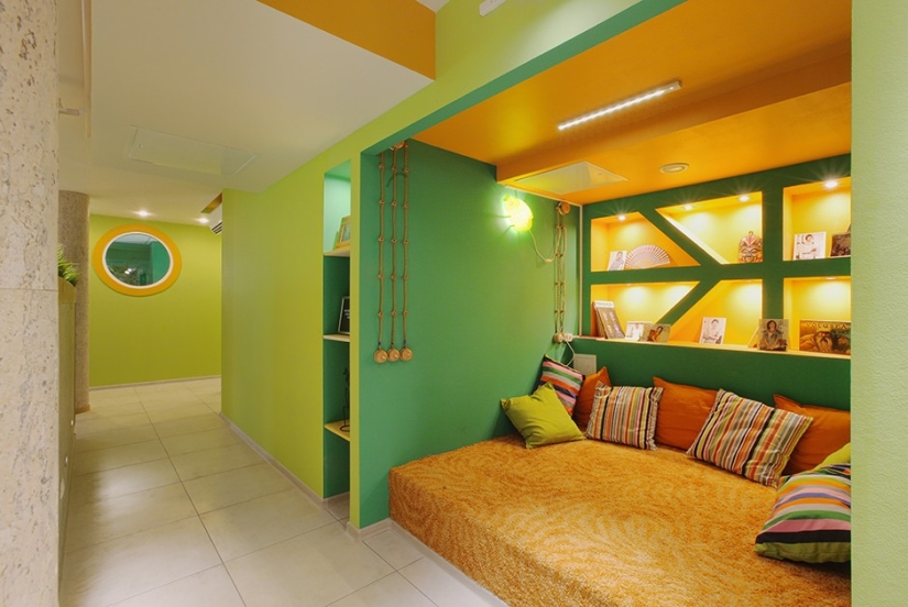
1. Who owns, for example, this bright space? We will advise you: advertisers. The office space of the Mov!e communication group houses two of its members at once: digital and communication, each with its own tasks and needs. The premises, by the way, are located on the technical floor of the Wellton Park residential complex.
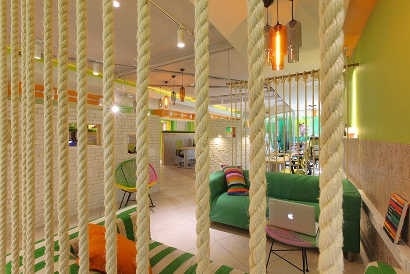
2. The main task set by the customers is quite easy to read from the picture: to organize an informal environment - a breeding ground for designers, copywriters and art directors. And, of course, fit two teams in one space.
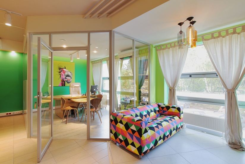
3. Finishing materials were specially chosen "with an eye" for sound insulation - it is undesirable to interfere with the creative process with extra decibels. And when choosing a palette, the authors of the project, the Architectural Bureau of Galina Gorokh, did not limit themselves to corporate colors. Gamma basically continues the color scheme of the residential complex in which the space is located. After all, informal means informal.
CEOoffice
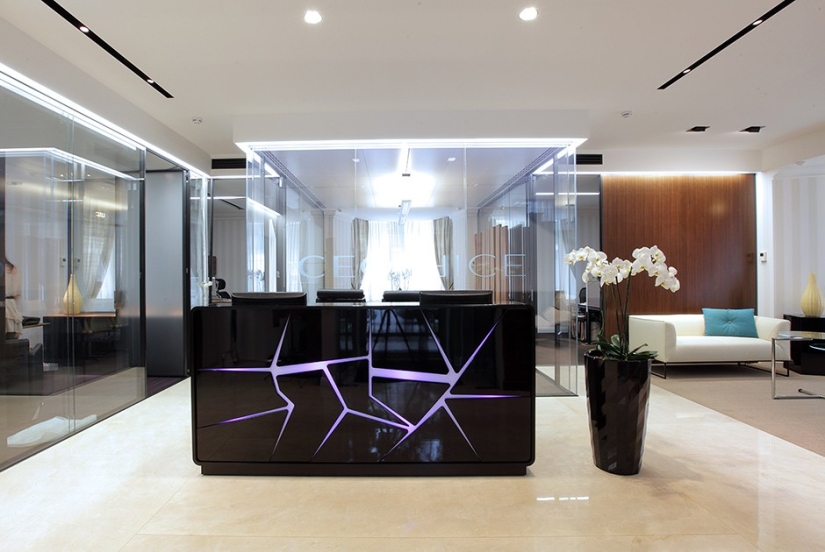
4. The next issue of our program is an office-boutique of a company dealing with interior solutions. “A century-old tree from France, Vologda lace and furniture from cult designers,” is how the project is briefly described on the award website. And this can be understood: the office is also a showroom where potential customers can see product samples, so to speak, "in their natural habitat."
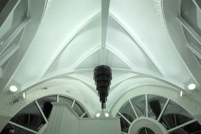
5. The place is appropriate - the company has chosen one of the Moscow mansions on Prospekt Mira for its office. The architect of the building - Oleg Yavein - is known, in particular, for the reconstruction of the Hermitage. The first floor of the mansion is reserved for the reception and VIP area for executives and is stylized as a privileged private club.
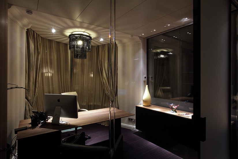
6. The second floor is given to young and active employees aged 25-30 and is designed as an open space. “Zoning is focused on the internal needs of employees who are used to working in two modes: office and home,” the project page says. Therefore… the area of the floor was divided into two parts: one is the usual open space, the second is the zone of informal communication. Sofas, a bar - you can not leave the office even on Friday.
Iridato
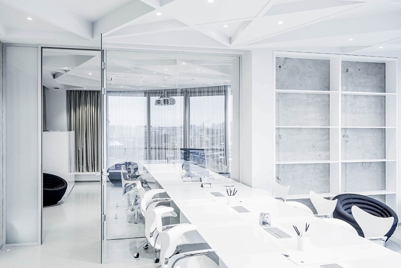
7. This office belongs to a company that organizes business for various brands, including recruitment and training of personnel. In accordance with the needs of the customer, the authors of the project, the Archido bureau, zoned 700 square meters on three floors in such a way as to highlight open space, a training area, meeting rooms, a representative part and public spaces.
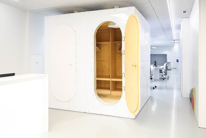
8. In the role of a wardrobe - a designer residential module, developed by the head of the bureau, Vadim Kondrashev.
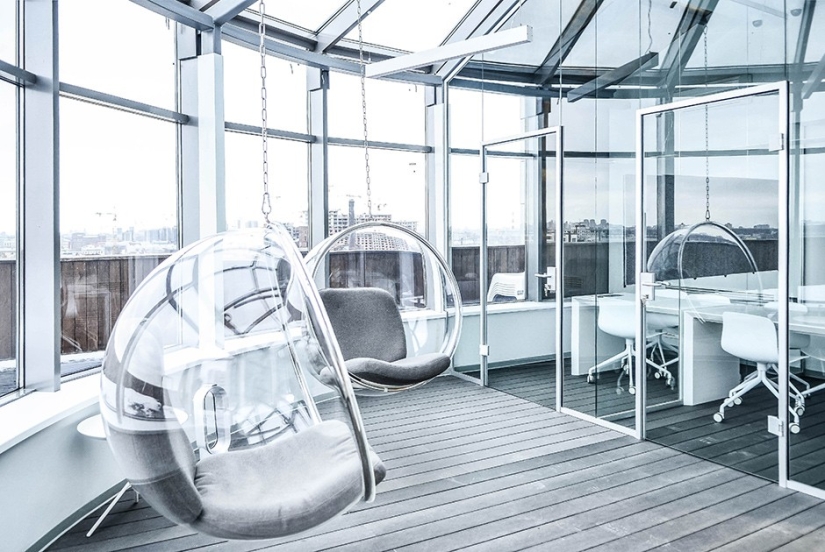
9. And this is how one of the corners of the lounge area looks like: here you can swing in chairs, looking at the panorama of St. Petersburg.
Project Agency
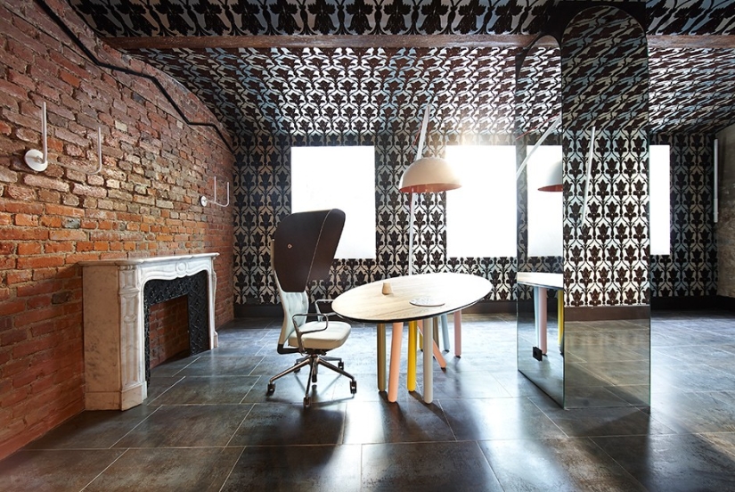
10. The office of the consulting company is located in one of the most premium corners of Moscow in terms of real estate - in Granatny Lane. The room is designed in the fusion style: centennial fireplaces are adjacent to designer furniture. The company formulated the business task as follows: "to design an office where nothing reminds of routine work and where several like-minded people experiment, do their favorite thing, while earning good money." Sounds good, doesn't it?
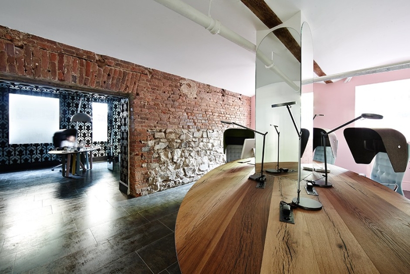
11. One thing is a little confusing (at least for us): when formulating their requirements for window lighting, “the client wanted to achieve the effect of a moon glow of unnatural bright colors with overflows, so that the interior would resemble David Lynch films,” says the project page. It is difficult to say which of the master's creations motivates employees better - The Elephant Man, Lost Highway, or maybe Twin Peaks? In any case, the customer knows better.
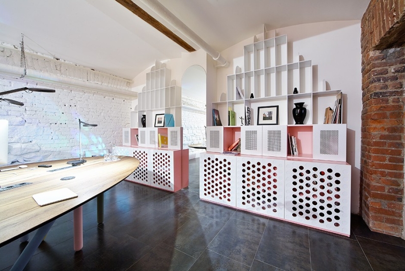
12. “It was important for us to create a space where aesthetics had more rights than function,” says Roman Krikheli, owner and creative director of the company. Well, it seems to us that the architectural bureau Iceoff has succeeded.
Target Ventures
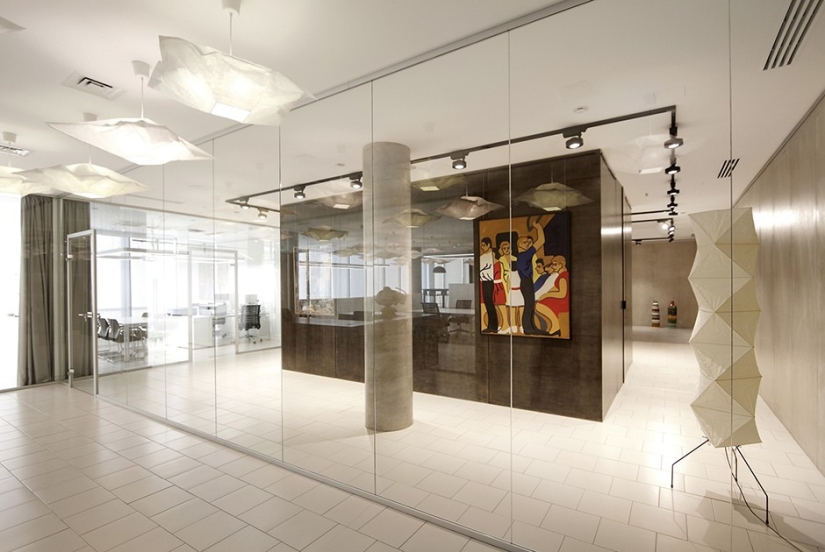
13. And this is not a creative agency, as one might think, but (one might say, “quite the opposite”) the office of a venture fund. It also happens this way: a rigid business structure exists in the same room with a beautiful one. As a business task, the customer formulated the requirement “to combine in one space an investment fund office and a private gallery with a collection of paintings and sculptures owned by the company's partners”. (Spelling and punctuation preserved - ed.)
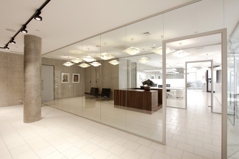
14. As a result, the authors of the project, the Praktika bureau, settled on this zoning option: the reception and the meeting room are in the middle, and the office itself and the art gallery are located in a kind of “wings” on the sides of the central zone.
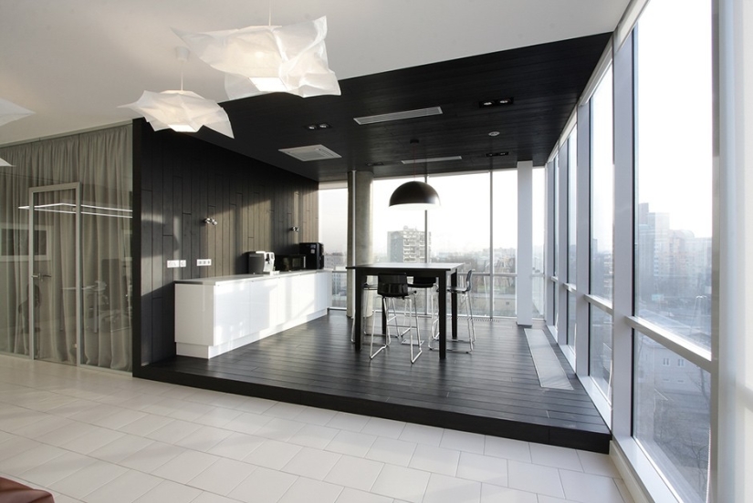
15. At the same time, all partitions are transparent - office personnel with a certain visual acuity can admire masterpieces or, in any case, absorb the general atmosphere of beauty.
Keywords: Office | Award | Work
Post News ArticleRecent articles

It's high time to admit that this whole hipster idea has gone too far. The concept has become so popular that even restaurants have ...

There is a perception that people only use 10% of their brain potential. But the heroes of our review, apparently, found a way to ...
Related articles

Many believe that cats are essentially idlers, spending their days in idleness, games and gluttony. But in fact this is not the ...

This collection of photos will clearly please the little inner perfectionist who lives in each of us. It doesn't matter how much ...

Most major companies profanity is not encouraged. It is considered that the profanity — it is a sign of disrespect for ...

New Year's is a time to surprise and delight loved ones not only with gifts but also with a unique presentation of the holiday ...