How to write neopisuemo: masterpieces of outdoor advertising
Categories: Design and Architecture
PictolicAdvertising pursues us everywhere, and people just stopped noticing her. But the ad designers are not born yesterday: every day they invent new ways of audience engagement. Although the exterior design is hardly a novelty in the advertising industry, this opens up a lot of room for imagination.
Successfully beat the surrounding urban space and to enter the is even where seemingly not much to look at, is art.
(19 photos)
 Source: Postureo Español
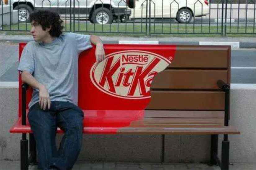
Designers Kit Kat decided to tackle the theme of a break with the city bench.
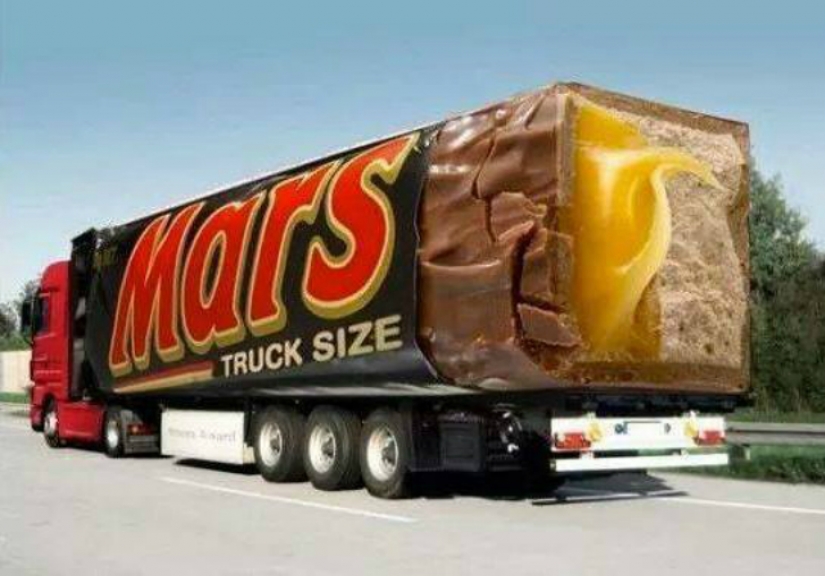
Instead of dirty trucks of indeterminate color, we see a delicious chocolate bar.
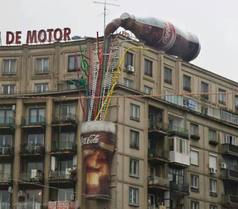
Some giant knocked over a bottle of coke on the roof. How fortunate that the bottom was glass, isn't it?
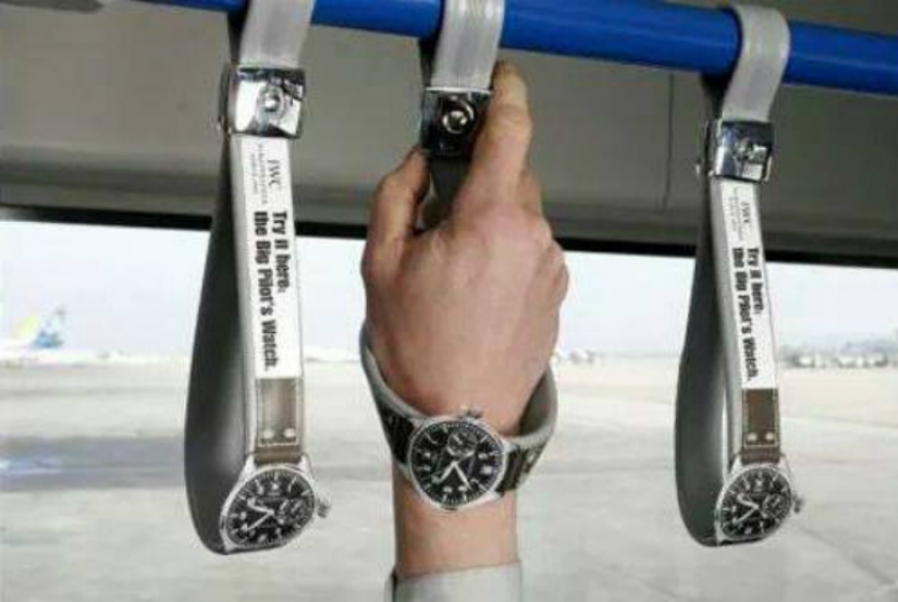
Three in one: you can drive from one point to another, hold onto the handrail for stability and try on the watch.
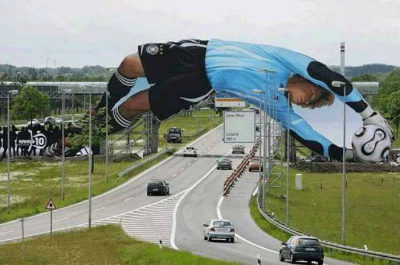
The player famously leaned over the road, while showcasing brand sportswear.
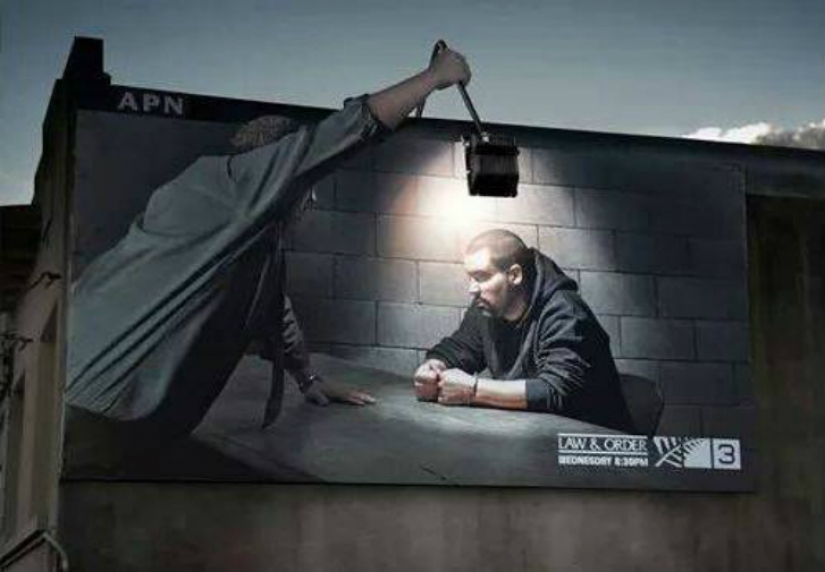
The urban environment is often used for social advertising, in this case, the citizens are urged not to break the law.
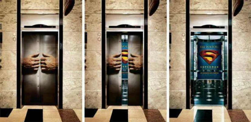
And this is the lift Superman. Doors of elevators can be successfully used for interesting career moves.
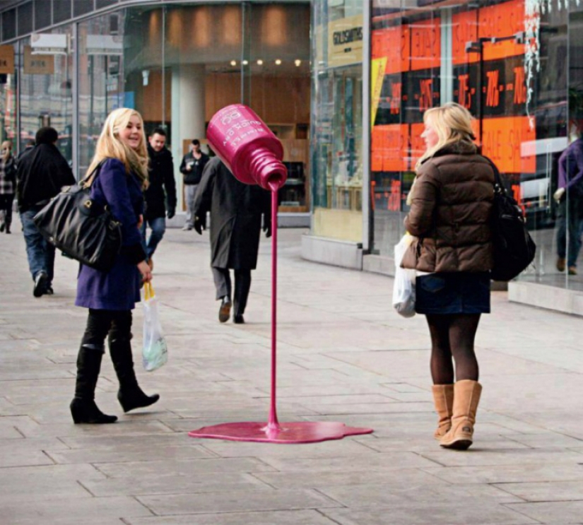
There are and placement, and the design, which obviously hints at the incredible durability of varnish.
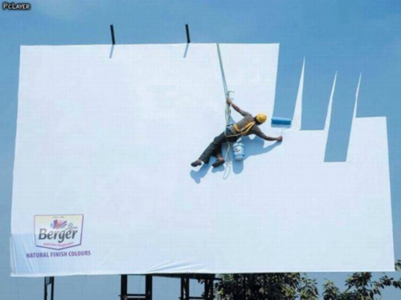
Another example of how to convey the idea about the qualities of the advertised product.
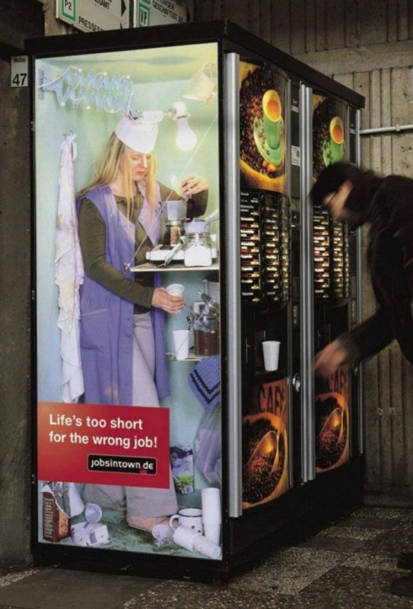
A series of advertising services on job search, which included this example in his time was famous throughout the world.
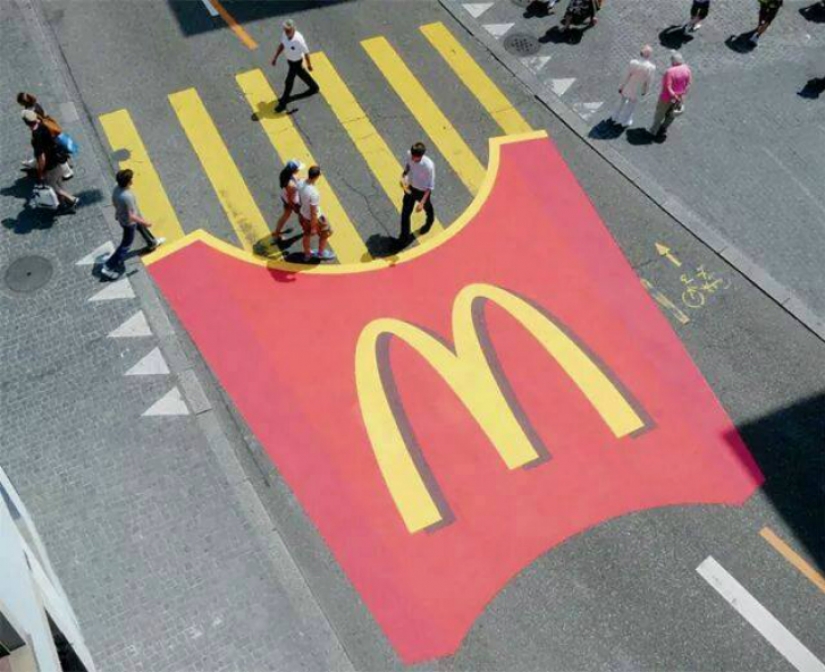
McDonald's managed to write your advertisement in road markings.
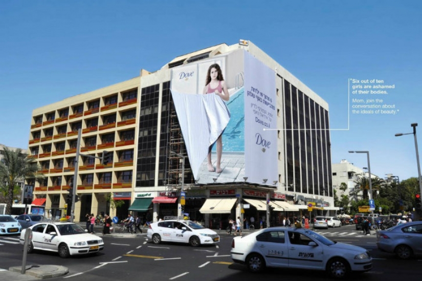
This Israeli is from shamefully hiding behind the girl reminds us that we should not feel ashamed of his body. Well and unobtrusively offers to buy certain products, of course.
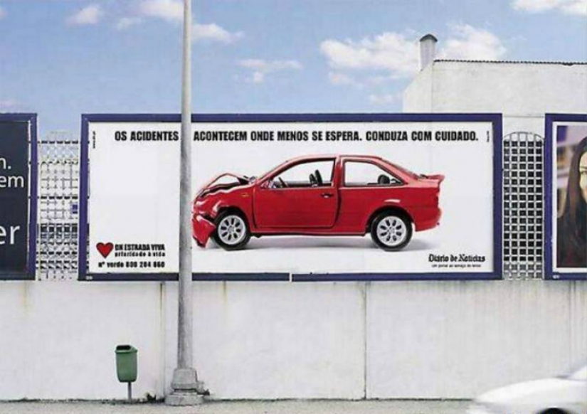
The PSAs with the help of this post reminds of the caution when driving a car.
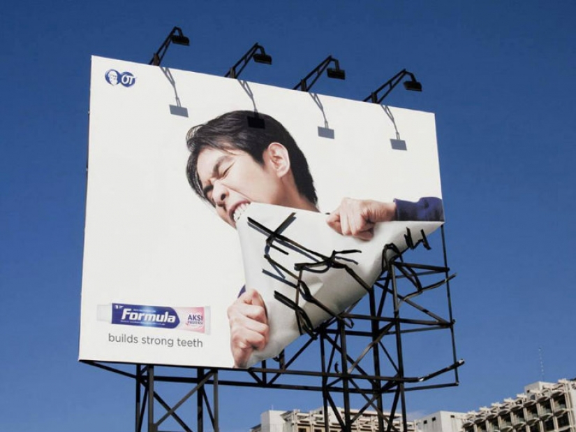
So advertising designers imagined a fortress of teeth.
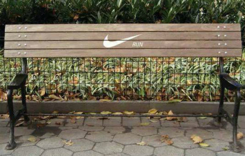
Bench without seat recalls that you need to move more.
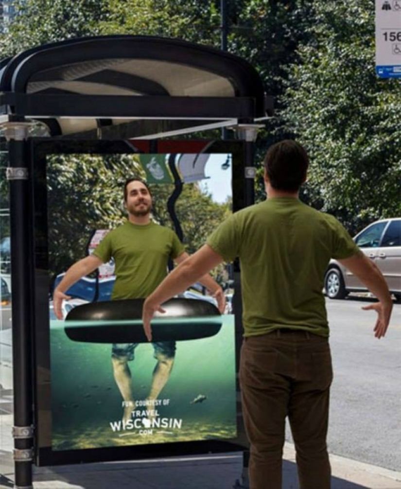
With this advertising design you can feel like a little vacation.
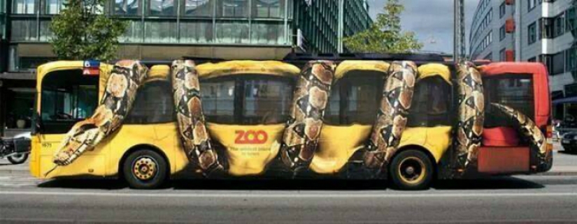
The zoo is successful looks like.
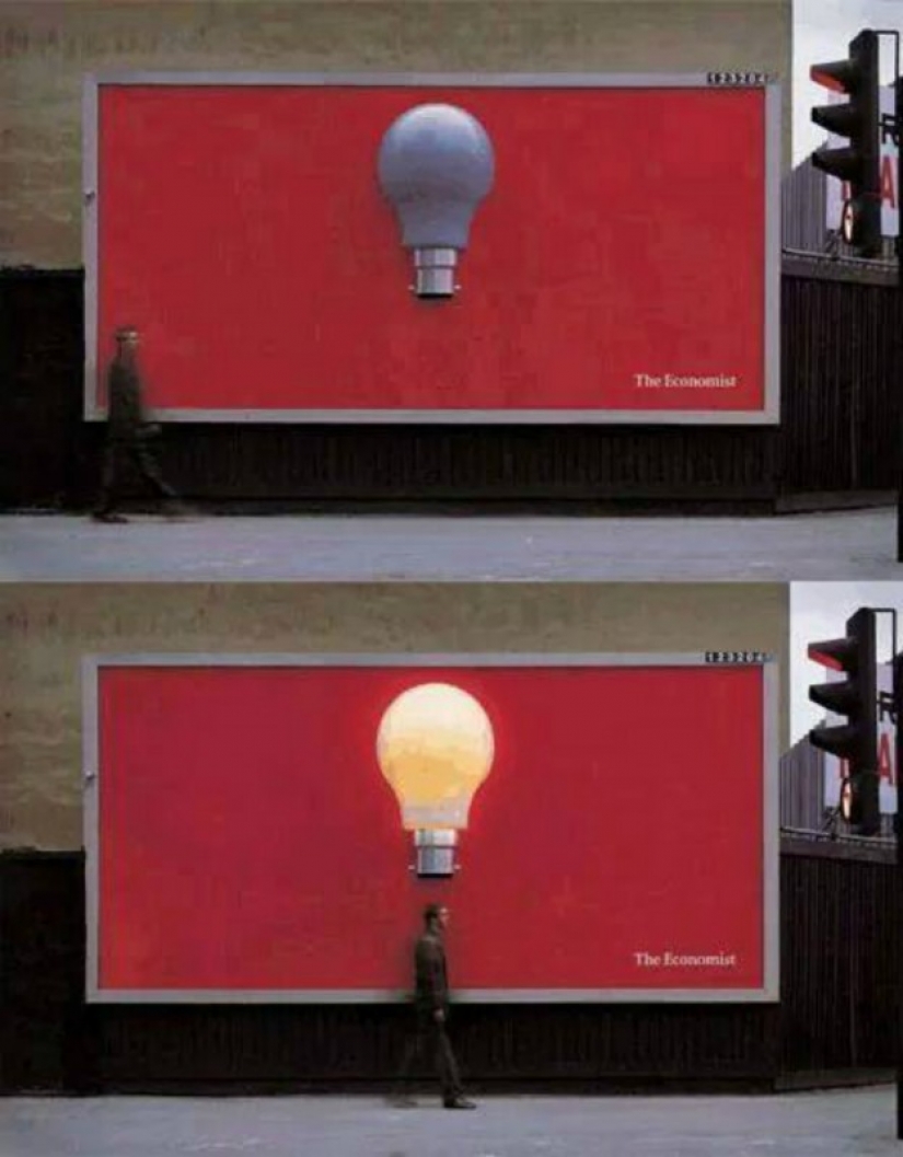
Minimum words, maximum images. Person is — lamp is lit, and the bottom smaller is written the name of a famous edition.
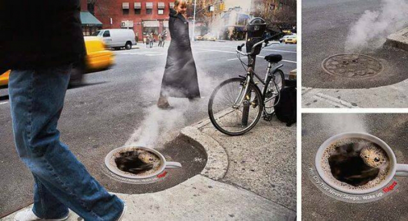
Instead of emitting pairs passers-by see hatch a Cup of coffee that you will agree, much nicer.
Keywords: City | Creative | Creativity | Outdoor advertising | Advertising campaign | Social advertising
Recent articles

It's high time to admit that this whole hipster idea has gone too far. The concept has become so popular that even restaurants have ...

There is a perception that people only use 10% of their brain potential. But the heroes of our review, apparently, found a way to ...
Related articles

There is a perception that people only use 10% of their brain potential. But the heroes of our review, apparently, found a way to ...

Under the motto "let everyone know" people were writing on the pavement (and not only) what it tells the heart. And sometimes it ...

If you like peace and privacy, it is unlikely that you will choose a metropolis, going on vacation. Especially when in the world ...

New Year's is a time to surprise and delight loved ones not only with gifts but also with a unique presentation of the holiday ...