Hidden elements in famous logos
Categories: Art | Design and Architecture | People | Society | World
By Vika https://pictolic.com/article/hidden-elements-in-famous-logos1.htmlA good logo is a very important image element for any company. First of all, it should look beautiful and serve as a business card of the company. However, sometimes logos also have additional functions: it contains a hidden message or an image that is invisible at first glance. Check out 10 interesting examples of hidden elements in famous logos.
10 PHOTOS
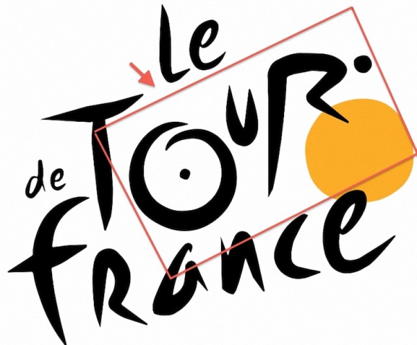
1. The Tour de France logo features a cleverly hidden image of a cyclist riding a bike. Look closely: the curved r in Tour is a cyclist, and the o and yellow circle is a bike. Good truth. (Photo: screenshot).
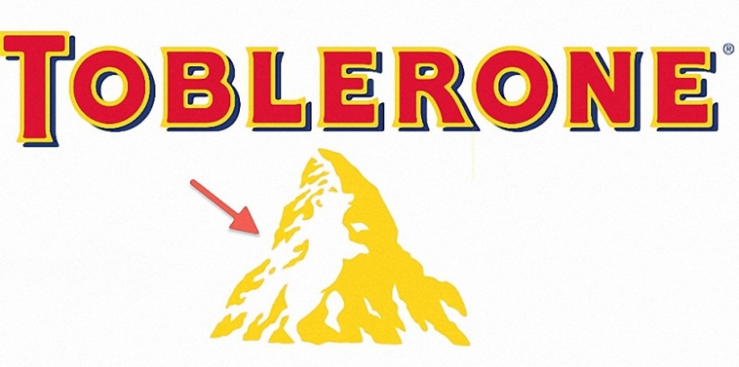
2. The triangular-shaped Swiss chocolate Toblerone logo also contains an artfully hidden object. At first, in the picture, you see only a yellow-white mountain. Look closely at it and you will see a bear dancing there.
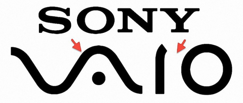
3. SONY VAIO - the logo of Sony's popular laptop series - a combination of analog and digital technology. "VA" deliberately resembles analog broadcast waves, while "IO" symbolizes binary code.

4. A special message contains the Amazon logo. First, the arrow under the name resembles a smile and illustrates the company's motto "make customers happy." Secondly, it points to the letters A and Z, thus showing what a wide range of products is available in this online store (that is, from A to Z). (Photo: Michel Spingler/AP Photo).
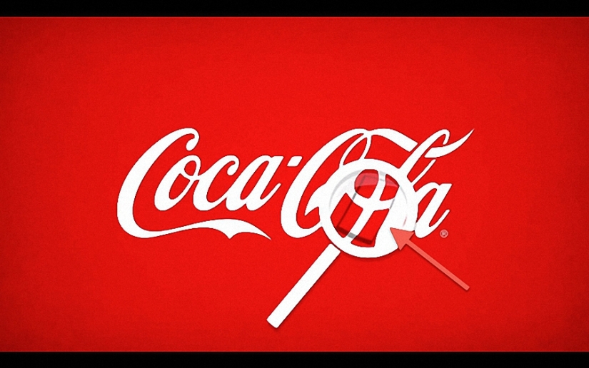
5. Coca-Cola. This popular brand, on the occasion of one of its campaigns in Denmark, hid the Danish flag in its logo.
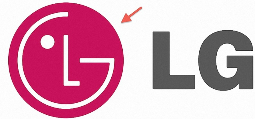
6. LG logo. Some argue that the logo of this company is a tribute to the cult hero of computer games named Pac-Man. However, the version seems more likely that this is a smiling face with a winking eye.
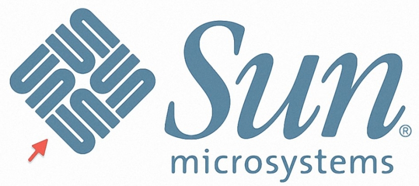
7. The Sun Microsystems software and hardware logo is an ambigram - a pattern that can be read from either side and will always produce the word "Sun". Moreover, it is worth noting that in this case there is no letter S as such in the logo because each time it is obtained from the appropriately set small letters "u" and "n". Smart, isn't it?
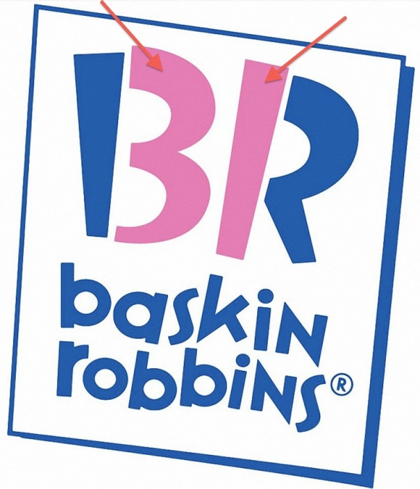
8 Baskin Robbins This logo is an example of the ingenious use of the initials of the company name. From the parts of the letters “B” and “R” highlighted in pink, the number 31 is obtained - exactly the number of types of ice cream offered by Baskin Robbins to its customers.
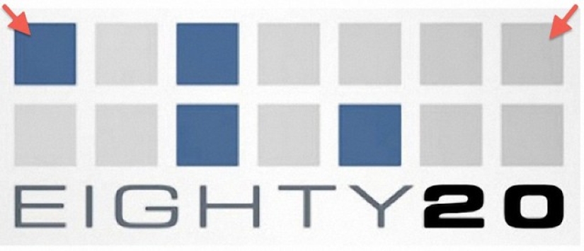
9.Eighty20. This research company uses a binary code in the logo. Blue squares are 1, gray squares are 0. So 1010000(80) + 0010100(20) = Eighty20.
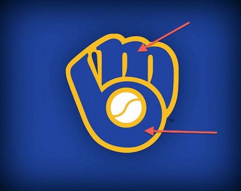
10. The Milwaukee Brewers are a baseball team. Its logo - a glove - is recognized by everyone, but the initials of the team's name, skillfully hidden in it, can only be seen by looking closely. Cunningly.
Keywords: Hidden elements | Famous logos | Logo designs | Designers | Art | Secrets | Companies | Functions
Post News ArticleRecent articles

It's high time to admit that this whole hipster idea has gone too far. The concept has become so popular that even restaurants have ...

There is a perception that people only use 10% of their brain potential. But the heroes of our review, apparently, found a way to ...
Related articles

If today’s brands had honest logos made in medieval times, they would look something like what Ilya Stallone, an artist and a ...

George Bokhua is a New York-based graphic designer and illustrator known for his minimalist design work. He has gained recognition ...

Good logos are often minimalistic, but it takes skill and effort to create a simplistic, yet effective and memorable design.

New Year's is a time to surprise and delight loved ones not only with gifts but also with a unique presentation of the holiday ...