22 would-be designers and their "works"
Categories: Design and Architecture | Positive
By Pictolic https://pictolic.com/article/22-would-be-designers-and-their-works.htmlThere is a talent from God, and there are hands from ... shoulders. These people have just the second. They have hands, they can do something with them, but it doesn't matter whether it's good or bad. Yes, a bad design can ruin even the best product, not to mention more serious things. Here are at least 22 examples of how would-be designers managed to distinguish themselves and screw up when no one expected it.

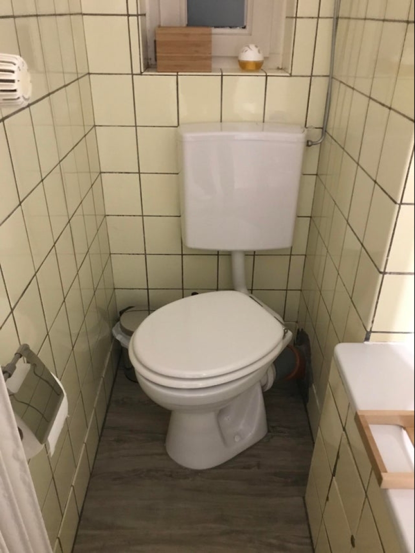
Yes, it is so installed. No, they haven't heard about pipe adapters.

This is how modern architecture has ruined the national Heritage site in Bucharest.
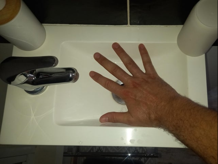
"Either I'm too big, or there's something wrong with the sink"

So that it would not be boring to relieve yourself.

The creator of this toy decided that one mouth of the tiger would not be enough.

Not the most successful advertisement. Causes dizziness and nausea.

Excellent parking space! I wonder why no one has taken it yet?

Although, some designers, obviously, do not care about both motorists and pedestrians.

"The original, they said. Quality!"

"The door in the bathroom of my hotel does not close, because it is hindered by... the toilet"
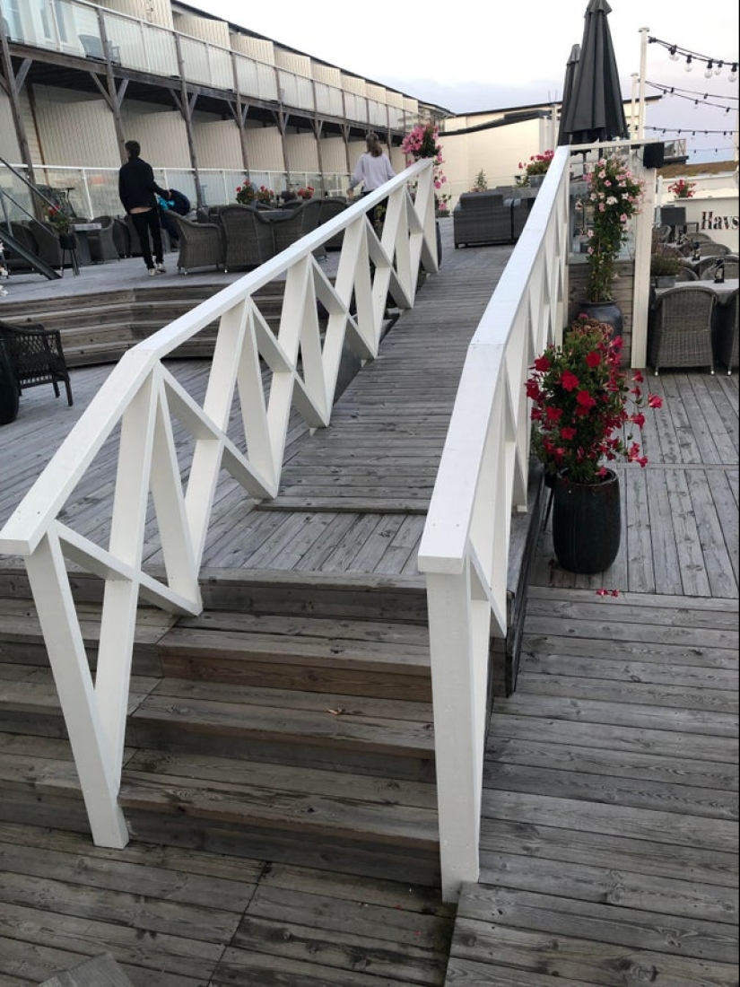
We take care of people with disabilities, but not completely.

"The switch is located directly behind a sharp metal sheet. Several times I almost cut my finger"

Yes, we have a ramp. But first you need to climb the stairs.
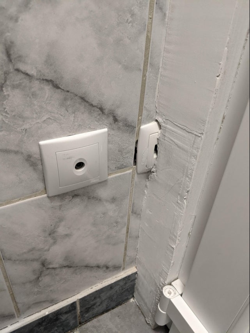
Did you really need an outlet?

Not the best advertisement for a children's hair salon.
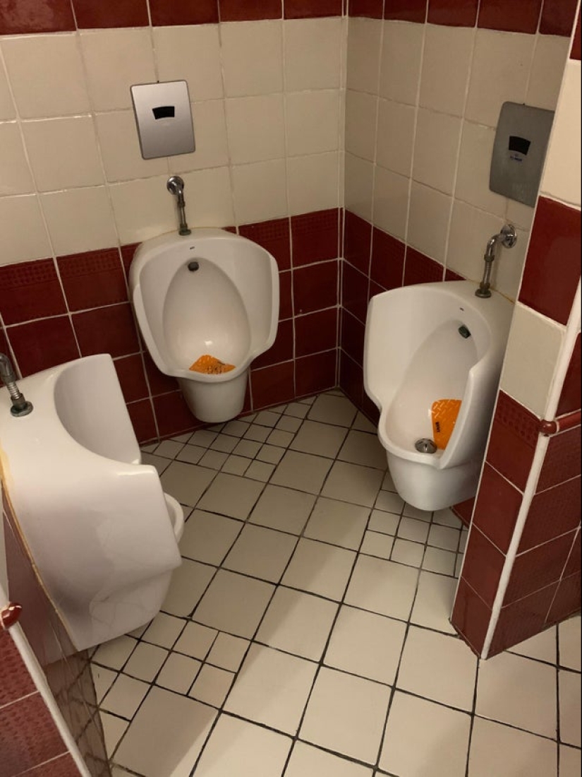
Personal space? Not here!
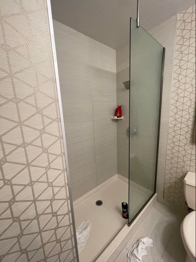
"There is no sliding door in this hotel in Las Vegas, so the entire bathroom is watered with water"

"In this reproduction of the fresco by Diego Rivera, the entire section is missing due to the poorly positioned doorway. This could have been easily avoided by moving the mural two meters to the right."

And then they say, " Look into my eyes!"

Thanks to the design of the pillowcase, it seems that bugs are crawling on it.

Teaching children good manners? And it looks like something else…

Cook for 123 minutes.
Keywords: Positive | Design and architecture | Selection | Funny | Humor | Designers
Post News ArticleRecent articles

It's high time to admit that this whole hipster idea has gone too far. The concept has become so popular that even restaurants have ...

There is a perception that people only use 10% of their brain potential. But the heroes of our review, apparently, found a way to ...
Related articles

There is a perception that people only use 10% of their brain potential. But the heroes of our review, apparently, found a way to ...

Everyone wants the wedding day to become special and remain in the memory of the newlyweds, parents and guests forever. Well, no ...

Under the motto "let everyone know" people were writing on the pavement (and not only) what it tells the heart. And sometimes it ...

New Year's is a time to surprise and delight loved ones not only with gifts but also with a unique presentation of the holiday ...