22 photos of a really terrible interior, or When the designer was drunk
Categories: Design and Architecture | Positive
By Pictolic https://pictolic.com/article/22-photos-of-a-really-terrible-interior-or-when-the-designer-was-drunk.htmlIf you are going to do a designer renovation in an apartment, make sure that you are definitely working with a professional. Otherwise, there is a risk of getting into situations faced by these people. Not only that, they were left without the desired repair, so now they also have to redo everything!
In the meantime, the interior is still bad, it's not a sin to put up his photo for the amusement of network users.
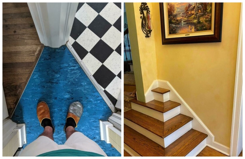
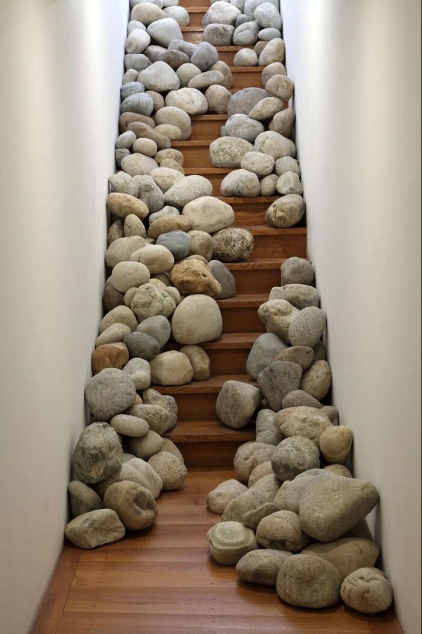
Through the thorns... into the bedroom.
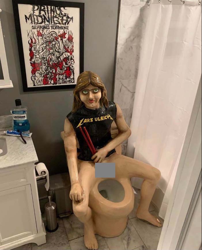
I think I'll be patient.
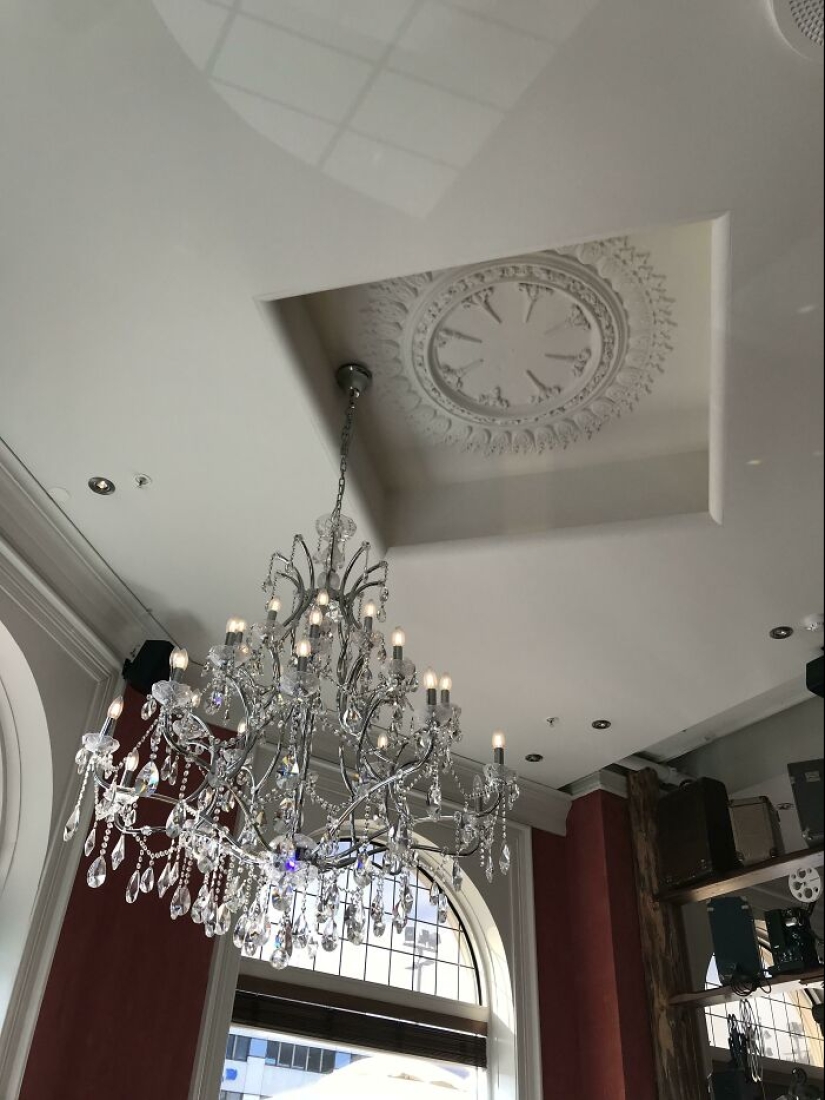
The horror of the perfectionist.
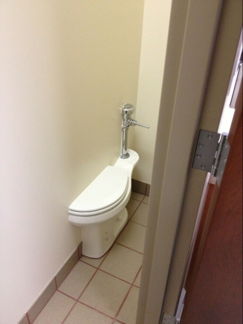
Toilet demo?
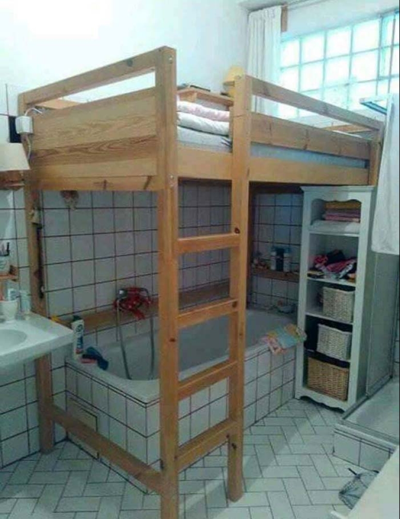
When the apartment is with a small area and you need to save space as much as possible.
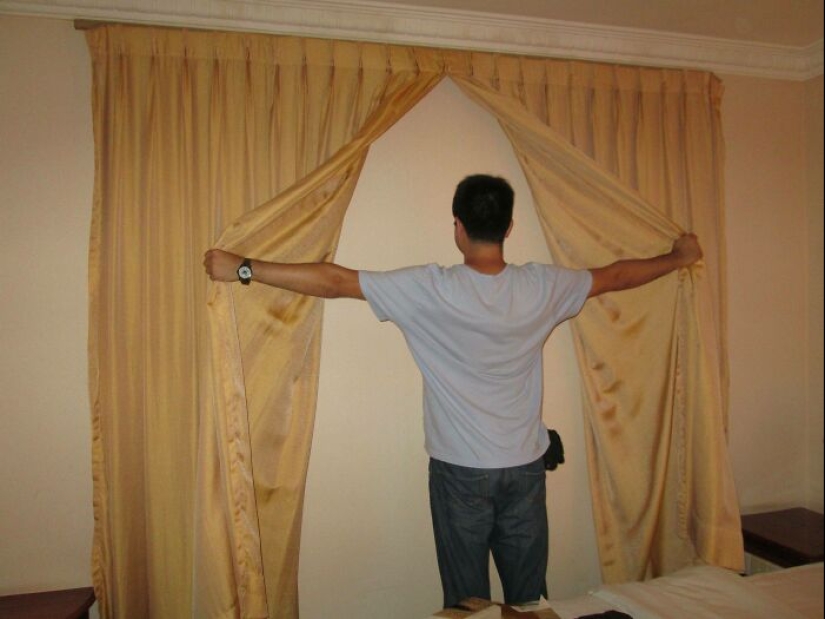
"Promised a sea view."
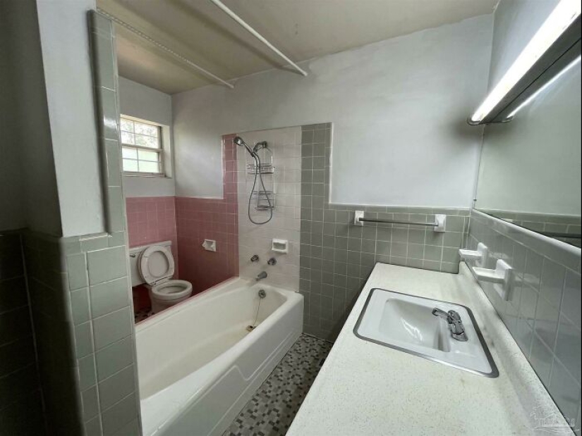
To get to the toilet, you need to step over the tub. No one said that this path would be easy.
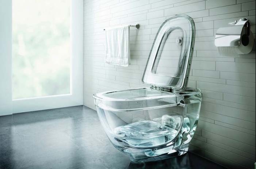
This is not a good idea…
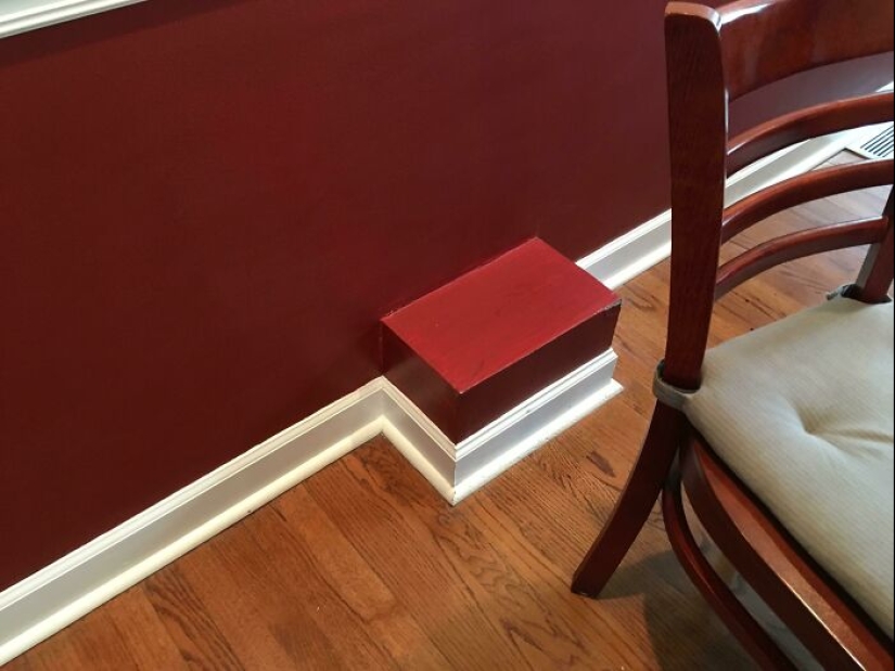
From the authors of corners on furniture.
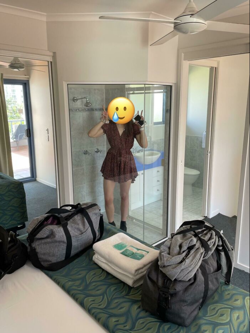
Privacy? No, you haven't.
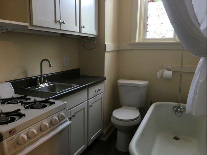
As they say, in tight quarters, but no offense!
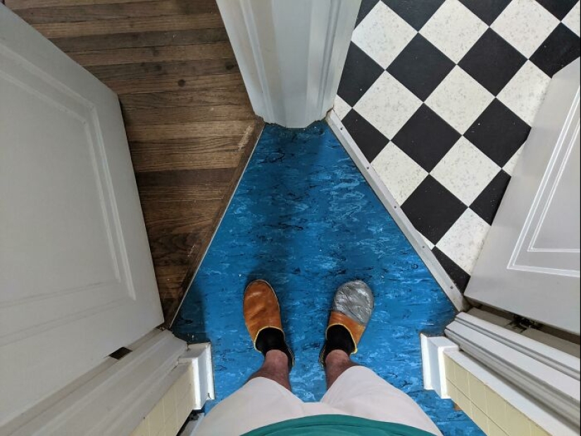
"The intersection of three rooms in my new house."
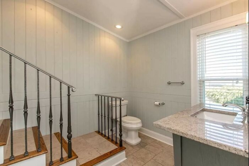
Not the best location.
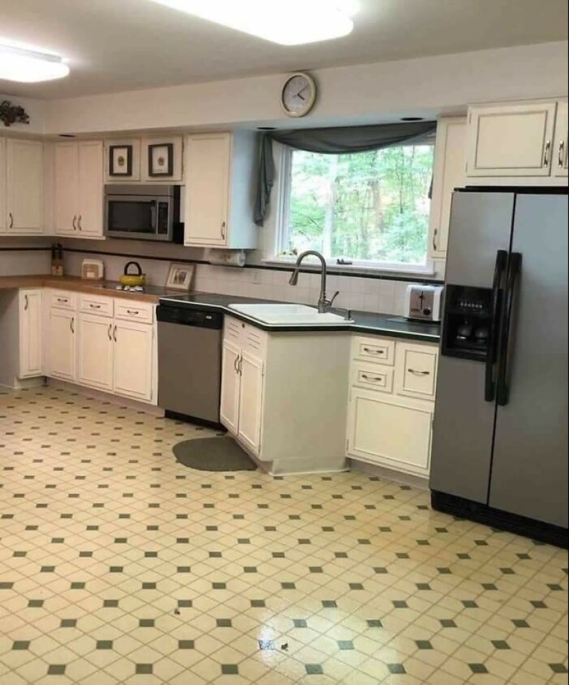
"This sink is driving me crazy!"
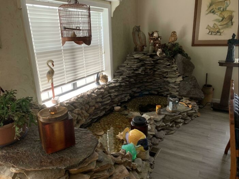
"My grandparents have a fish pond in the living room."
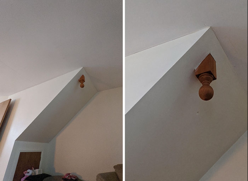
The bottom side of the stairs. Just why?
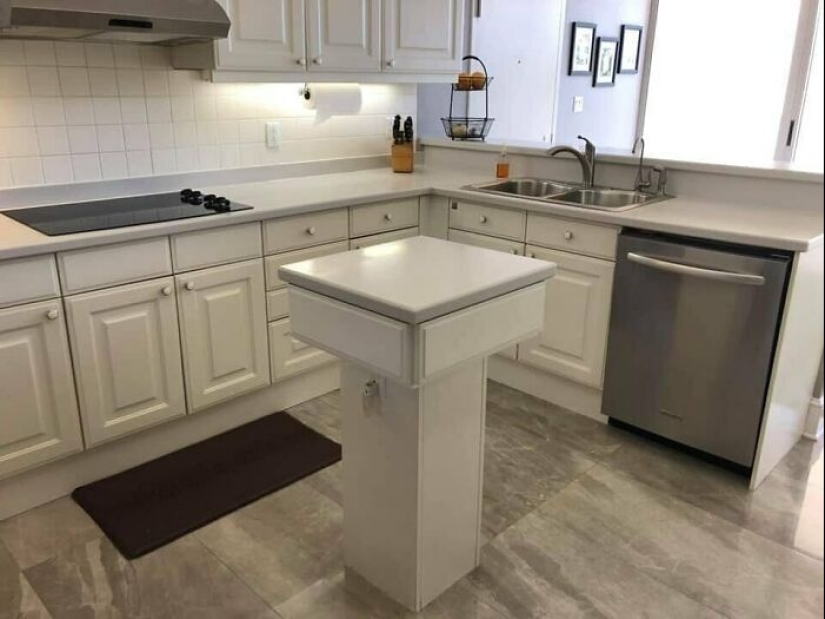
"You asked for a kitchen island. What's wrong?"
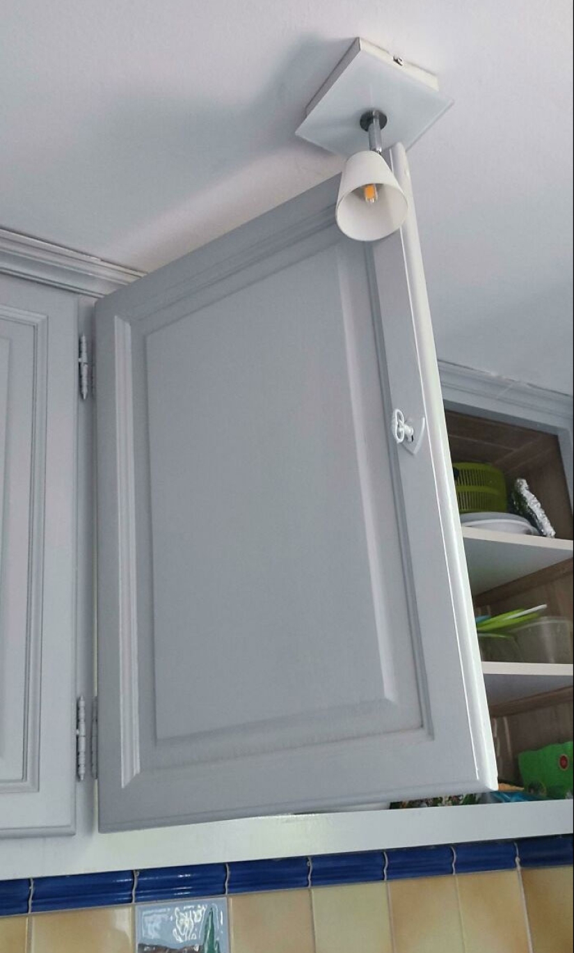
A silent war is being waged between the lamp and the locker door.
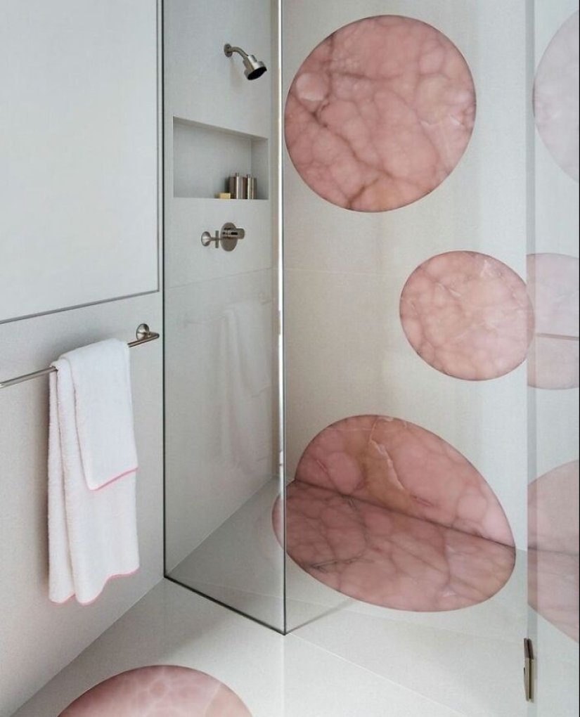
Mmm... how creepy.
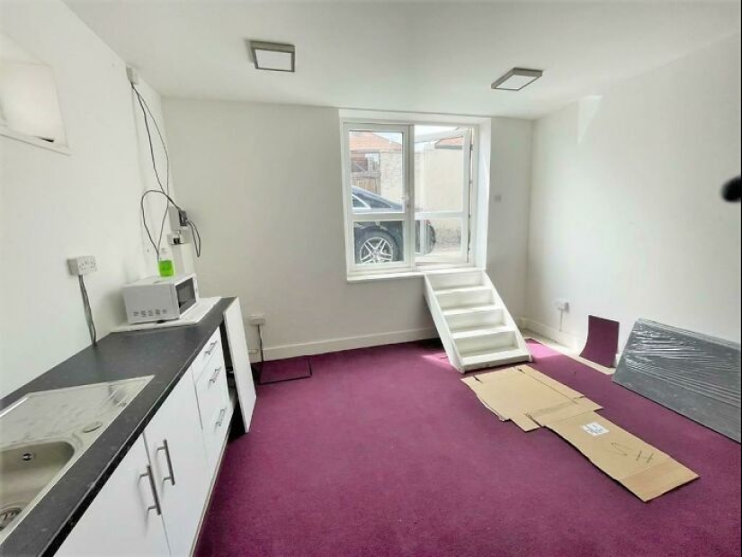
Why do you even need a door when there is a window?
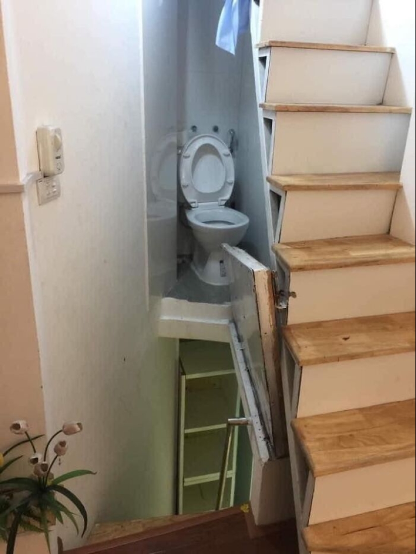
The longer you look at this photo, the worse it gets.
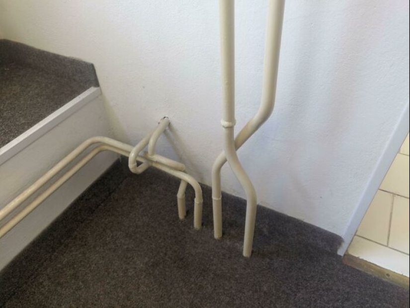
Very practical.
Recent articles

It's high time to admit that this whole hipster idea has gone too far. The concept has become so popular that even restaurants have ...

There is a perception that people only use 10% of their brain potential. But the heroes of our review, apparently, found a way to ...

New Year's is a time to surprise and delight loved ones not only with gifts but also with a unique presentation of the holiday ...