22 cases when the packaging is cooler than the product itself
Categories: Design and Architecture | Positive
By Pictolic https://pictolic.com/article/22-cases-when-the-packaging-is-cooler-than-the-product-itself.htmlPackaging is a big deal these days. It is developed by designers and marketers, and sometimes even famous artists are involved. Therefore, sometimes a box, bottle or wrapper looks more attractive to the buyer than its contents. Look at these 22 masterpieces of packaging genius that amaze with their originality or beauty.
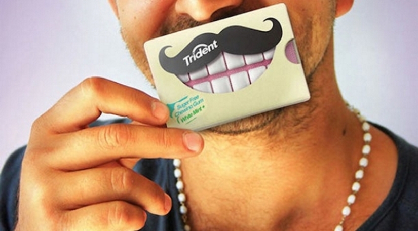
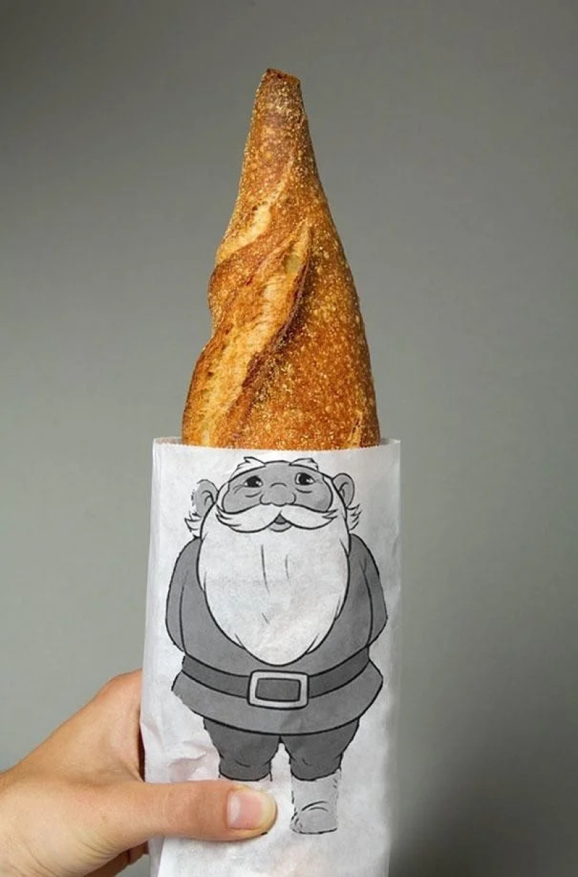
Bread bag in the shape of a gnome.
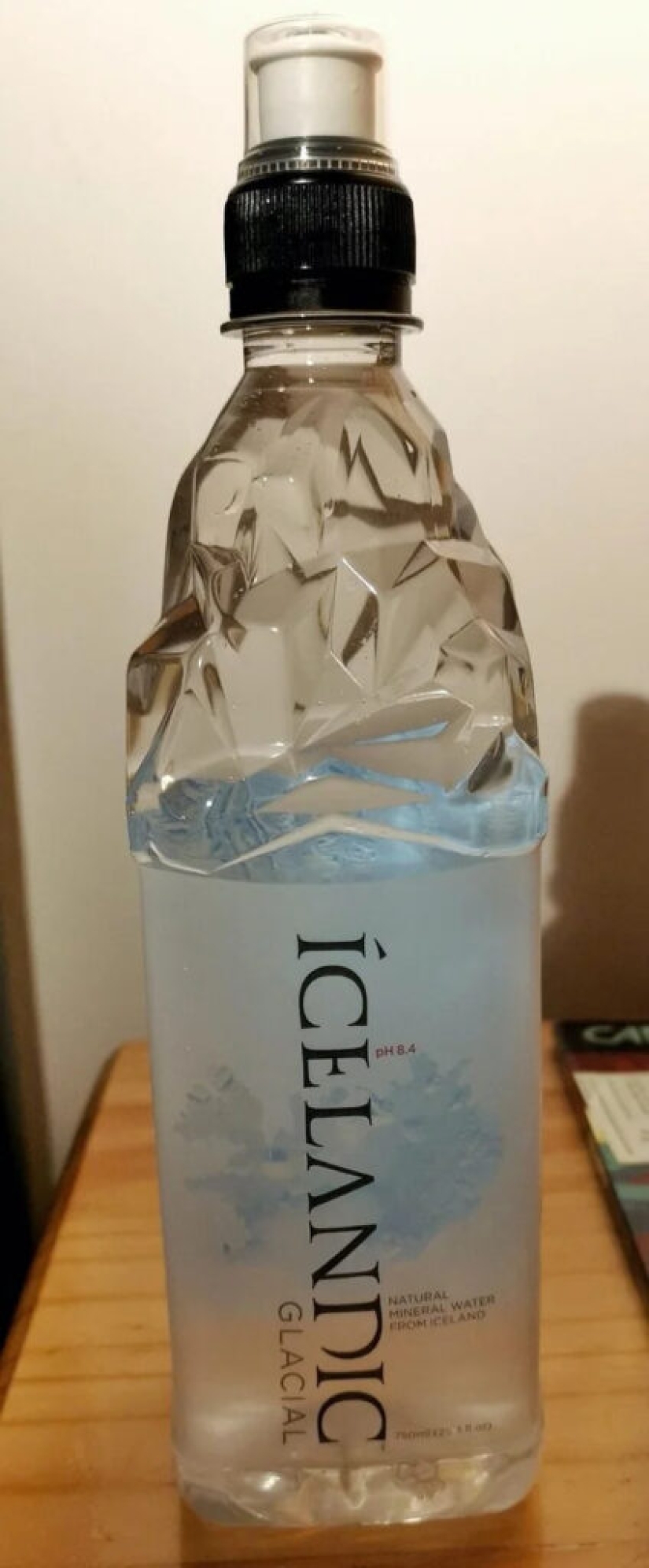
A bottle of natural water obtained from a glacier.
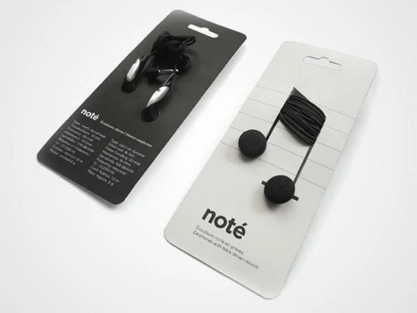
Headphones-notes.
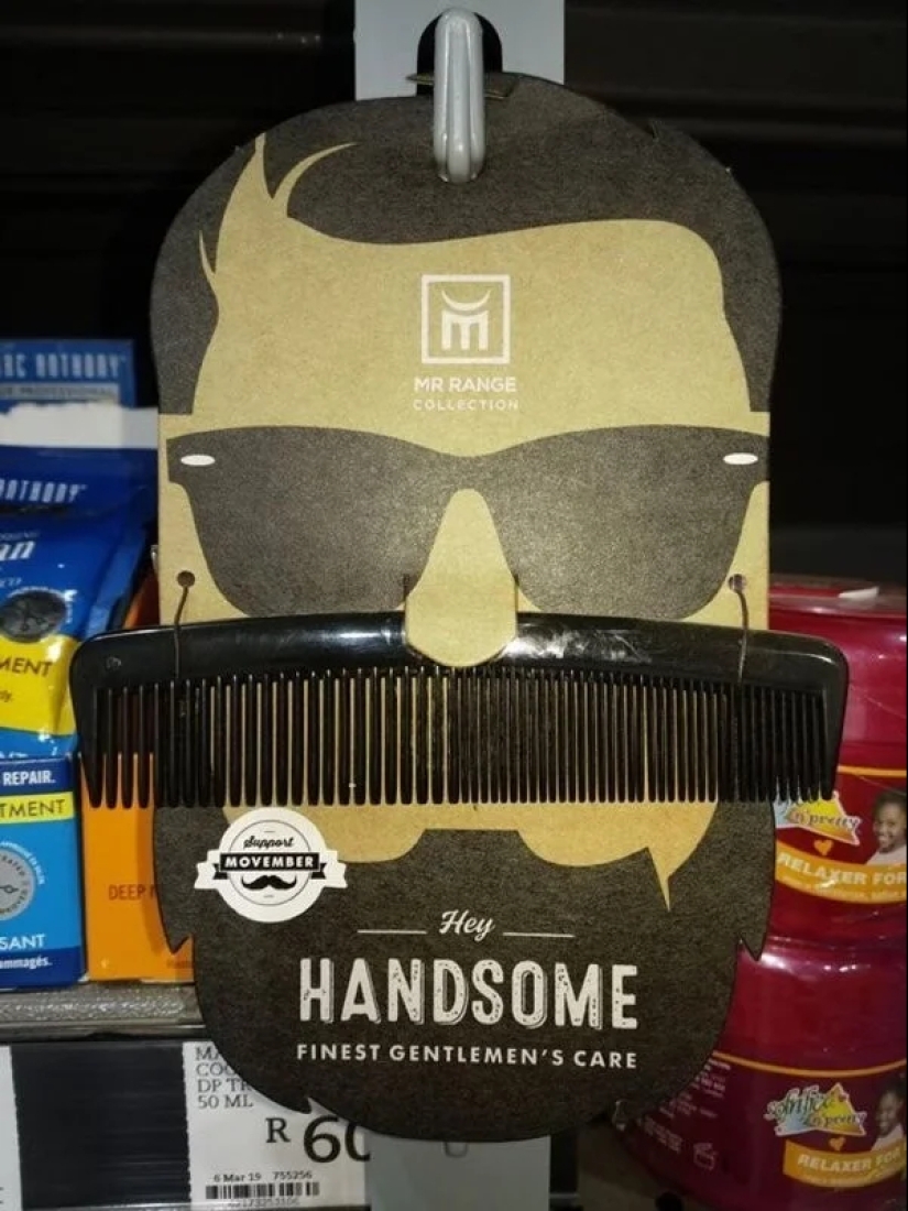
Men's comb.
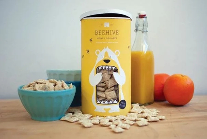
Pads with honey.
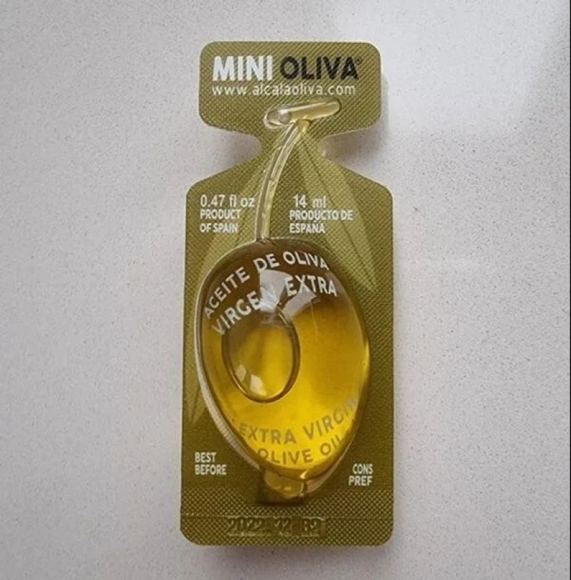
Single-use olive oil capsule in the shape of an olive.
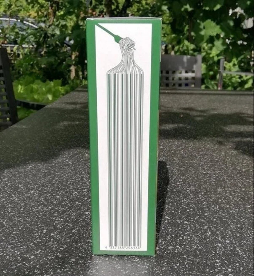
Barcode on a box of spaghetti.
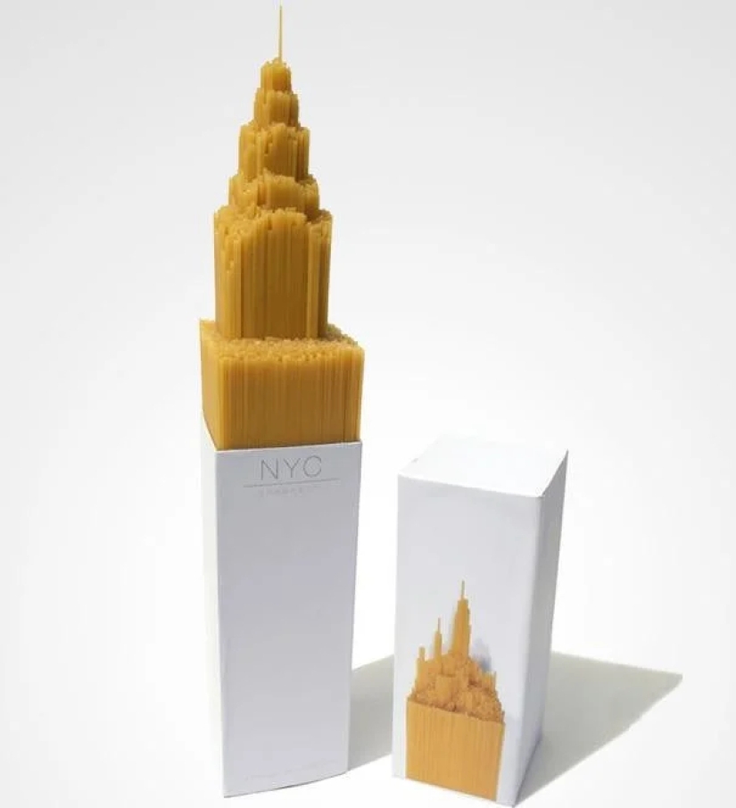
Spaghetti again, but in the form of a skyscraper.
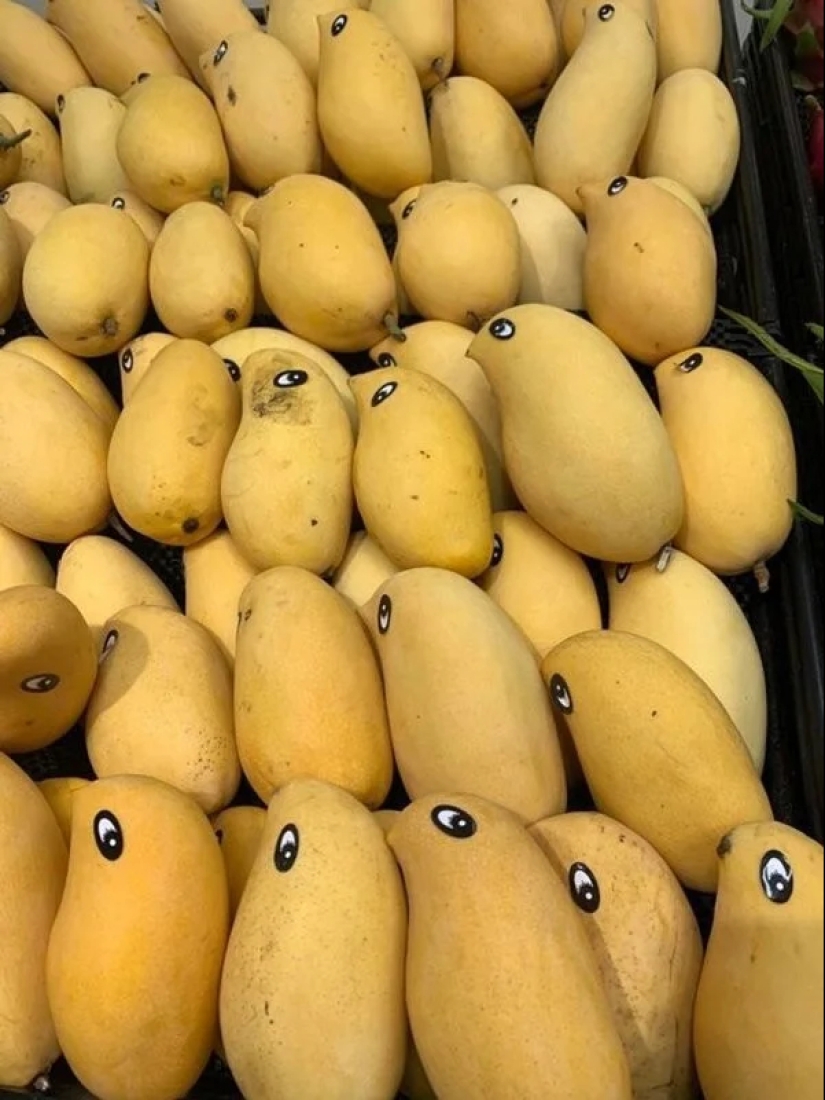
Mango fruits with eye stickers.
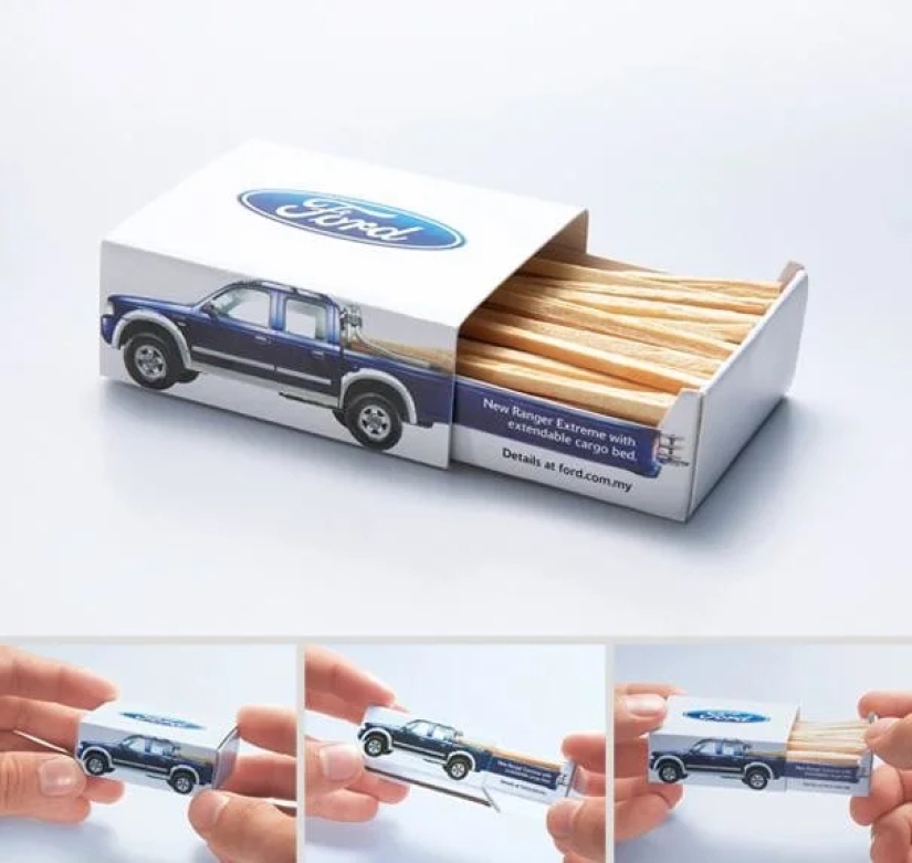
A box of matches in the shape of a pickup truck.
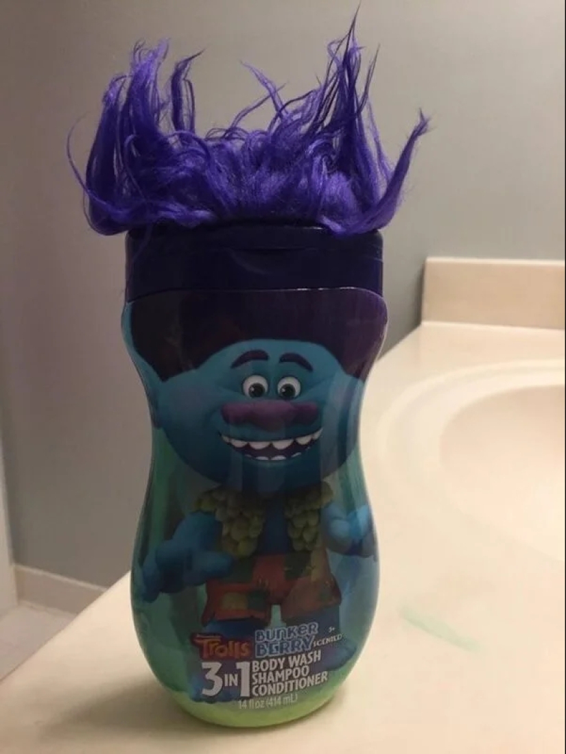
Children's shampoo with hair, so that the child can learn to wash his hair.
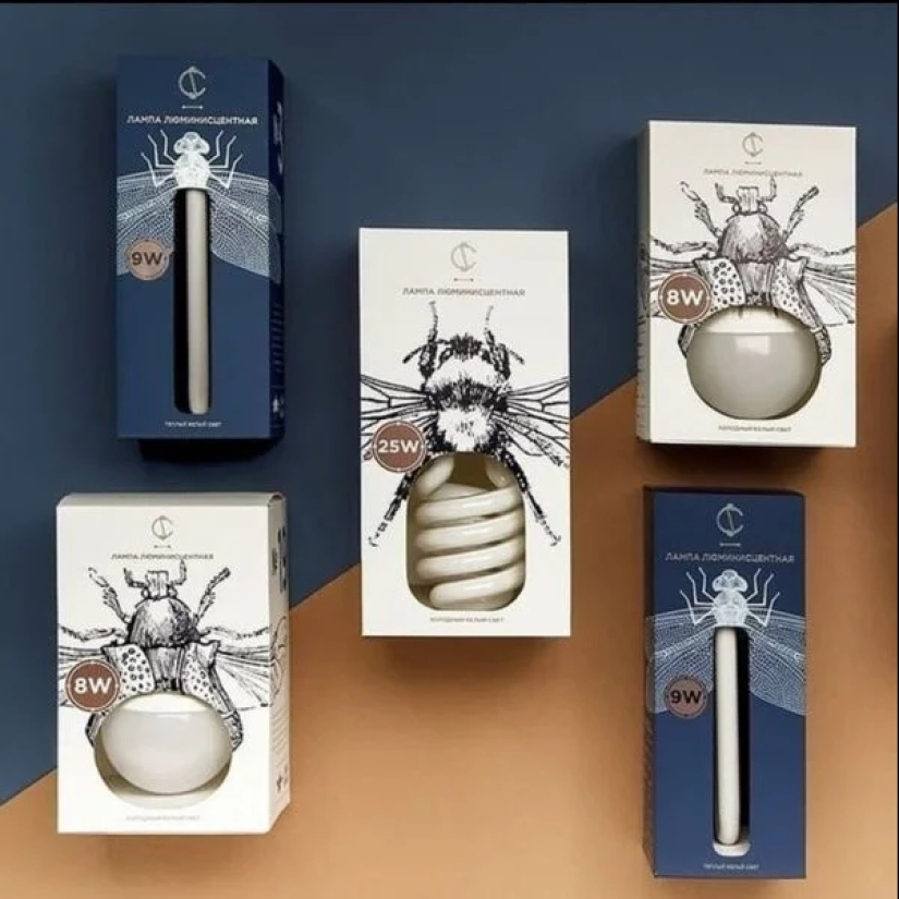
Original packaging for light bulbs.
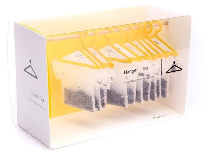
Tea bags on hangers.
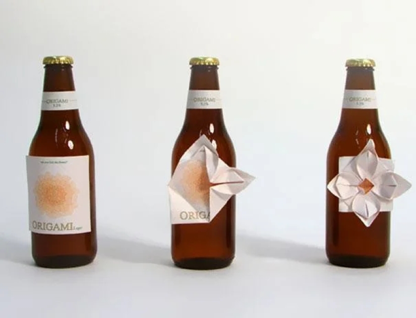
Beer with origami.
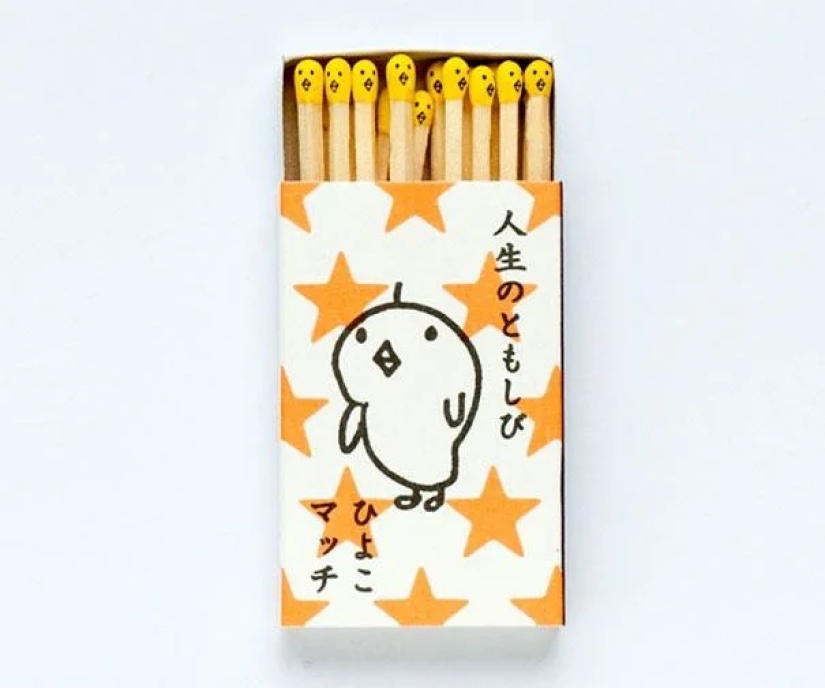
Japanese matches.
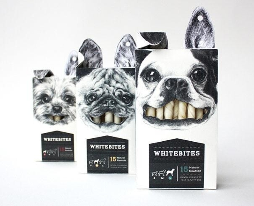
Dog treats with microelements for teeth.
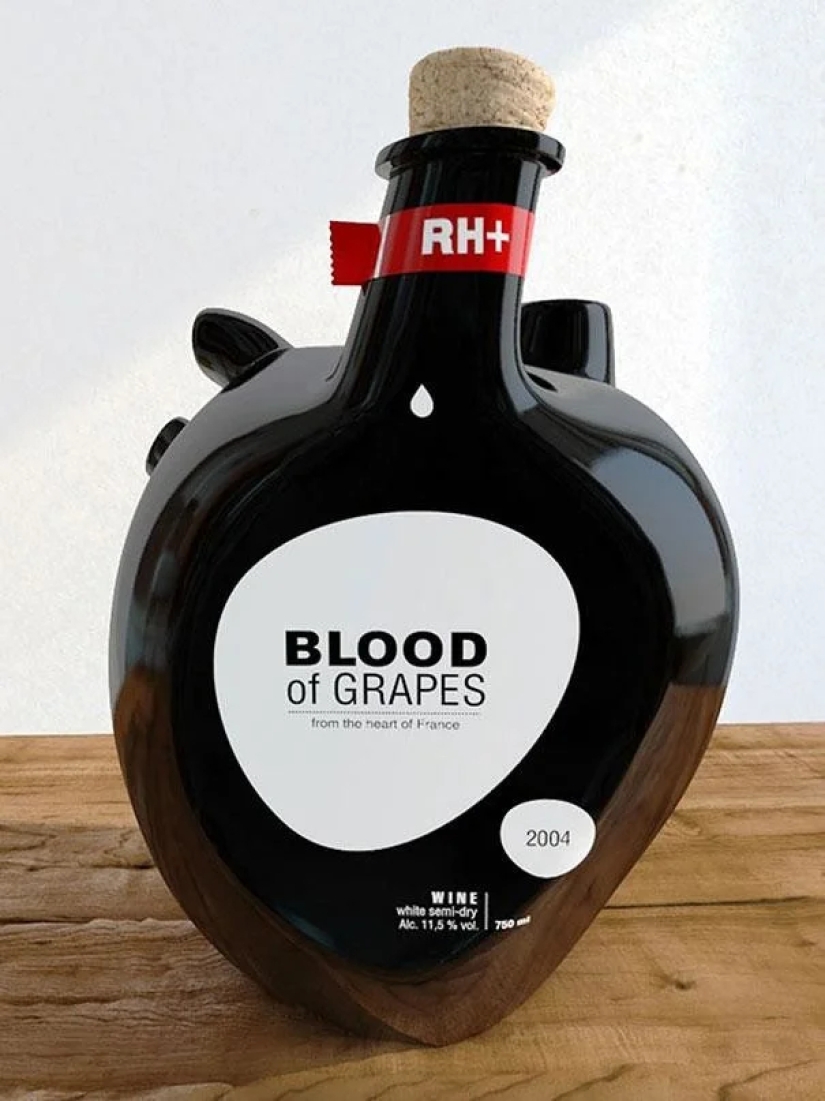
A bottle of wine “Blood of the Grapes”.
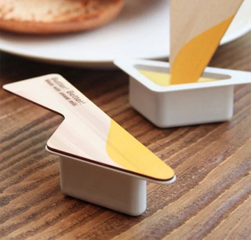
Butter sandwich with knife lid.
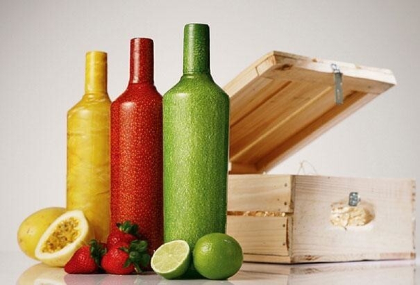
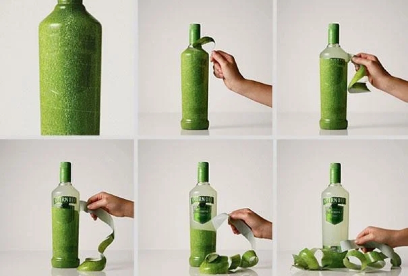
Fruit water.
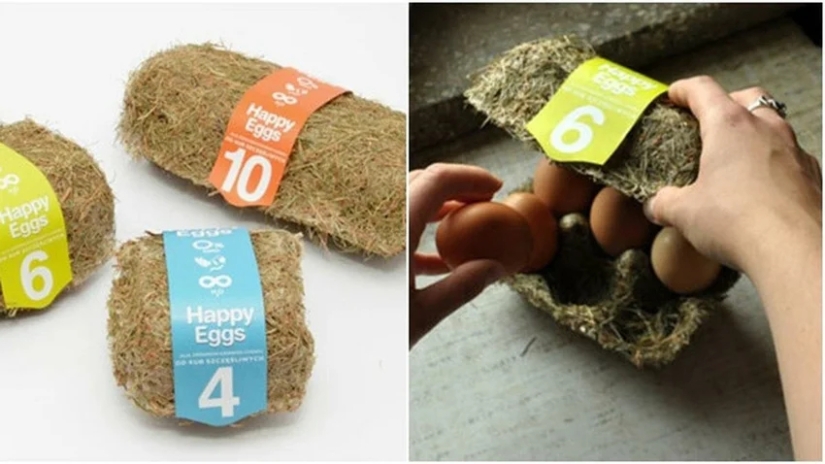
Egg packaging made from hay.
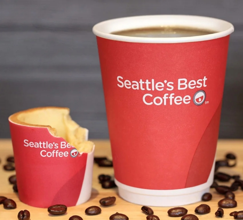
Edible coffee cup.
Unfortunately, sometimes packaging design becomes a tool to deceive customers.
Recent articles

It's high time to admit that this whole hipster idea has gone too far. The concept has become so popular that even restaurants have ...

There is a perception that people only use 10% of their brain potential. But the heroes of our review, apparently, found a way to ...

New Year's is a time to surprise and delight loved ones not only with gifts but also with a unique presentation of the holiday ...