12 Terrible Design Fails Shared By People Online
Categories: Design and Architecture | Food and Drinks | People | Production
By Vika https://pictolic.com/article/12-terrible-design-fails-shared-by-people-online.htmlA well-thought-out design can make a product more user-friendly, attractive, and efficient. However, not all designs hit the mark. There are plenty of instances where products fall flat due to poor design choices.
Thanks to the power of the internet and social media, these design mishaps are quickly shared and critiqued by Reddit users worldwide. Let’s explore some examples of bad product designs that have made rounds online, serving as both cautionary tales and a source of humor.
12 PHOTOS
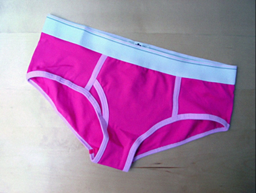
#1
Women’s underwear. The part that is supposed to get dirty is never far enough forward to catch what it's supposed to catch.
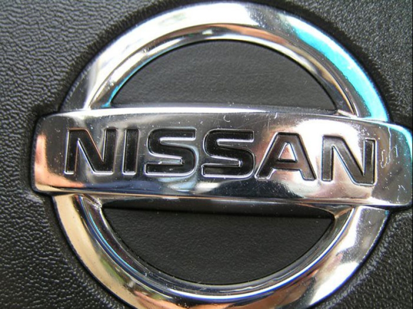
#2
The shift on a Nissan Pathfinder. Trying to get it into neutral is like a carnival game. Almost destroyed it trying to enter a car wash.
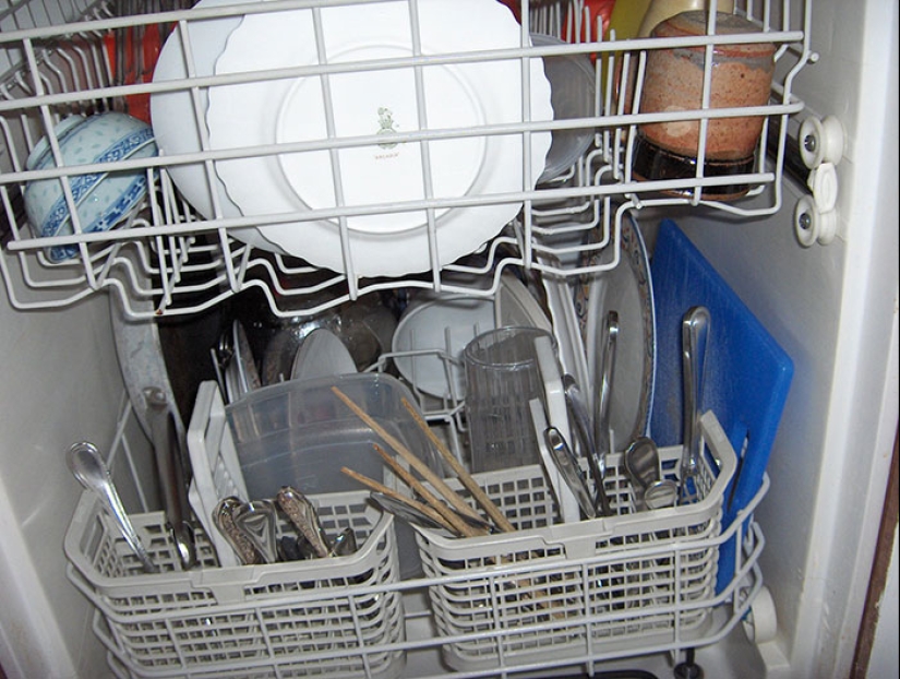
#3
My dishwasher beeps several times loudly when the cycle is done. Loudly enough that you can hear it outside the house. If you don’t open the door, it will beep again 45 minutes later, and every 45 minutes forever until you do so. There is no way to silence this feature or reduce the volume.
Apparently, there’s no such thing as starting the dishwasher at night and then going to bed in these designer’s minds…
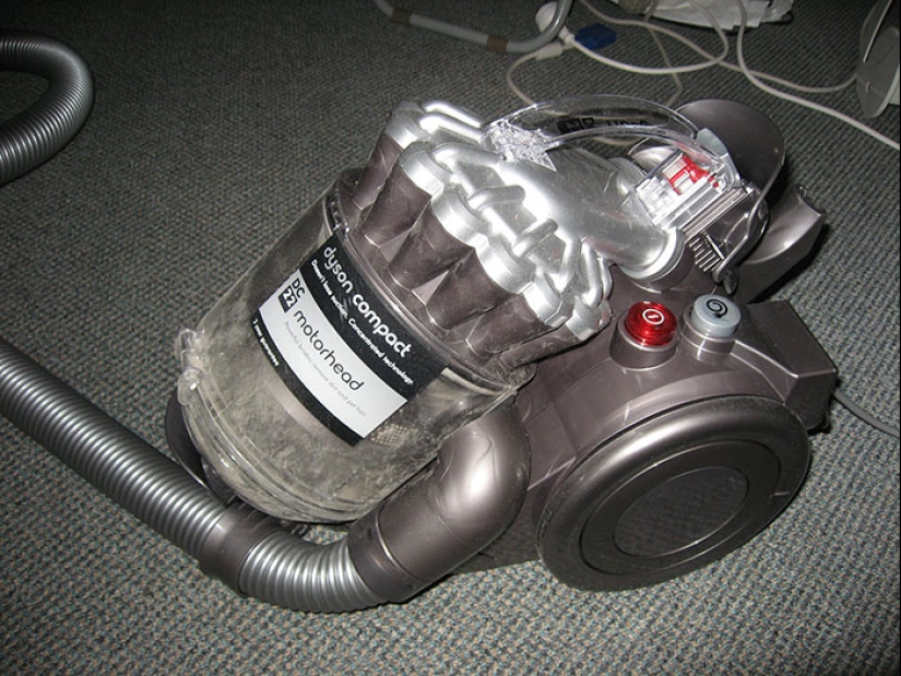
#4
Dyson vacuum cleaners. They may be great if you live in a pristine, lovely house – but when it’s an old house and you add 4 cats, a dog, and 2 children it’s a useless piece of c**p where the cleaning head needs to be de-clogged every 10 minutes. And you almost need to be an engineer to disassemble, clean, and reassemble it. I hate that f*****g piece of trash and am very, very sorry that I sold my reliable old Hoover. I am positive that Dyson and whoever else was involved in creating this masterpiece has never actually had to clean a house. Sucking up pieces of styrofoam at the testing clinics is not a real-world example.
#5
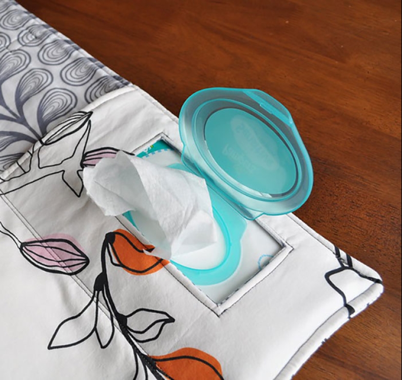
Baby wipes.
Hey, you know when a good time to struggle with opening a package that says it has perforations but really doesn’t?
Do you want one? Here’s a chunk of 20.
Do you want a bunch? Here’s a tiny ripped corner.
You have 10 left on a trip and need to conserve? Too bad motherf****r, here’s the rest of the pack. Get your tired a*s to CVS.
#6
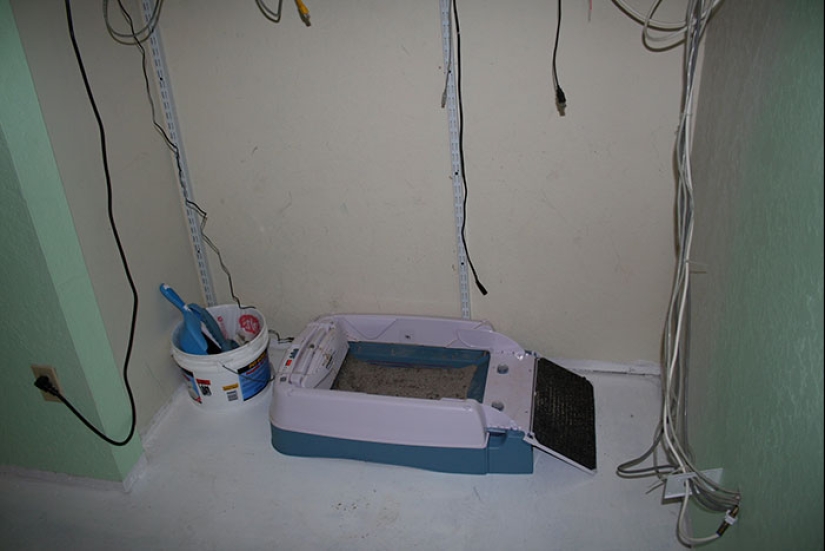
I had an automatic litter box that was fine for pee but the motor was way too weak to scoop poop and regularly got stuck. Also, poop tended to stick to the tines and make a big mess. I called the (small) company. The rep told me that the box design was tested using water and was never tested in a real-life situation with real cats as no one there had a cat. She didn’t understand why this was a problem.

#7
The trunk won't open on some Chevrolet cars if the battery is dead. There is no keyhole or physical release cable.
The battery is in the trunk.
You can jump it from contacts under the hood, sure, but that’s such an odd design choice to me.
#8
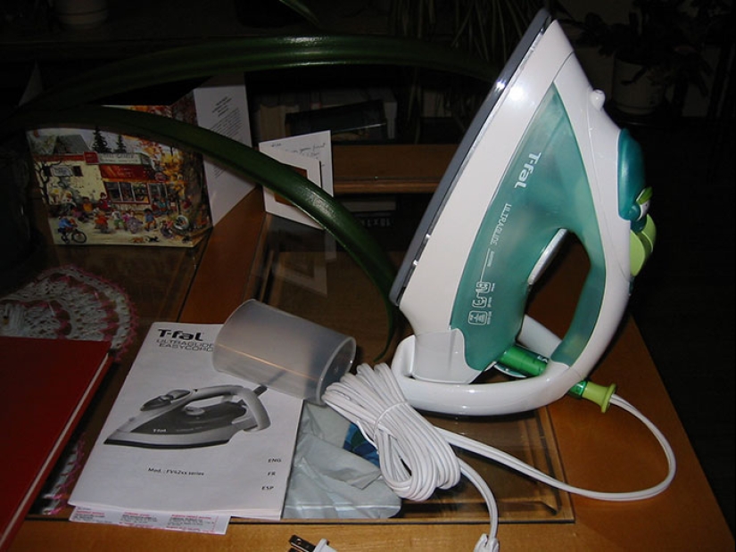
My new iron. Has a restart if you tip it over after it’s timed out. So if you accidentally leave it plugged it and it gets knocked over by accident (pet or child bumps the board, wind knocks something over knocking the iron over) it starts up while face down.
#9
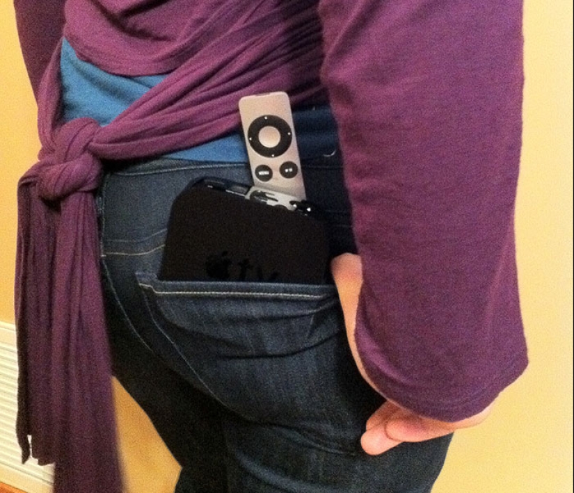
Pockets of women’s clothing.
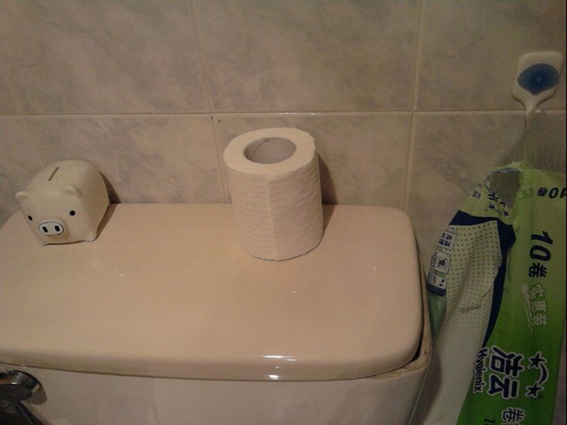
#10
Single-ply toilet paper

#11
Kids bubbles where the container is a test tube with a rounded bottom so it can never be set down unless the cap is on
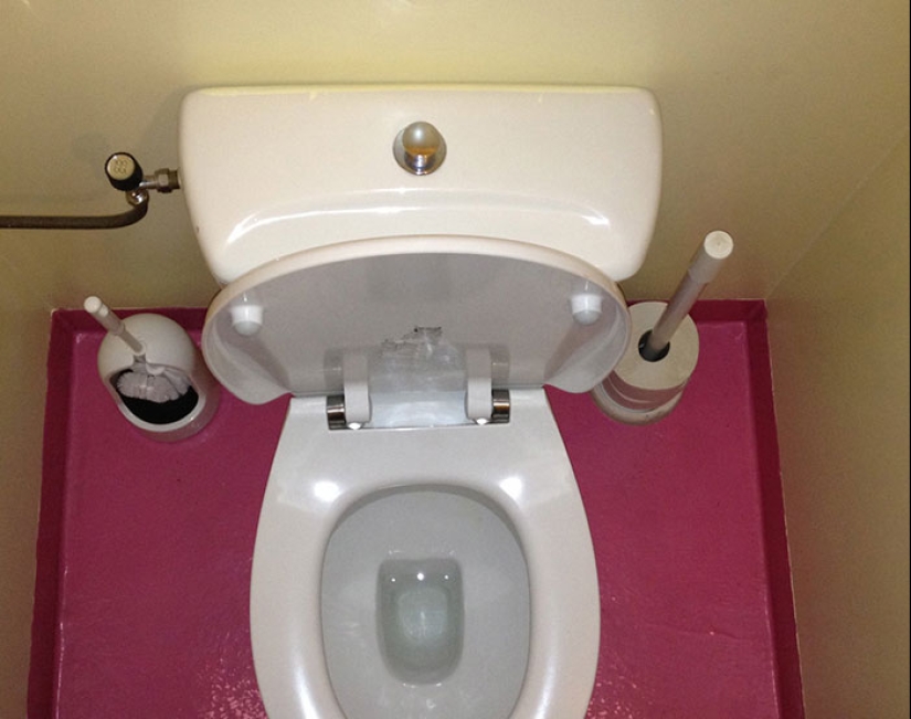
#12
The newly-built ladies' toilets in our office building had no space for the sanitary products bins. The bins ended up awkwardly shoved into the too-small gap with the net result of making the actual toilets too narrow to sit on. Fully expect those dimensions were drawn and approved by someone who had no use for the bins or didn’t even know they were present in every toilet.
Keywords: Terrible Design | Design fails | Products | Product designs | Design choices
Post News ArticleRecent articles

It's high time to admit that this whole hipster idea has gone too far. The concept has become so popular that even restaurants have ...

There is a perception that people only use 10% of their brain potential. But the heroes of our review, apparently, found a way to ...
Related articles

Surely you have repeatedly struck by household wisdom and skill of your mothers and grandmothers about all that is within the ...

To eat a bowl of chicken soup when you have a fever and runny nose — a great idea, but just as some foods help to get better ...

Losing extra pounds is hard. This requires a healthy portion of dedication, self-improvement and strict discipline, especially when ...

New Year's is a time to surprise and delight loved ones not only with gifts but also with a unique presentation of the holiday ...