11 Design Fails In Public Places So Atrocious, They Make People Wonder How They Got Approved
Categories: Art | Design and Architecture | People | Photo project | Society | World
By Vika https://pictolic.com/article/11-design-fails-in-public-places-so-atrocious-they-make-people-wonder-how-they-got-approved.htmlThe secret of a great public space lies in its design. For people to visit and make use of these places many times over, they have to be functional, accessible, easy to use, match the needs of the community, and evolve with it as it changes. After all, most things are created to be utilized, not just to be seen.
However, not all designs can check these boxes. “What happens when they fail to do so?” you may ask. Well, they are shared online for netizens to judge. The team at Pictolic has collected some of the worst cases in the list below. We hope that these photos serve as a public service announcement that we deserve better!
We also reached out to urban planners Taiwo Agbaje and Samuel Austin, who kindly agreed to share some tips on how to create a successful public space.
11 PHOTOS
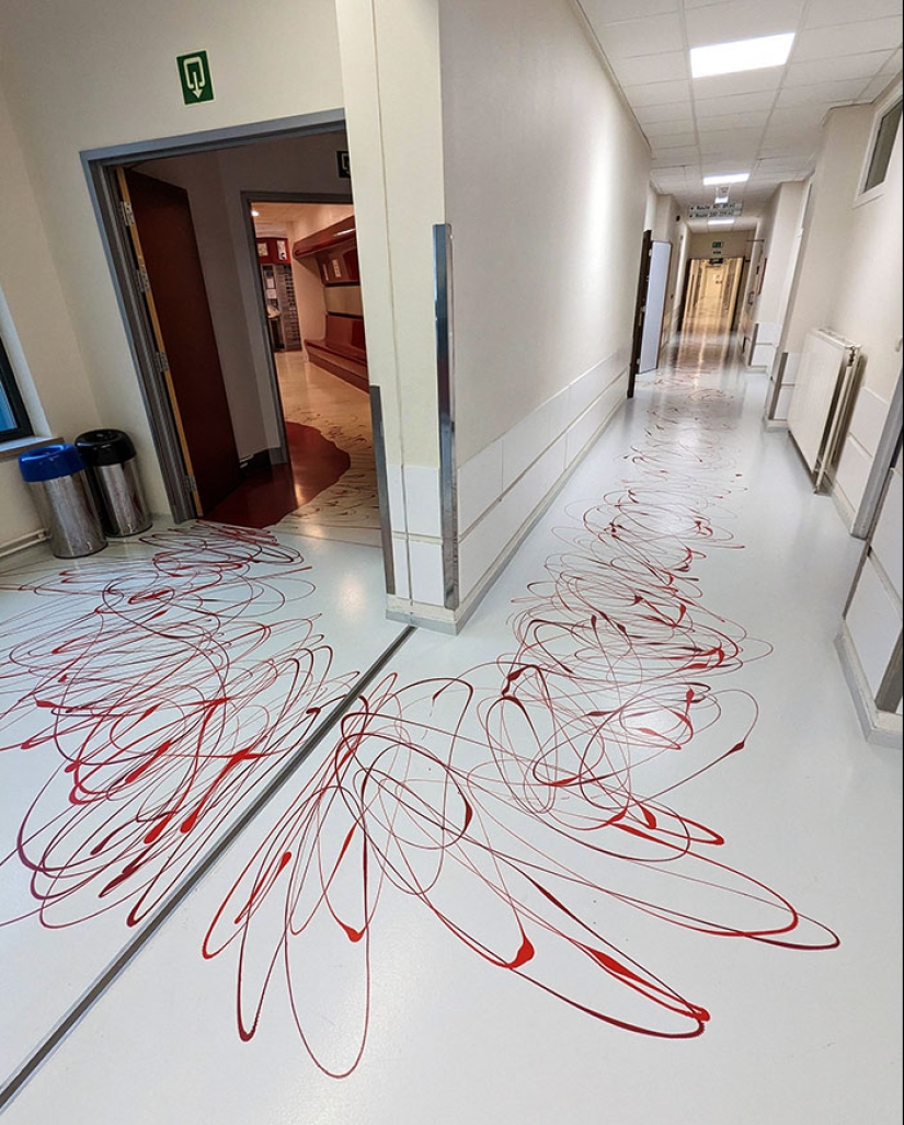
#1 This Pattern On The Hospital's Floor
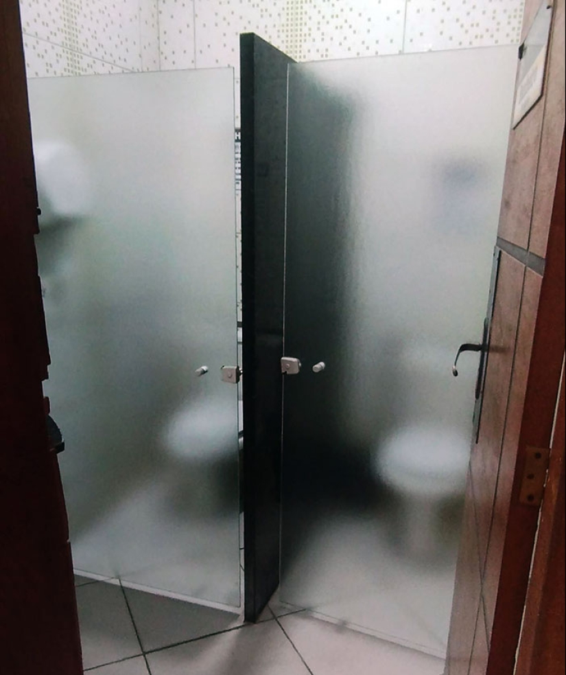
#2 The Students In My Course Complained About Not Having Enough Privacy, And the University Decided To Install Glass Doors To Solve The Issue
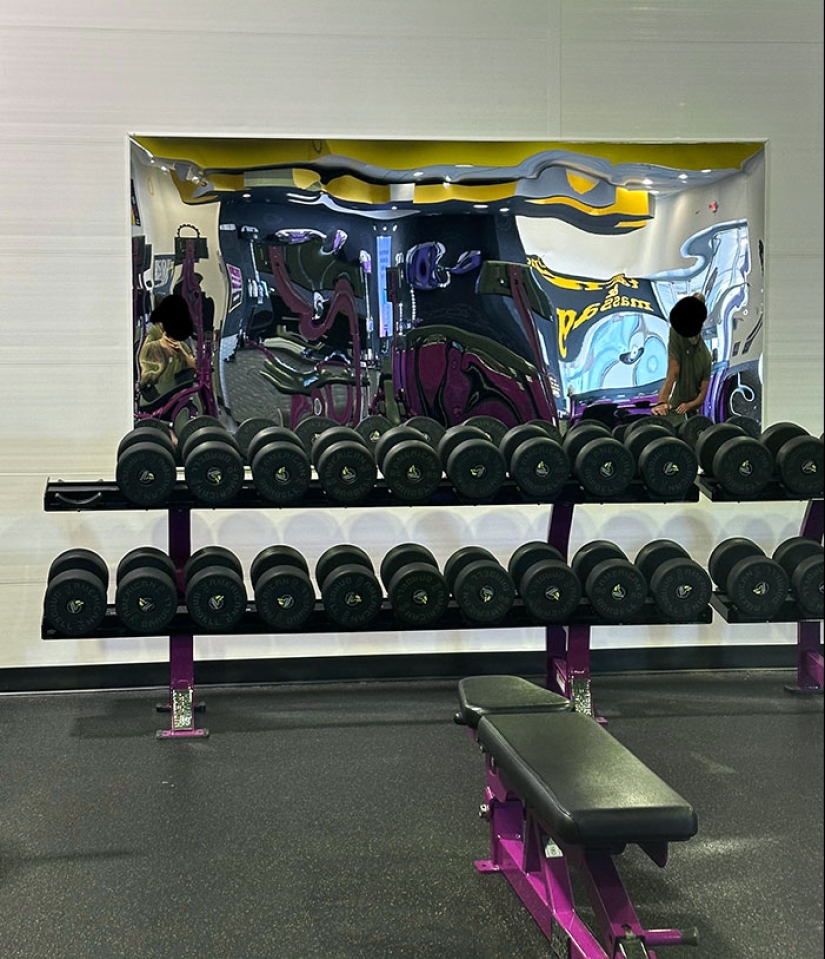
#3 They Put Circus Mirrors In My Local Gym
Urban planner and GIS analyst Taiwo Agbaje tells Bored Panda that one aspect that makes a public space successful is its accessibility. “A remarkable public space is undeniably easy to access and navigate, visible from a distance, and seamlessly connected to its surroundings.”
Other features that it has to include are engaging activities. “Successful public spaces are unequivocal hubs of vibrant activity, offering diverse opportunities for people to engage and participate in various activities,” says Agbaje.
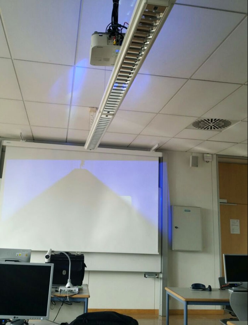
#4 My School Installed A New Beamer. I Nominate Them For "The Best Engineering 2017"
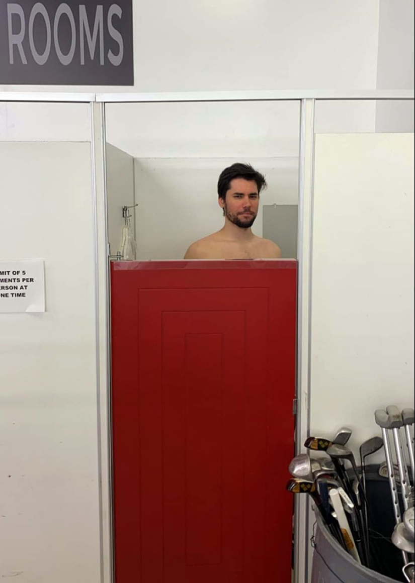
#5 The Fitting Room Door At The Thrift Store
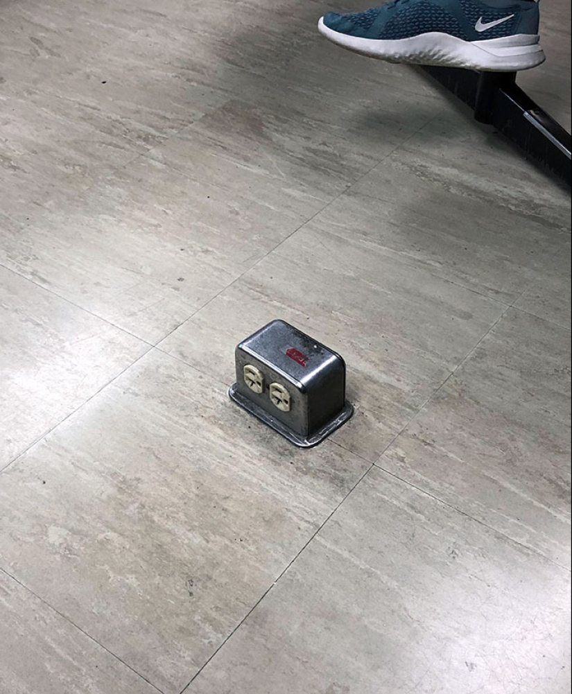
#6 My Classroom Has These Floor Outlets. It's The Toe Stubber 5000
He also adds that such places should be comfortable, pleasing to the eye, and serve as a fostering environment for social interactions. “A comfortable environment is undeniably crucial, where seating, shade, cleanliness, and pleasant aesthetics significantly contribute to a positive experience. The space's image must radiate safety, inviting warmth, and impeccable maintenance.
Outstanding public spaces definitively foster social interactions, serving as unequivocal meeting points that genuinely enhance the sense of community, enabling connections among friends, family, and strangers."
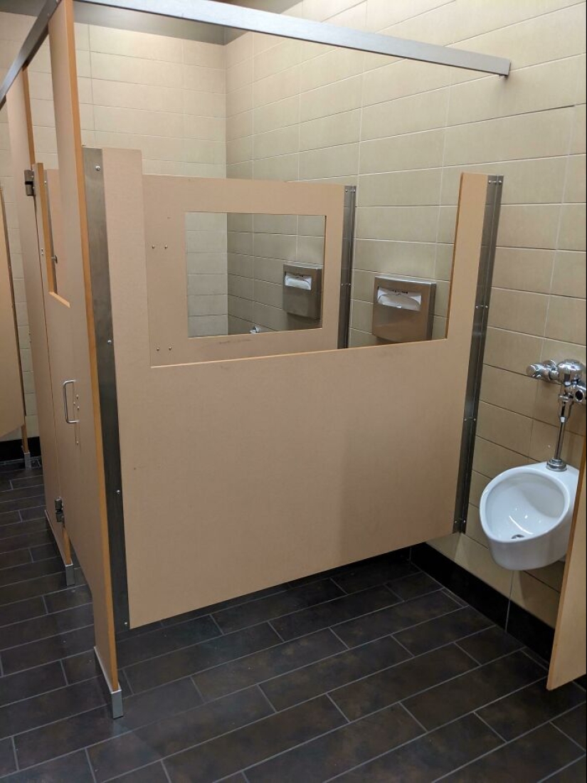
#7 Public Restroom Stalls With... Viewing Windows? Why?
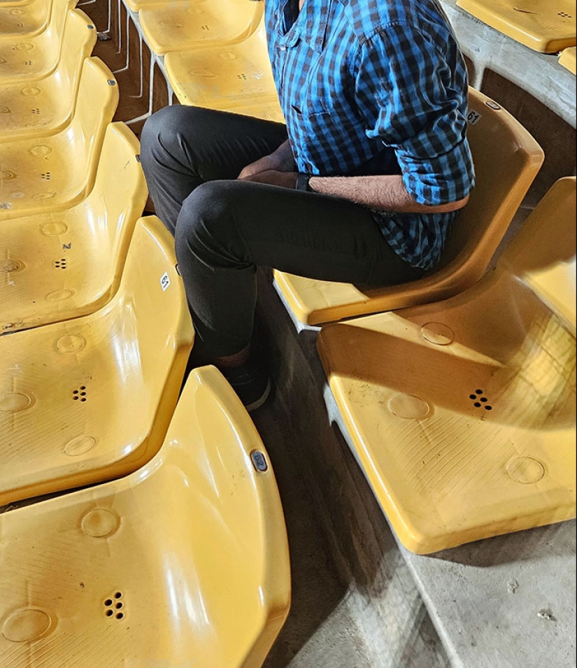
#8 Leg Space In A Cricket Stadium
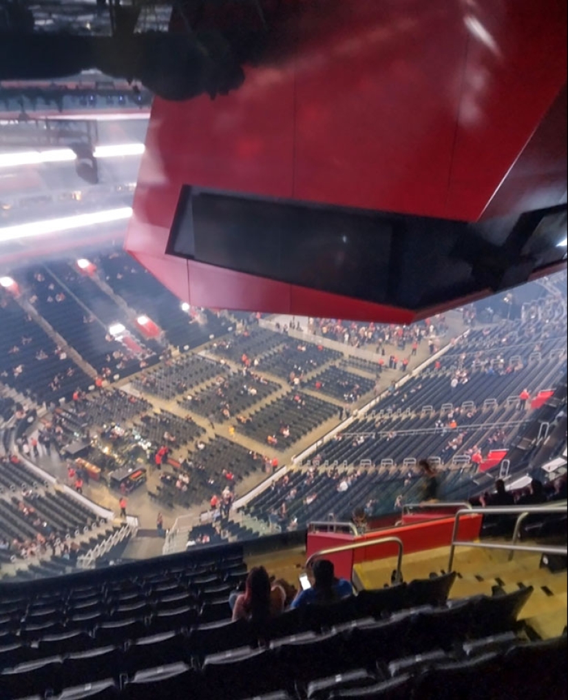
#9 This Is The View Of The Stage At The Concert I'm At
Urban planner Sam Austin, who advocates building liveable cities for youth, summarized these principles by saying, “Public spaces should make people 'stick' and linger for longer, encouraging people to stay and spend time in. Whether that's having informal seating spaces along a pedestrian street or interactive public art - it should provide multiple opportunities to enjoy the space.”
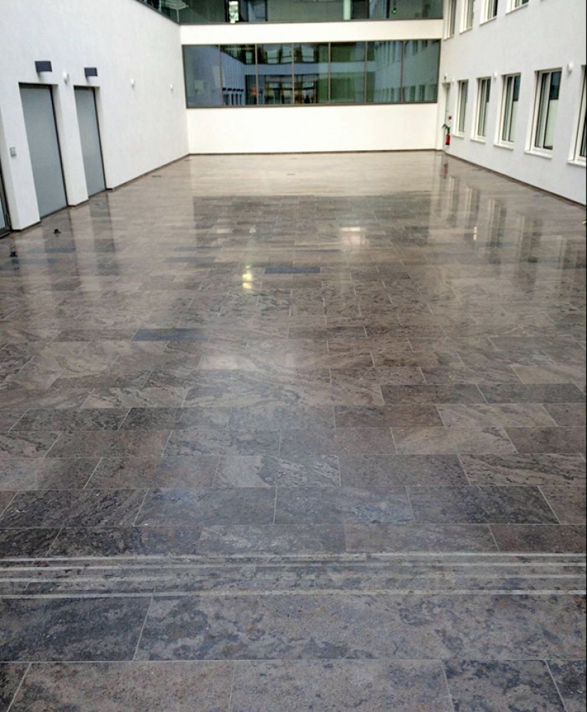
#10 There Are Three Steps Down At The Entrance To This Lobby
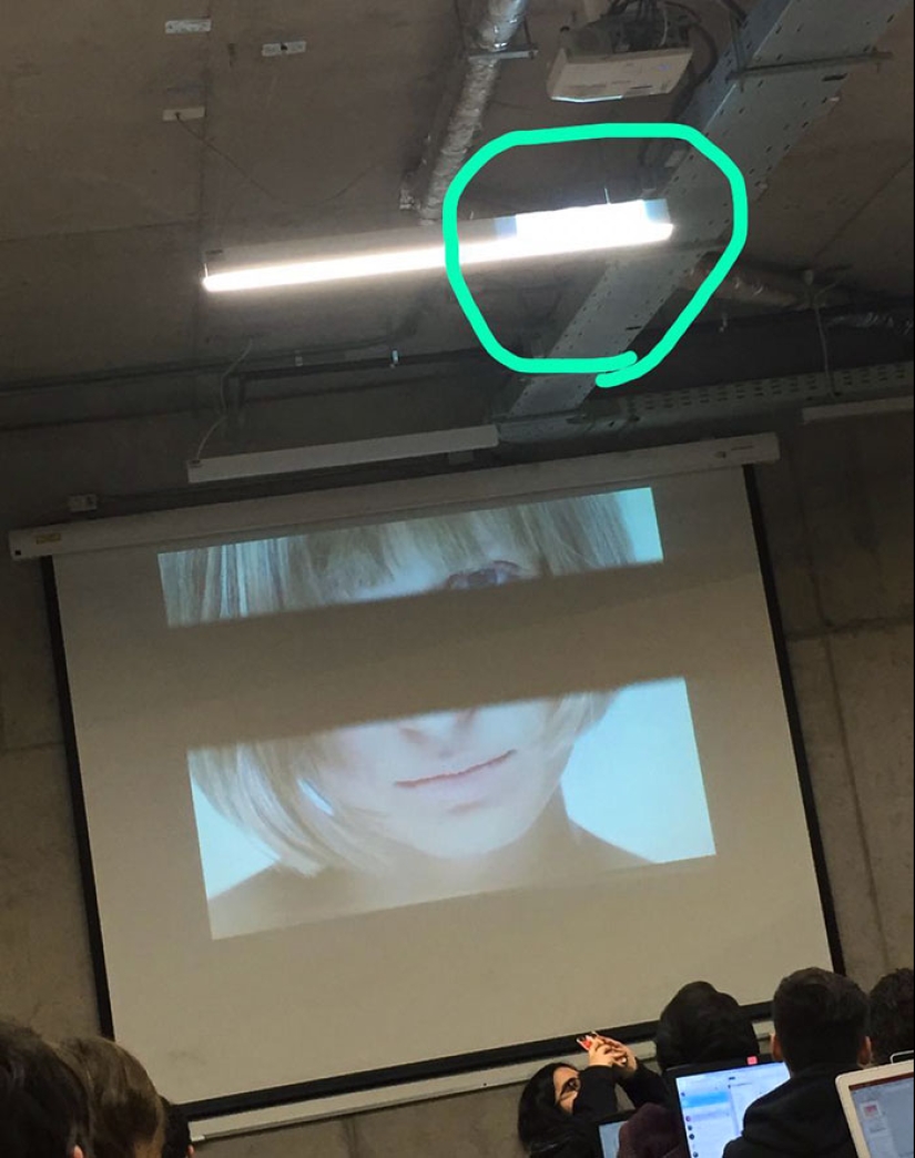
#11 Perfectly Thought Classroom
Keywords: Design Fails | Design failures | Public places | People | Interior designs | UX design
Post News ArticleRecent articles

It's high time to admit that this whole hipster idea has gone too far. The concept has become so popular that even restaurants have ...

There is a perception that people only use 10% of their brain potential. But the heroes of our review, apparently, found a way to ...
Related articles

When you’re neck-deep in your work, you can get so focused on a few details that you no longer see the forest for the trees. ...

The very point of hiring a professional designer is to get the job done right. Or so we’d like to think. But it seems sometimes ...

Motivational posters are all around us, giving us 2 minutes of hope and peace of mind. However, as this anti-positive poster ...

New Year's is a time to surprise and delight loved ones not only with gifts but also with a unique presentation of the holiday ...