10 most famous logos that have a hidden meaning
Categories: World
By Pictolic https://pictolic.com/article/10-most-famous-logos-that-have-a-hidden-meaning.htmlThe logo is the face of the company. It's more than just a symbol. After all, a successful logo is associated with the brand, with its products and services. In addition, the company's symbolism often contains its history, and often some hidden meaning. It is about such logos that we will discuss in our review.
1. Vaio
The Vaio company was originally a division of Sony, but in 2014 it became the property of JIP. Engaged in the production of computers by Vaio. The wave on the logo represents an analog signal, and one and zero represent a digital signal.
2. Toyota
The logo of the Japanese automotive company Toyota is nothing more than a needle eye with a thread threaded through it. The unusual logo is a reference to the company's past, when it was engaged in the production of sewing machines. And the individual elements of the Toyota symbol make up the letters of the word-the company name.
3. Continental
The Continental logo has a catch with the letters " C " and "O", which in the name in the future form an image of a car tire. Recall that it is their production that the company is engaged in.
4. Pinterest
The logo of the popular Internet service Pinterest, the key feature of which is the ability to collect, "pin" your favorite images, is distinguished by its capital letter. If you look closely, the "P" here is stylized as a sharp button.
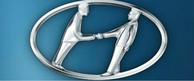
5. Hyundai
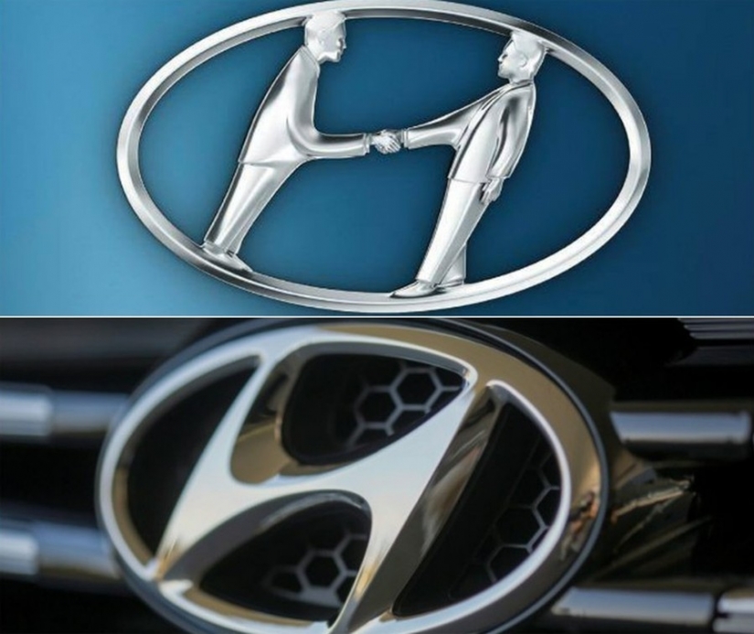
Many people mistakenly believe that the Hyundai logo simply means the capital letter of the company name. That's not so. In reality, an improvised " H " is a customer and a seller shaking hands.

6. Amazon
The secret of the Amazon logo is quite simple, although it is not obvious. The mysterious arrow connecting the letters " A " and " z " is nothing more than a symbol of a smile. It indicates the friendliness and friendliness of the company's employees.
7. LG
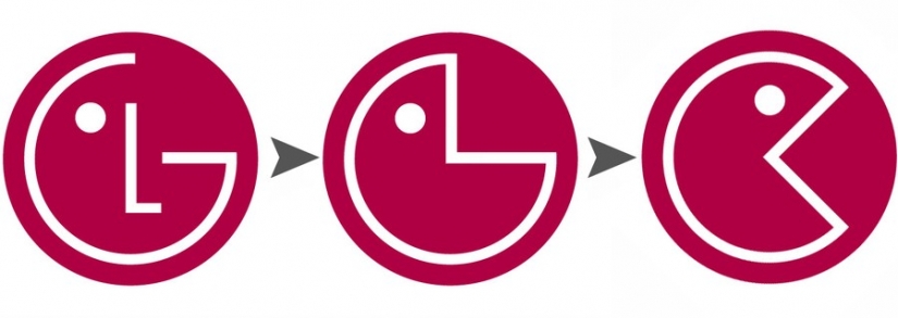
The LG logo is the most obvious-it symbolizes a person's face. The company itself stated that on their part it is a desire to maintain a human attitude to the client. In the network, the LG symbol is often compared to Pac-Man.
8. Coca-Cola
Only at first glance, there is nothing remarkable about the Coca-Cola symbol. In fact, in the second part of the word, the Danish flag is hidden between the letters "C" and "l". It is also worth noting that this company is one of the few in the world that has never changed its logo in the entire history of its existence.
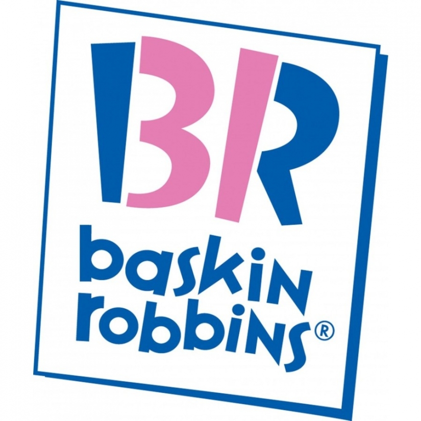
9. Baskin Robbins
Previously, the motto of the popular youth cafe Baskin Robbins (and now the cafe chain) sounded like "31 tastes — every day of the month is new". Subsequently, the designers "embedded" the number 31 in the name, in the letters " B " and "R".
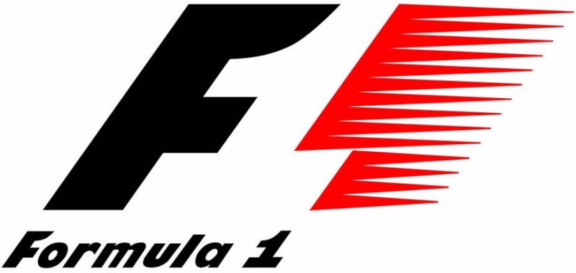
10. Formula 1
If you look closely, then in the corporate logo of the Formula 1 brand, a white unit is hidden between the letter "F" and the image of the flag. That, however, is the whole secret of the company.
Keywords: Symbol | World | Brand | Company | Logo | Meaning
Post News ArticleRecent articles

It's high time to admit that this whole hipster idea has gone too far. The concept has become so popular that even restaurants have ...

There is a perception that people only use 10% of their brain potential. But the heroes of our review, apparently, found a way to ...
Related articles

Have you heard of such a phenomenon as the doorway effect? Let's put it simply: have you ever walked into a room and immediately ...

Walking through this picturesque bridges, you can admire the views from these stunning views and breathtaking landscapes. We invite ...

Not all the house where they filmed the cult movies and TV shows, become "house-museums". Many of them are then sold as the ...

New Year's is a time to surprise and delight loved ones not only with gifts but also with a unique presentation of the holiday ...