10 interior design ideas that may not be useful in the future
Categories: Art | Beauty | Design and Architecture | Photo project | Society | World
By Vika https://pictolic.com/article/10-interior-design-ideas-that-may-not-be-useful-in-the-future.htmlEach of us tries to make our home not only cozy but also comfortable. Nowadays, many commercials and websites on the Internet, billboards, films, and TV series offer us many ideas on how to design our homes. Unfortunately, some modern ideas turn out to be useless from a practical point of view, and you may regret wasting time and money by implementing them in your life.
We at Pictolic try to protect our readers from hasty decisions when renovating their homes, and therefore show you useless fashion items.
10 PHOTOS
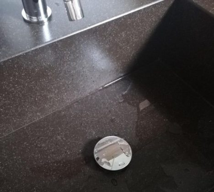
1. Stone sink with a flat bottom.
Indeed, this type of sink looks beautiful and fashionable, but it has a significant drawback that people will find out about after a while. It is rather difficult to keep it clean due to the flat bottom, the water does not drain completely and a small amount remains, which leads to the appearance of an ugly build-up. In addition, it is not always easy to remove soap suds from the corners of the sink. So, you have to choose between beauty and practicality.
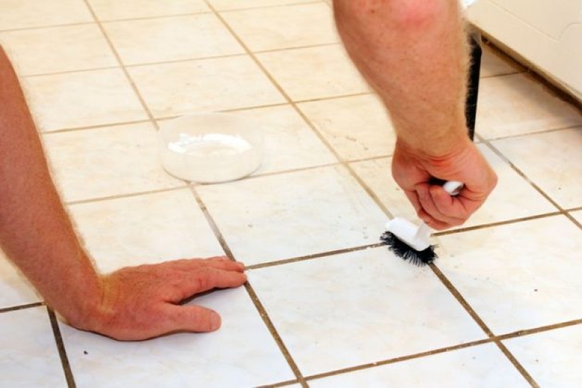
2. Light seams between tiles in the bathroom.
A bright bathroom always looks beautiful in photos, especially when the floor is white. However, due to constant humidity and hard water, the seams between the tiles begin to darken, as plaque and mold form. As a result, the bathroom loses its attractive appearance over time. Instead, try using darker-colored grout to keep your bathroom looking fresh longer.
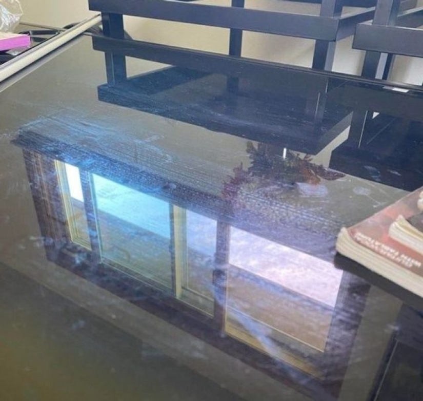
3. Glass table in the kitchen.
The glass table looks stylish as it lets in light. But at the same time, things like fingerprints, dust, and streaks can also be visible on its surface. It is unlikely that you will be able to wipe such a countertop well with an ordinary rag. You will have to use special cleaning products and microfiber cloths or cover with a tablecloth - but in this case, the idea of \u200b\u200bbuying a glass table becomes meaningless.
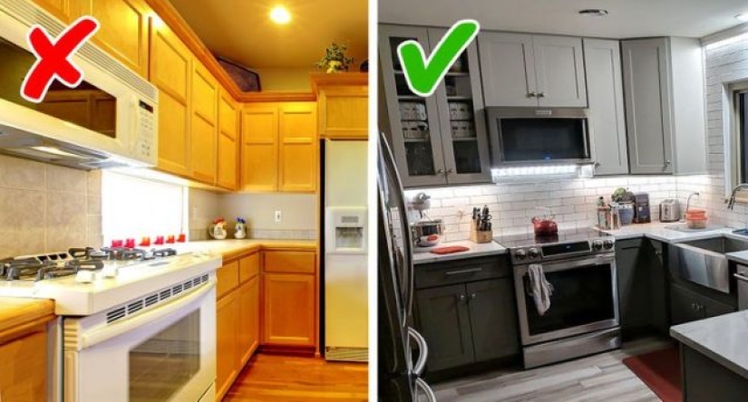
4. Space above kitchen cabinets.
The empty space above the kitchen cabinets is not actually used. That's why it's best to make these cabinets tall enough to reach the ceiling. Then you will not only be able to visually increase the height of the ceiling but also save yourself the hassle of cleaning hard-to-reach places. However, keep in mind that it's important to leave some space between the cabinet door opening and recessed lighting.
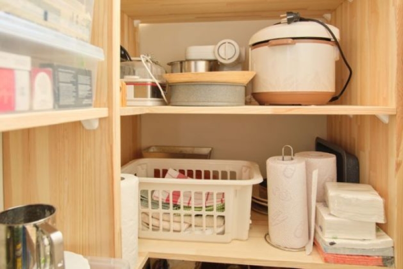
5. Open shelves.
We all know the phrase “There is never too much storage space”. Following this rule, we plan a lot of shelves on which we will carefully place everything we need. At first glance, it can be convenient and beautiful - everything is visible, and it fits into the overall design. But when it's time for the next cleaning, these shelves turn into a headache due to the accumulation of a huge amount of dust on them.
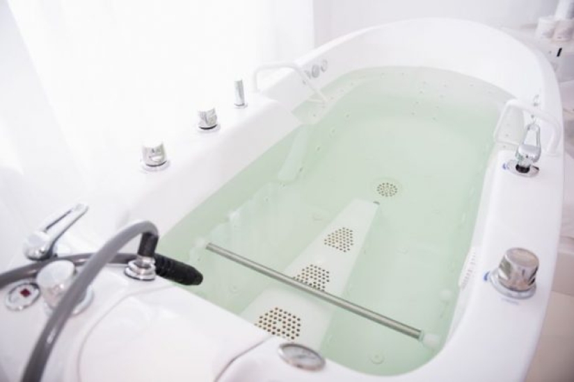
6. Hot tub.
It is hard to imagine a person who has never dreamed of a home hot tub. It will help you relax and de-stress while lying in warm water after a hard day's work. Some people even design their bathrooms around these tubs, which, by the way, cost quite a lot of money. But over time, it turns out that the systems in the bath require special care. The more protruding parts of the hydromassage elements on the snow-white surface of the bath, the more plaque and fungus will accumulate there.
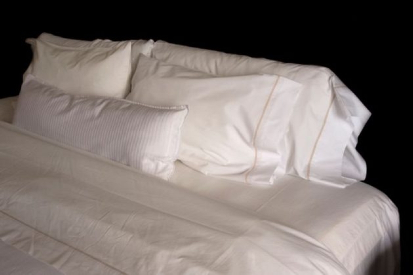
7. Bed linen made of silk.
We used to think that natural silk bed linen is a sign of luxury and exquisite taste. We bet you at least once in your life thought about buying such a set. Movies and TV series show us that rich people choose silk when it comes to their beds. But this choice is impractical because the silk bed linen wrinkles and remains cold to the touch. And their main drawback is that they are very slippery.
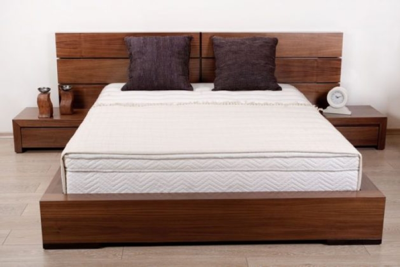
8. Beds with a wide base.
We spend a third of our lives in a dream, so things like our bed should be approached especially carefully and responsibly. Recently, thanks in part to advertising, people have begun to choose catwalk-style beds because such furniture looks unusual and stylish. However, practice shows that lying and getting up on them is extremely uncomfortable.
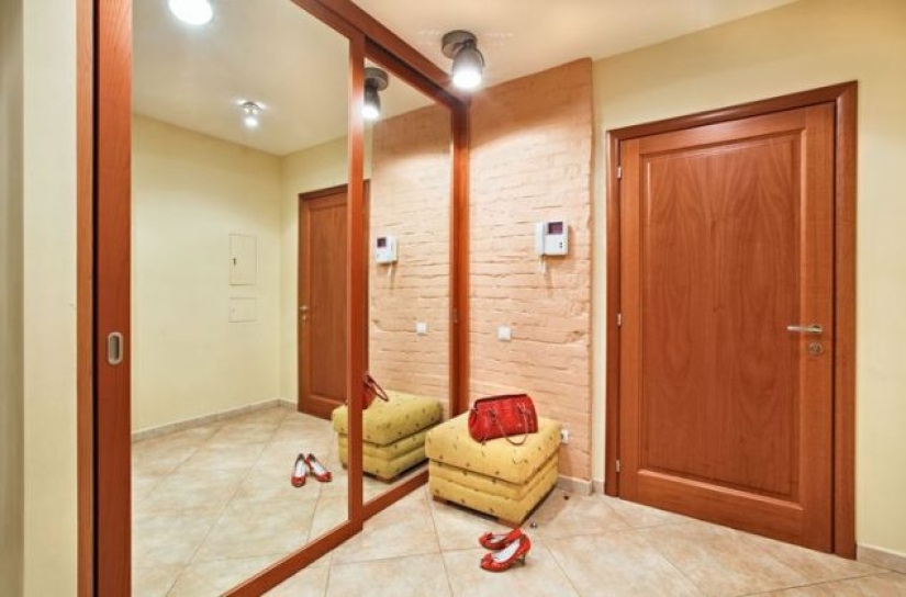
9. Wardrobes with large mirrors.
Sliding wardrobes with large mirrored doors are a fairly popular interior solution that allows you to visually expand the boundaries of the room. However, this visual trick has its drawbacks - handprints and dust marks will be clearly visible on this large surface. Even brushing a few times a week will not help get rid of this problem. In addition, mirrored doors are quite expensive.
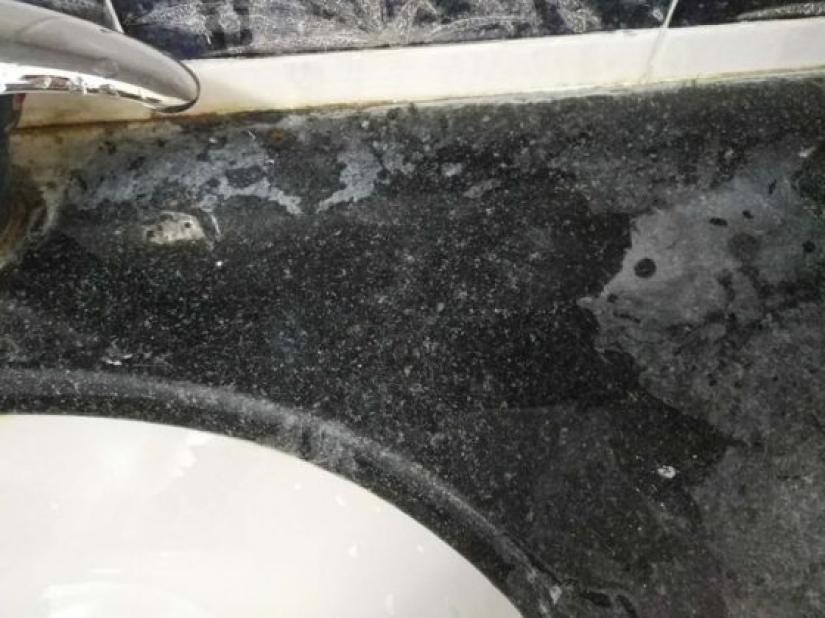
10. Black glossy stone top.
“Stylish, fashionable, and rich” are the first words that come to mind when we see a black stone countertop. That's why more and more people choose it. However, after a while, it becomes clear that this choice was actually the wrong one because every drop of water that falls on its surface and dries leaves streaks and stains. This also means that you will have to constantly wash and wipe down the area around the sink.
Keywords: Interior design | Design ideas | Home design | Flat | Architecture | Appearance | Design
Post News ArticleRecent articles

It's high time to admit that this whole hipster idea has gone too far. The concept has become so popular that even restaurants have ...

There is a perception that people only use 10% of their brain potential. But the heroes of our review, apparently, found a way to ...
Related articles

When decorating a house is difficult to find the right balance between functionality, comfort and style. No matter how much money ...

We've learned that the celebrity homes amazes with wealth and glamour. Indeed, the star mansions usually stagger the imagination. ...

The 2024 International Design Awards (IDA) has unveiled its outstanding winners, showcasing the very best in interior design. These ...

New Year's is a time to surprise and delight loved ones not only with gifts but also with a unique presentation of the holiday ...